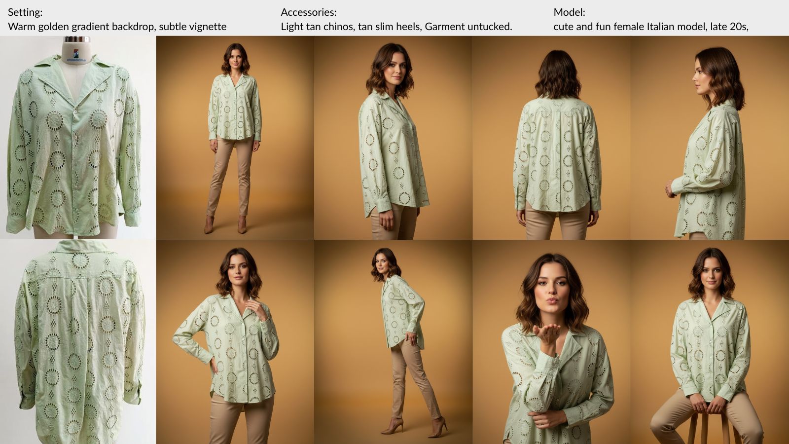
Catalog Photography · Guide
How to Make the Product Stand Out in Catalog Photos
Most catalog images that underperform are not bad photographs. The product is just not the first thing you see. Four decisions fix that, and none of them involve a camera.
September 6, 2026 · 14 min read
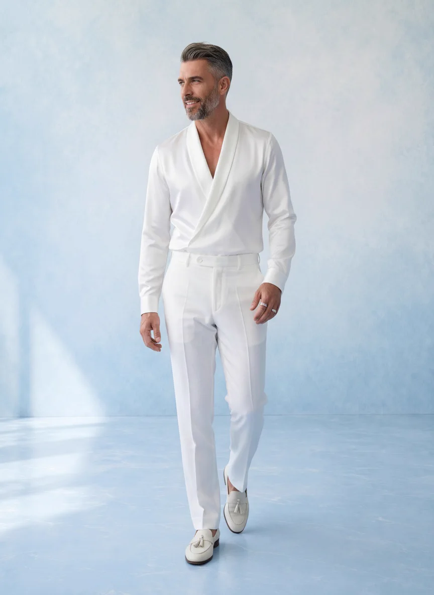
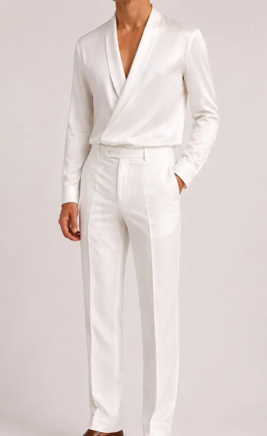
An all white outfit that would have vanished on a white sweep. The seller supplied a blue backdrop reference instead, and every edge of the garment survived.
Ask a seller why a product page is not converting and the answer is usually about the photograph. Wrong model, wrong light, wrong pose, needs a reshoot.
Look at the underperforming image at the size a shopper first meets it, a thumbnail in a grid or a tile in Google Shopping, and the problem is usually simpler than that. The garment has sunk into the background. Or it is fighting the background. Or the model is wearing three things and nobody can tell which one is for sale. Or the customer zoomed in to check the stitching and the stitching turned to mush.
None of those are photography problems in the way people mean it. They are decisions about ground, contrast, crop and resolution, and they get made before the image exists. This guide walks through the four of them using twenty-one real product sets, five frames each, plus a menswear label’s twenty colourways for the part about scale. Every claim has a picture next to it.
If you want the how-many-photos question, that is covered in How Many Product Photos Per SKU. This is the which-photos question, and the answer changes with the garment.
One
Pale garments lose their edges
White on white is the oldest problem in product photography and the one online sellers hit most, because the default catalog background is white or pale grey and a huge share of what sells is white, cream, ivory or ecru. Put one on the other and the outline of the garment goes soft. At full size you can still read it. At thumbnail size, which is where a shopper decides whether to click, the shirt becomes a shape with a head on top.
The fix is not a better camera. It is a ground that is not the same tone as the garment. The seller behind the whites outfit above had model photos of the outfit against a white wall and knew exactly what would happen on a white product page. So they supplied a background reference instead, a soft blue painted wall, and generated the set against that. Here is the sequence.
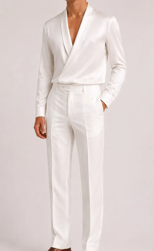
The starting photo. White outfit, white wall, edges already softening.

The background reference the seller supplied. Nothing else about the brief changed.
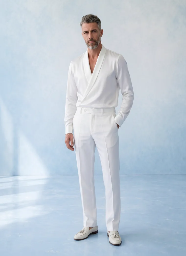
Same outfit, coloured ground. The lapel, the sleeve line and the trouser crease all read at any size.
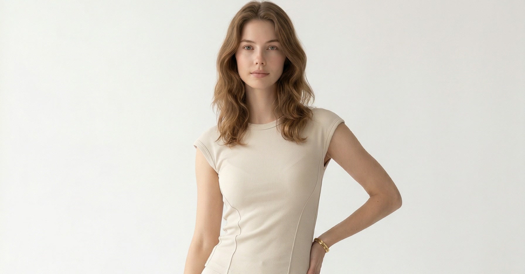
Now the version that did not get that decision. A white halter cami, generated on the standard pale grey ground with no reference supplied. It is a perfectly clean image, and at product page size it is fine. Shrink it to a grid tile and the top merges with the wall behind it, so what the shopper sees is black jeans and a face.
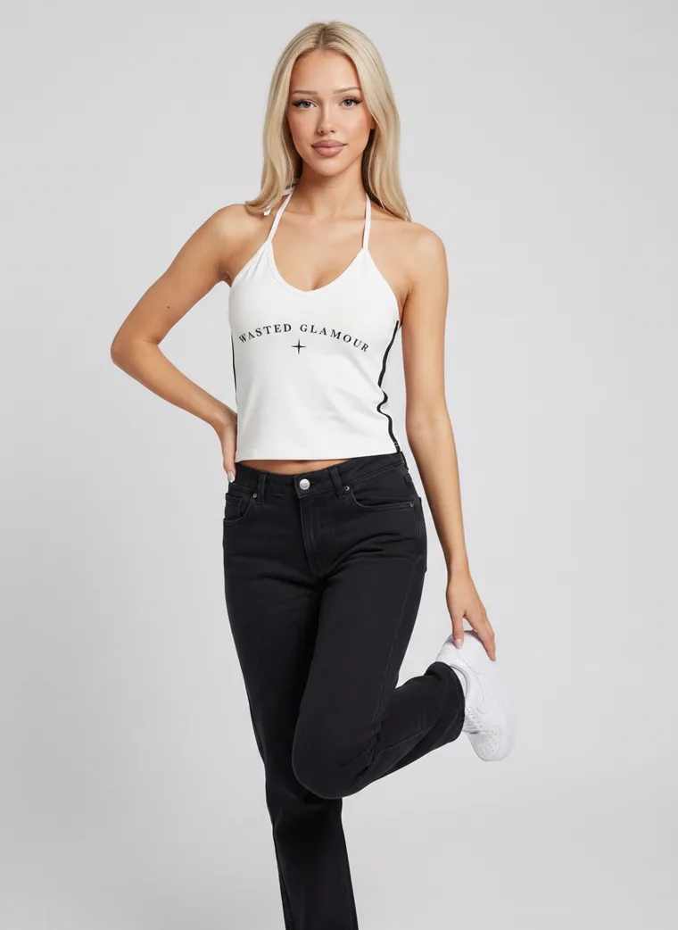
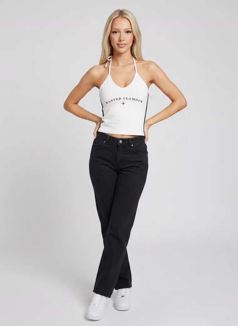
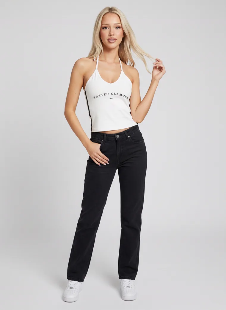
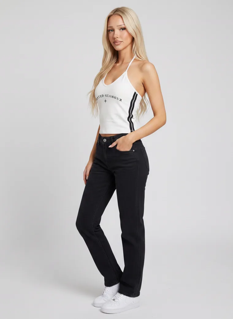
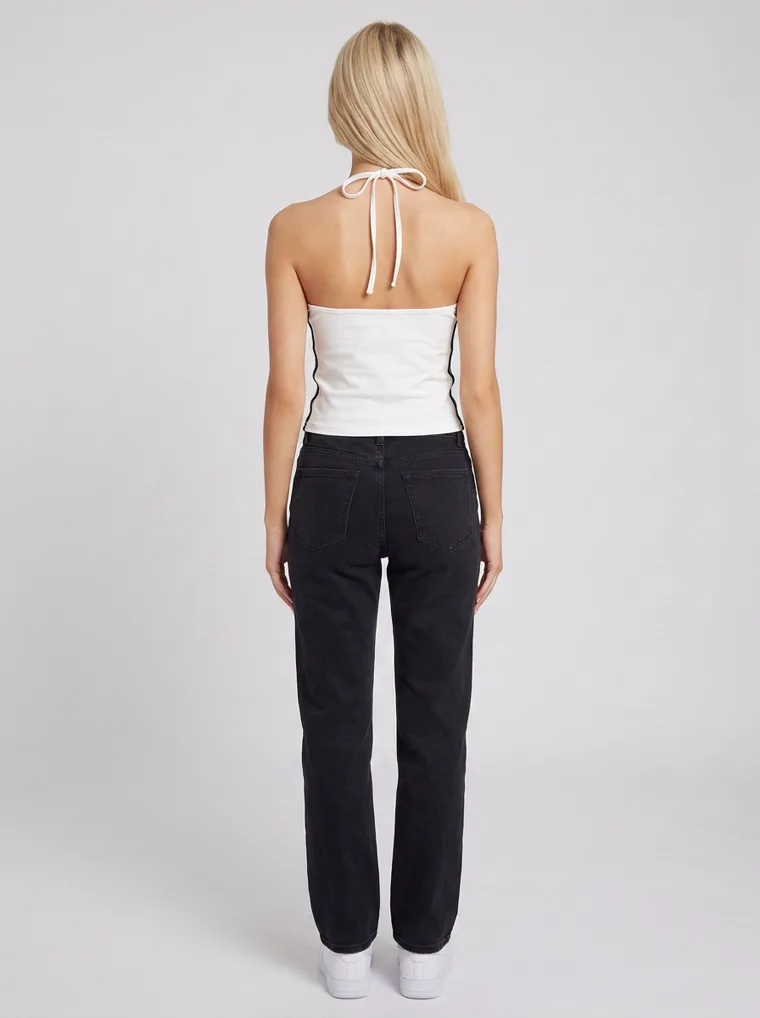
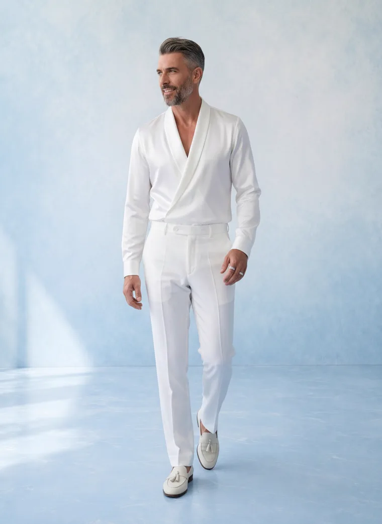
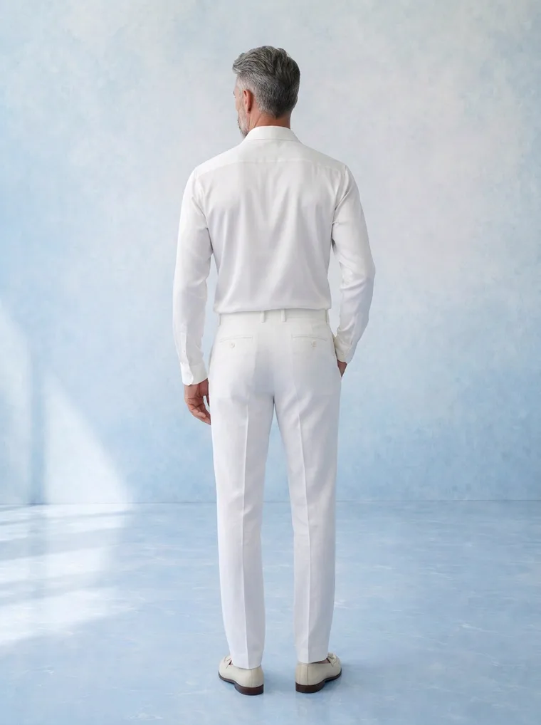
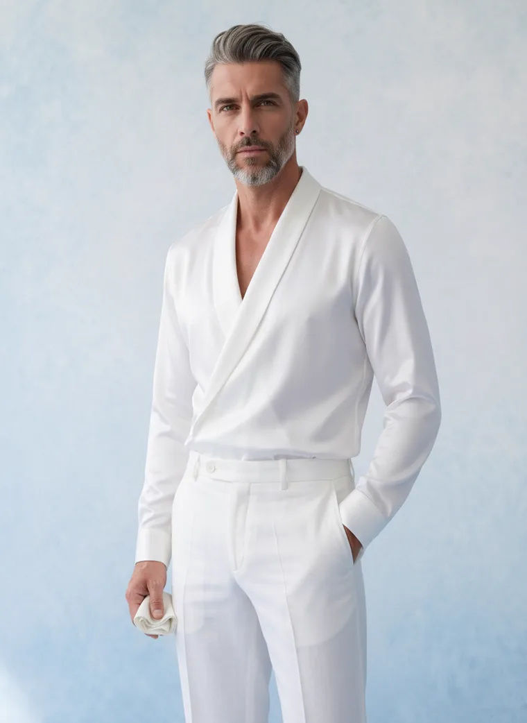
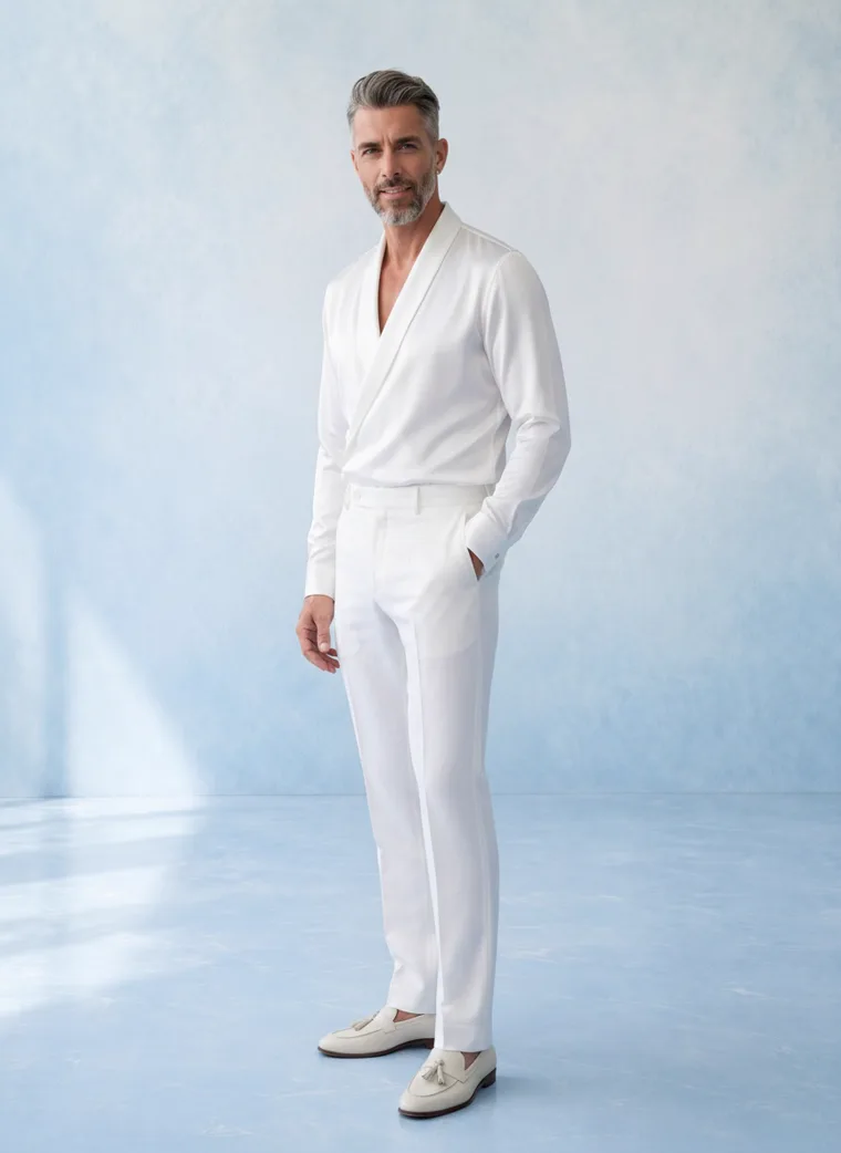
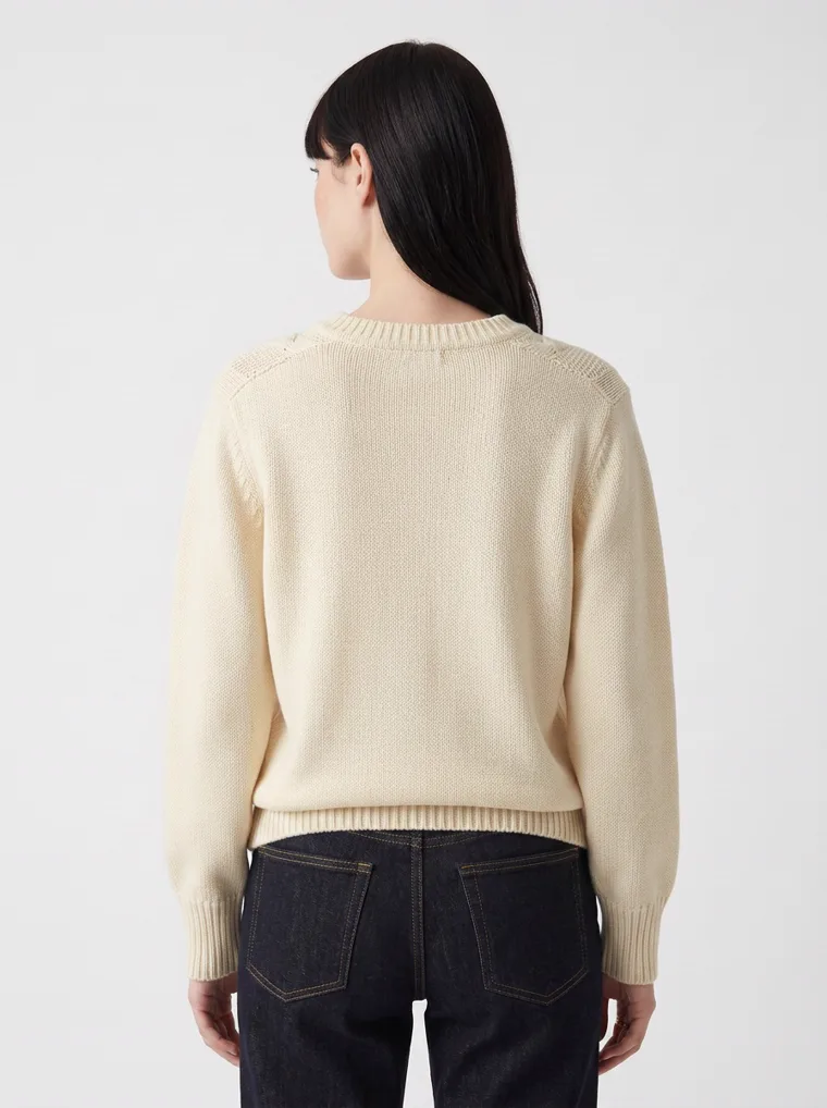
Both sets are technically clean. Only one of them survives being small. The rail under each lead shows the four supporting frames, the same five-frame structure a product page uses.
A coloured ground is the cleanest fix, but it is not the only one. Three other pale garments in this set hold on a pale ground, and each one holds for a different reason worth knowing.
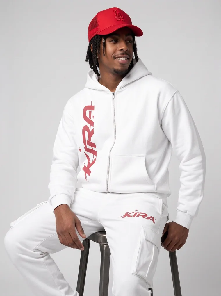
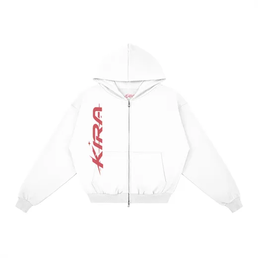
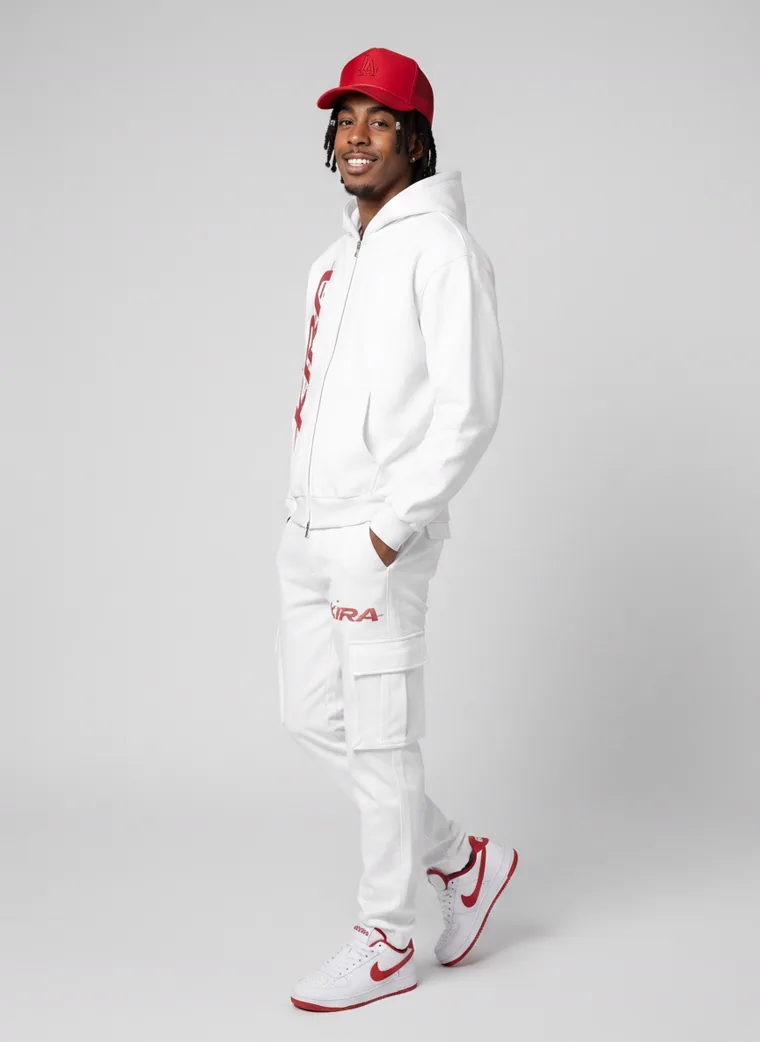
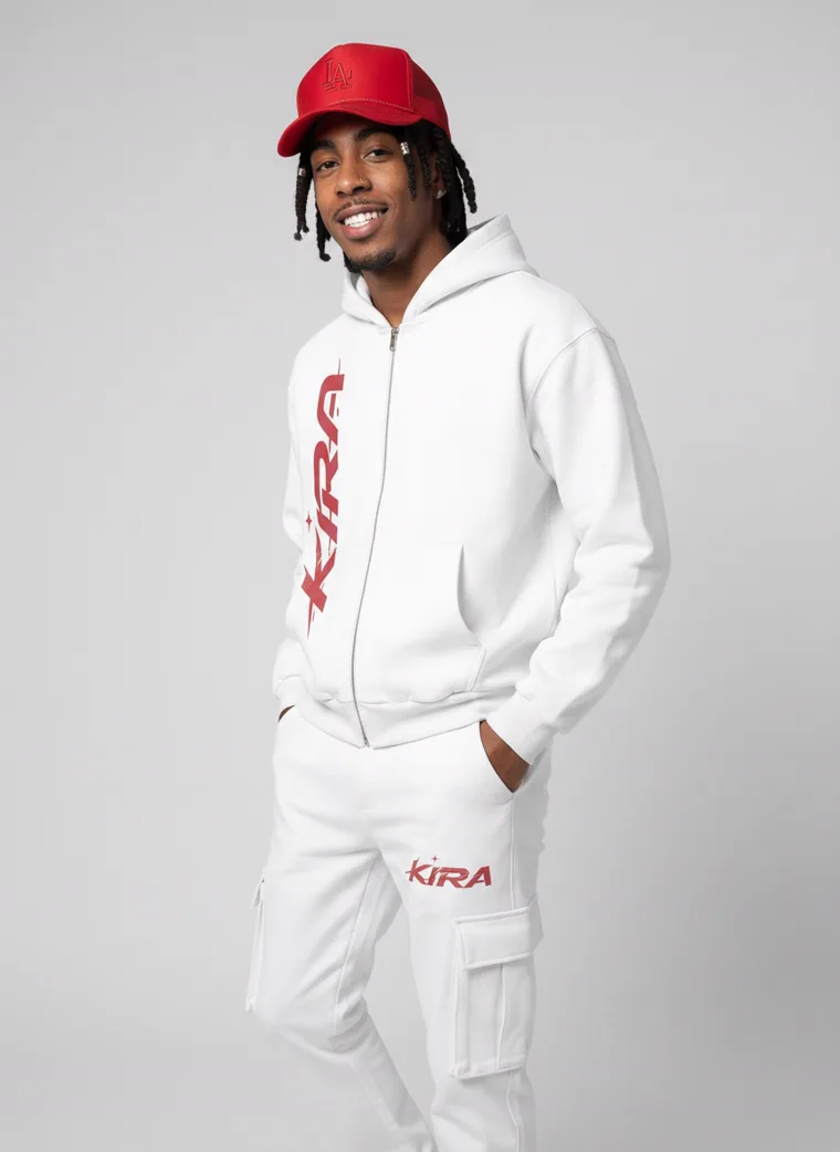
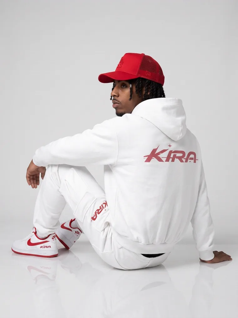
Accent. The red logo, cap and sneaker trim give the eye an anchor, and the directional shadow separates the hoodie from the wall.
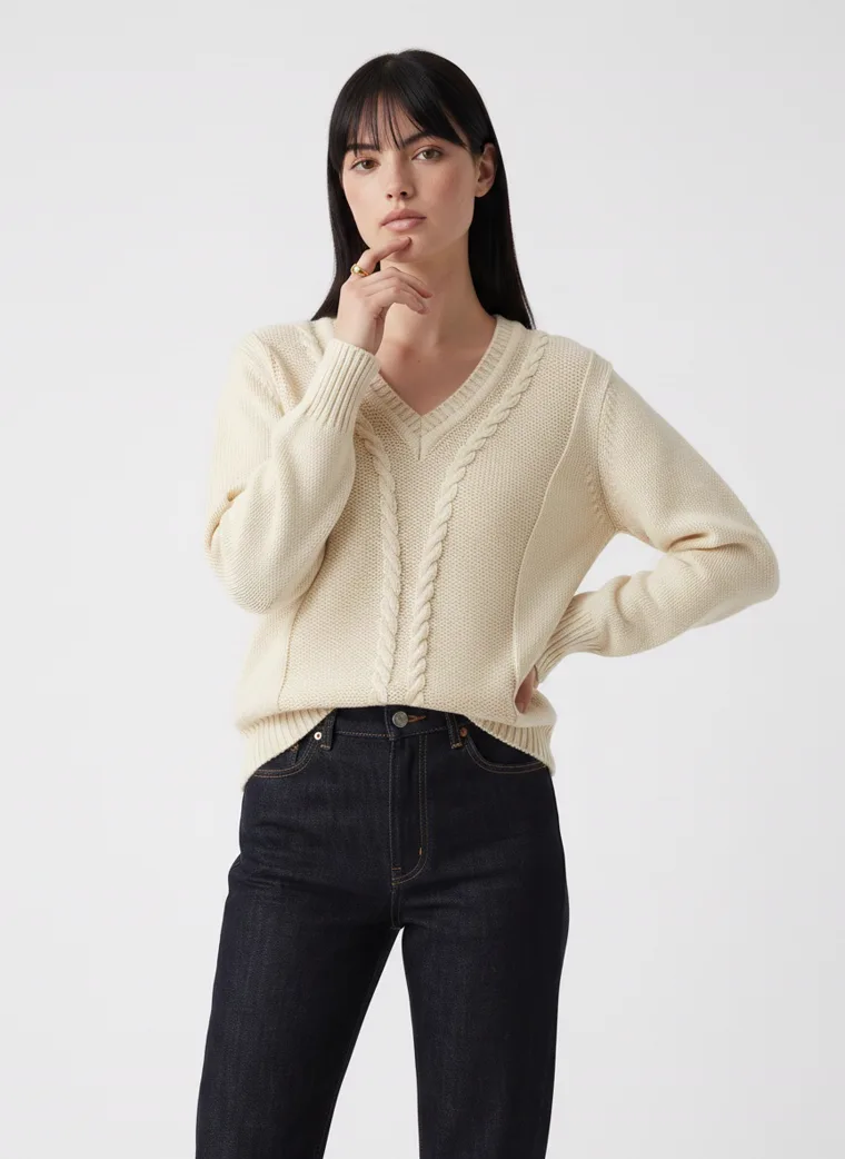
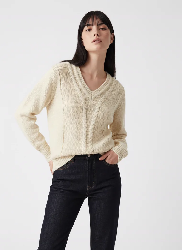
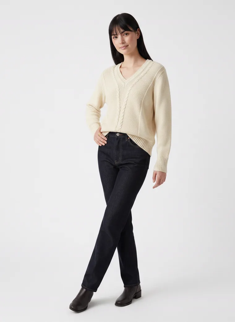
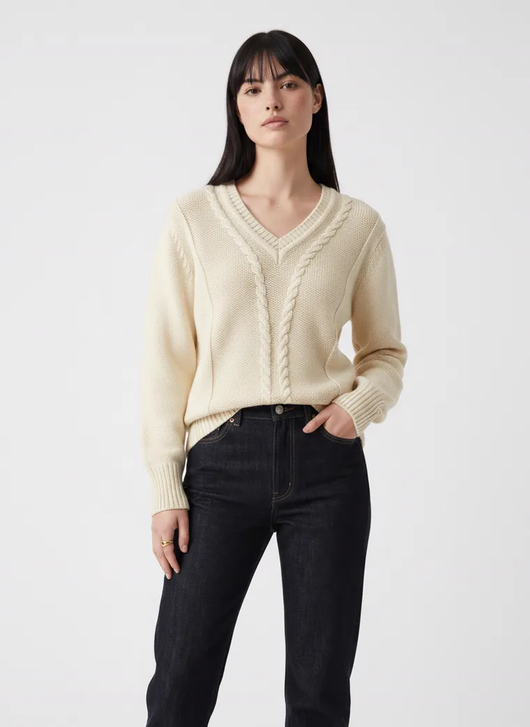
Texture. Cable knit throws its own tiny shadows, so the jumper draws its own outline even against pale grey.
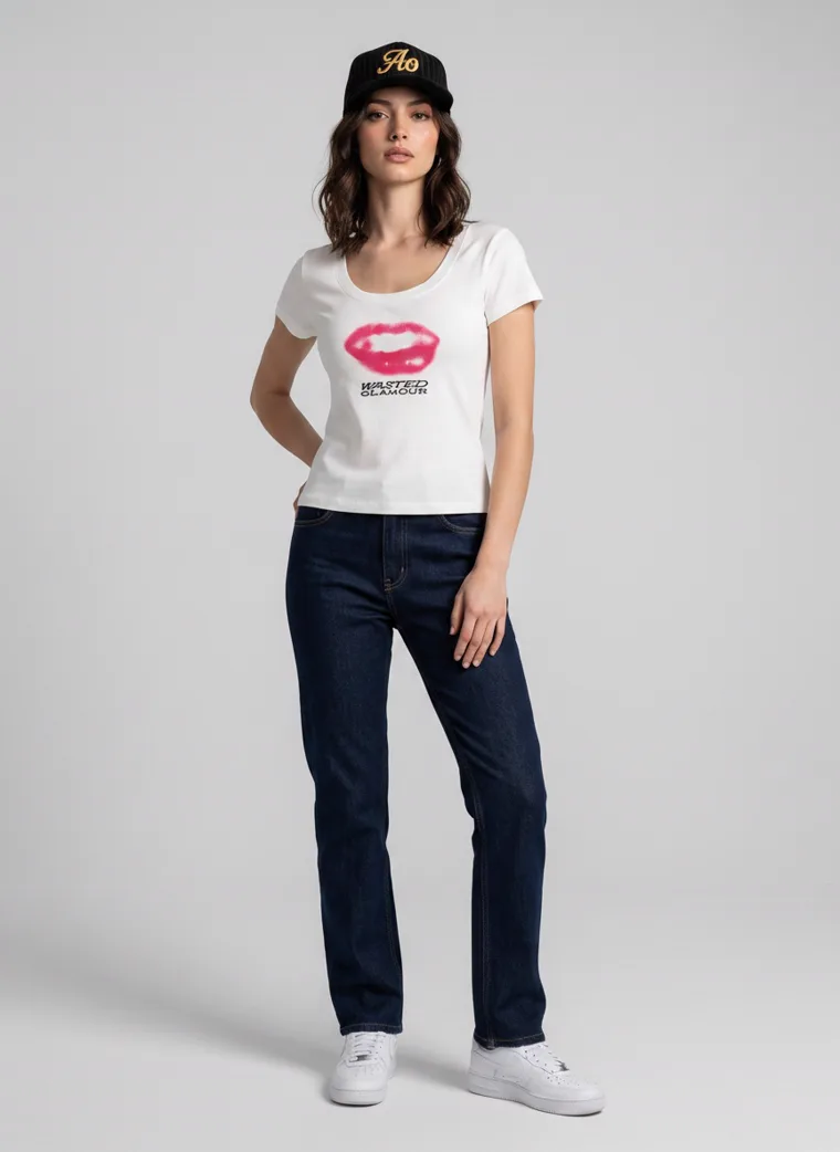
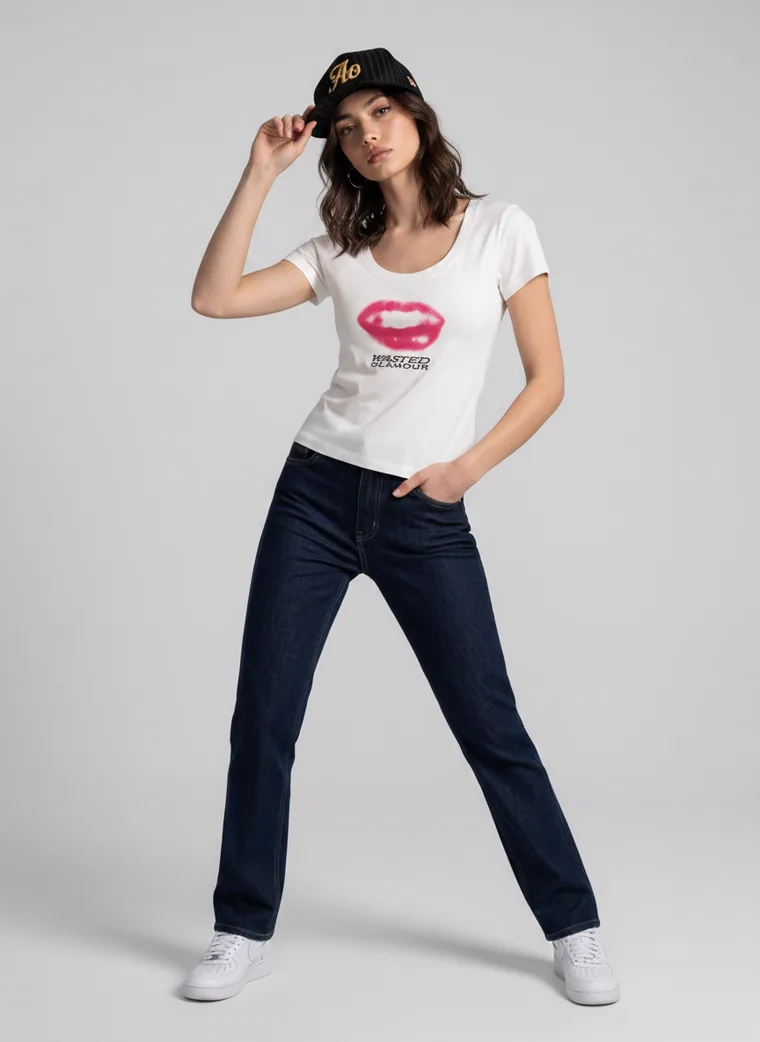
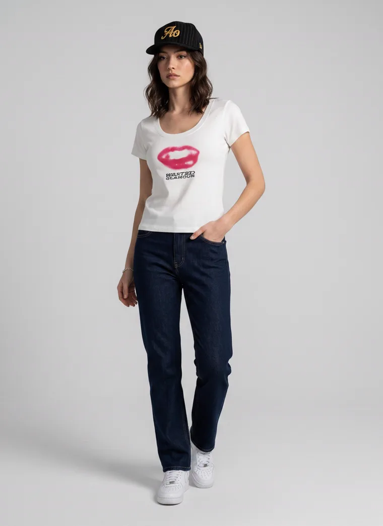
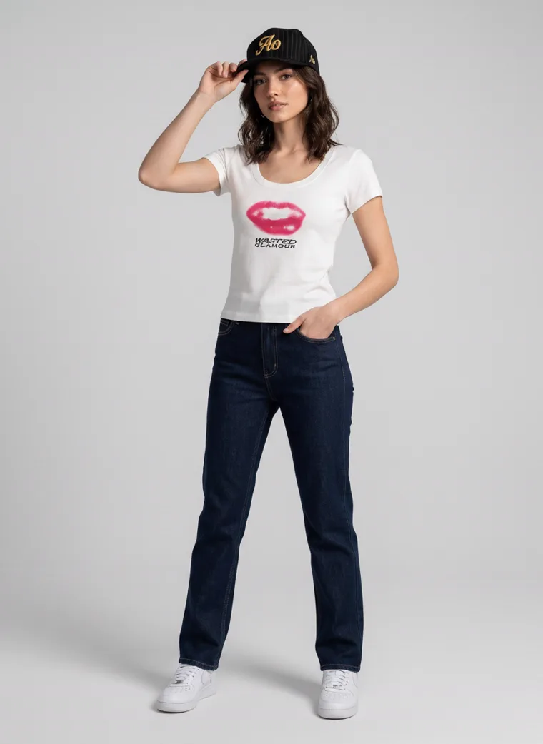
Graphic. A print on the chest is a focal point the wall cannot swallow, and the dark jeans do the rest.
A pale garment needs a coloured ground, a strong accent, or edge light. If it has none of the three, it will not survive being small.
The practical version, if you generate rather than shoot: the background reference is the control. A blue, sand, slate or warm grey reference costs nothing and removes the problem before the first frame exists. The mechanics of choosing one are in Control Your Catalog Narrative.
Two
A busy garment needs a quiet ground
The opposite failure. A garment with a lot going on, embroidery, a large print, a strong pattern, placed in front of a background that also has a lot going on. Each one is fine alone. Together, the eye has nowhere to land, and at thumbnail size the product and the setting collapse into one busy rectangle.
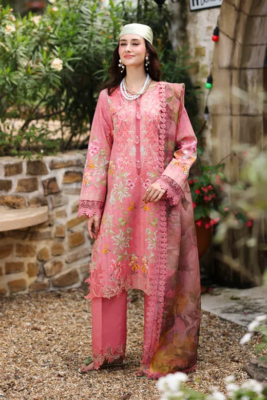
This one is less absolute than the pale-garment rule, because a location frame can work beautifully when the conditions are right. Two sets in this guide were shot in gardens, and they show the difference between the conditions being right and not.
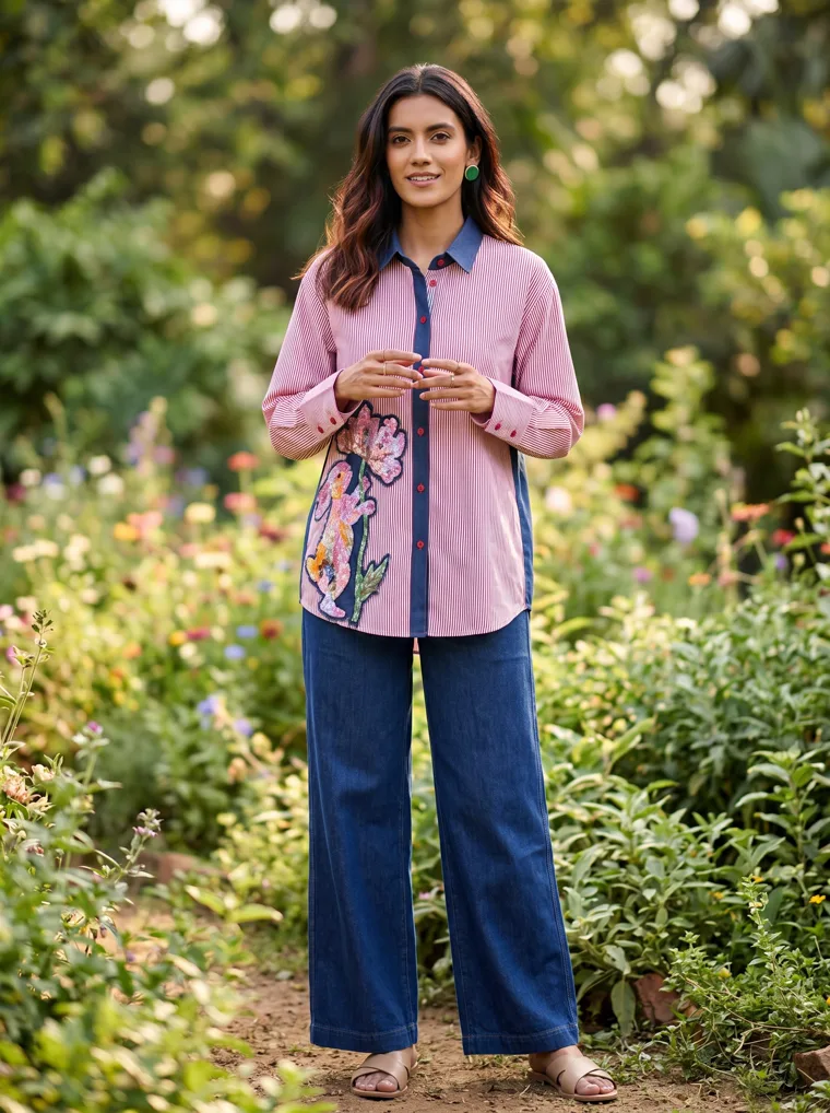
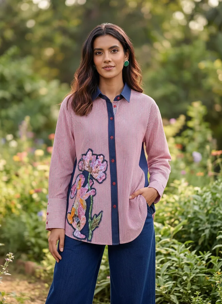
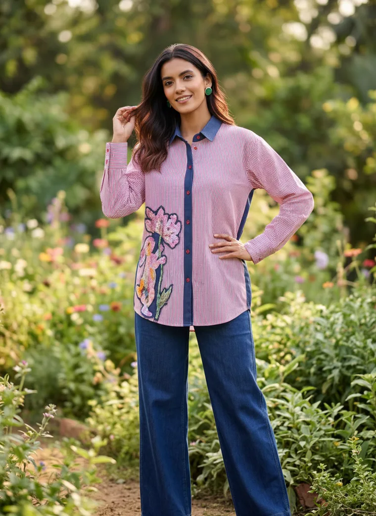
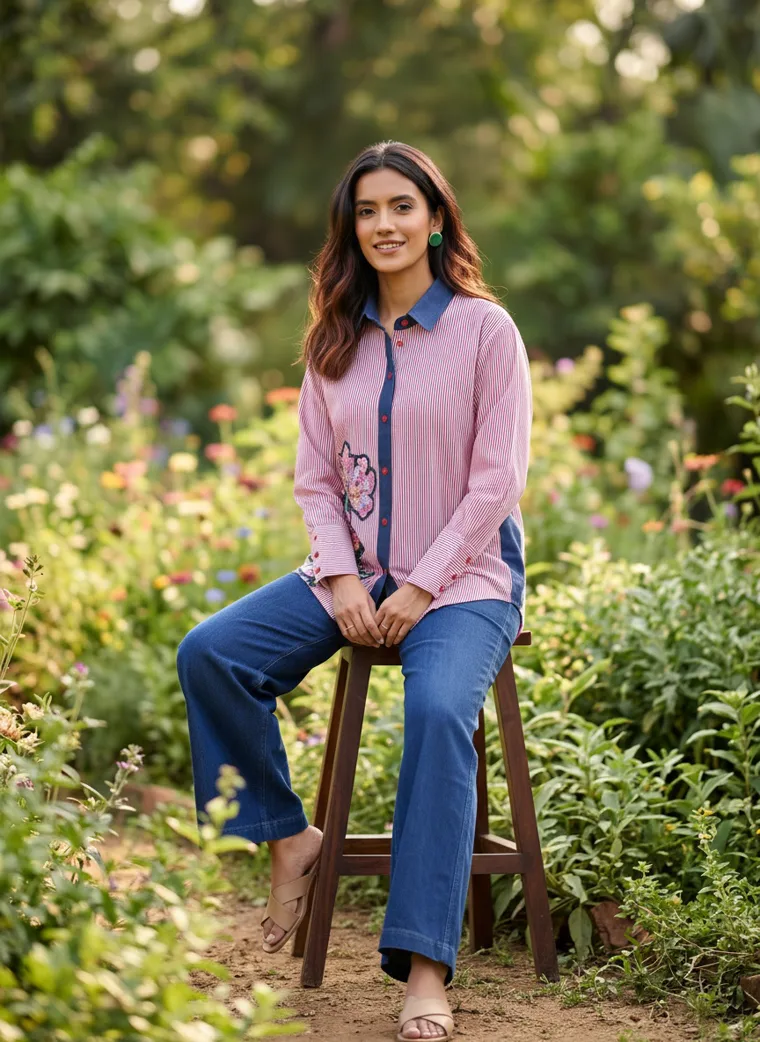
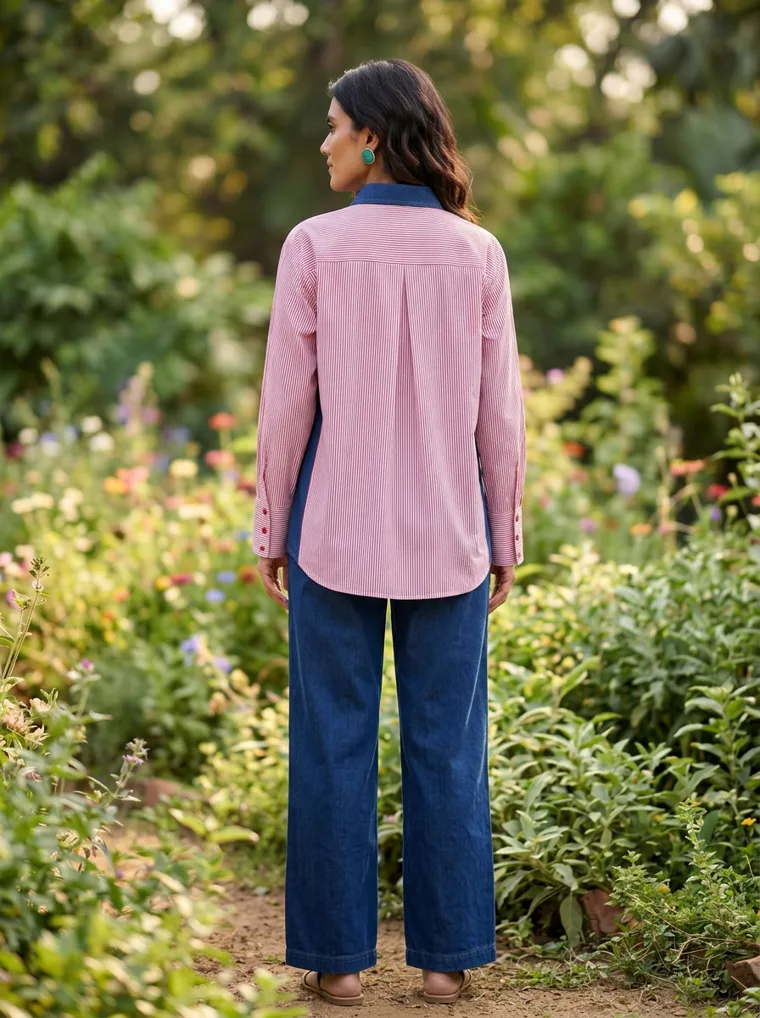
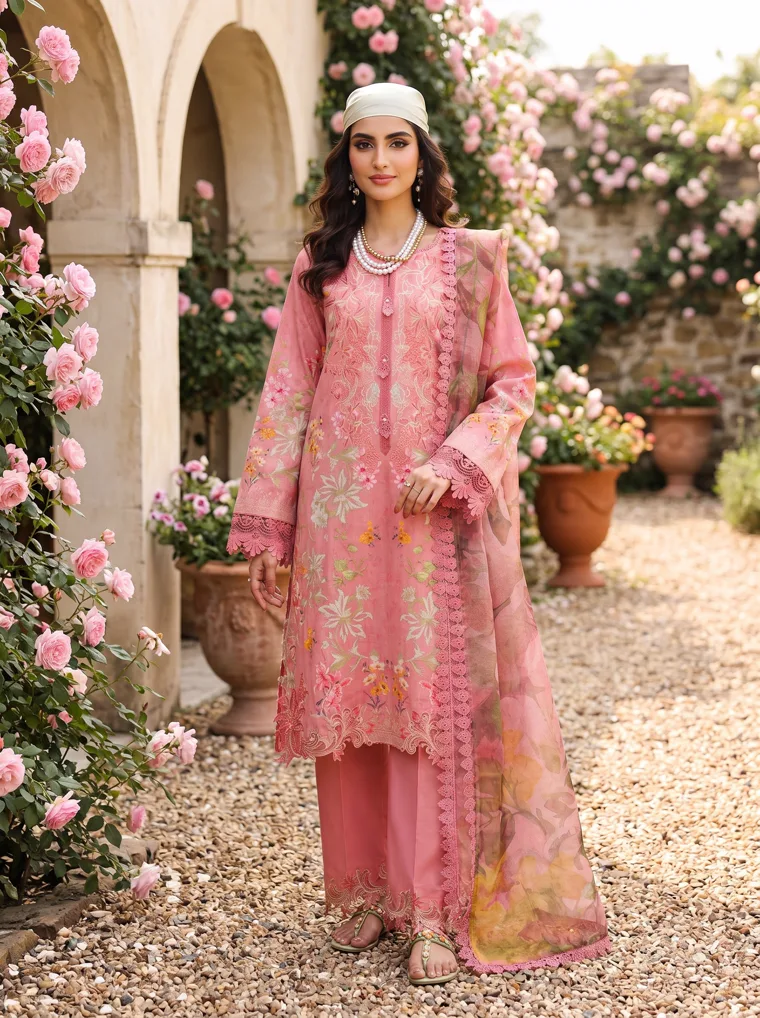
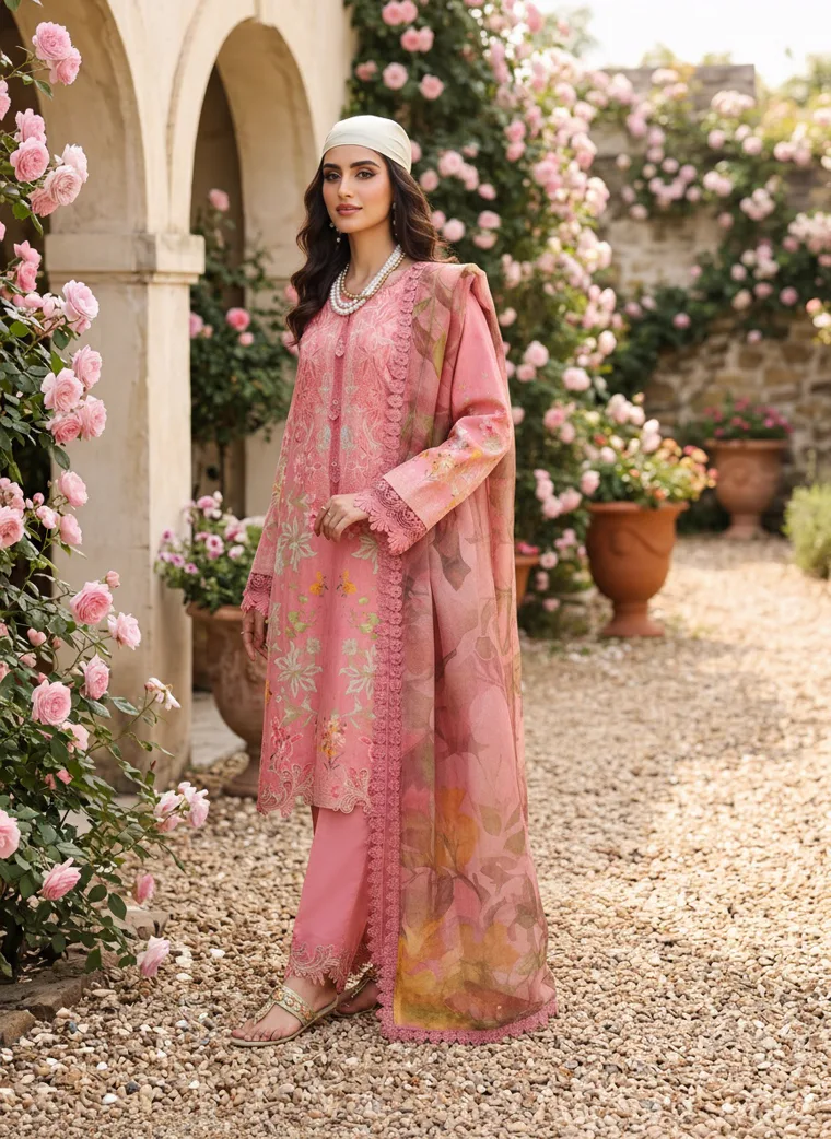
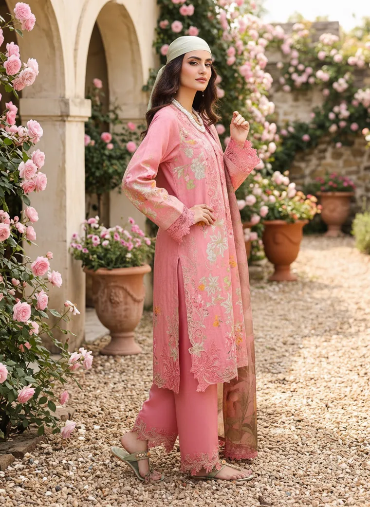
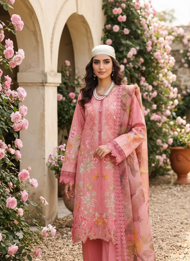
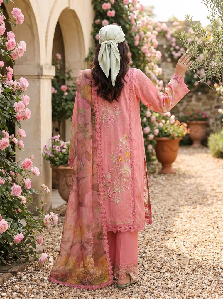
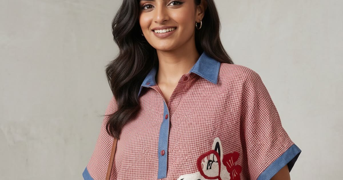
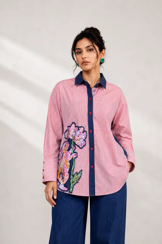
Left, the pink shirt on green foliage. The ground is busy, but it is a different colour from the garment, so the shirt lifts straight off it and the embroidery reads as one bold motif. Right, the coral kurta in a rose garden. Everything agrees, the garment, the roses, the sand arches, and that harmony is the problem: the print on the kurta and the flowers behind it become one surface.
The tell is the lead frame. On the shirt, you read the garment first and the garden second. On the kurta, you read a pink garden and then go looking for where the garment ends. That is the whole test, and you can run it on any image by shrinking it to the size of a phone thumbnail and asking what you noticed first.
The kurta is the more editorial image, and that is the trap. A palette that agrees with the location is what a stylist reaches for, and it is exactly what makes the product recede. If the ground has to be busy, the garment needs to contrast with it in colour, and the shirt is what that looks like.
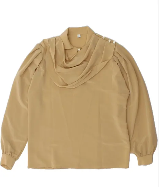
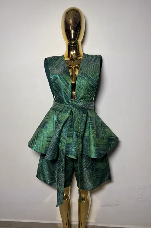
Both garments would behave very differently on a plain ground, and the set includes two busy garments that got exactly that. A camel cowl neck blouse with a heavy drape and bishop sleeves, and an emerald textured peplum dress with a plunge front. Both carry a lot of surface, both are on plain grounds, and both are instantly legible.
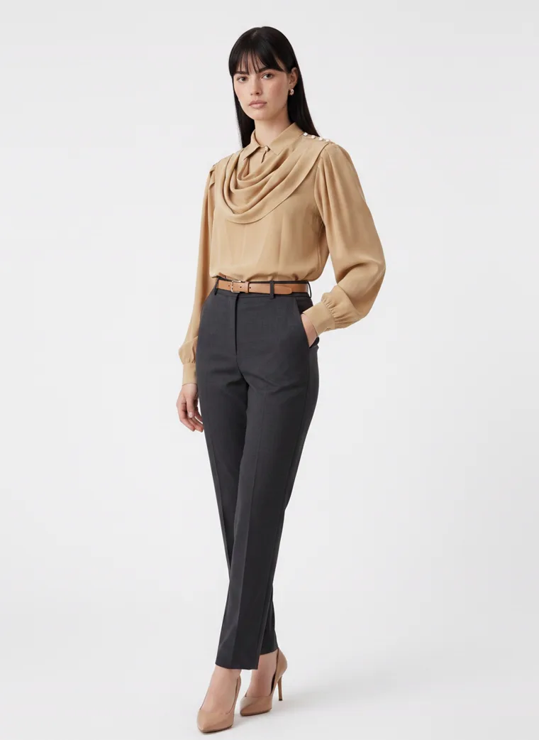
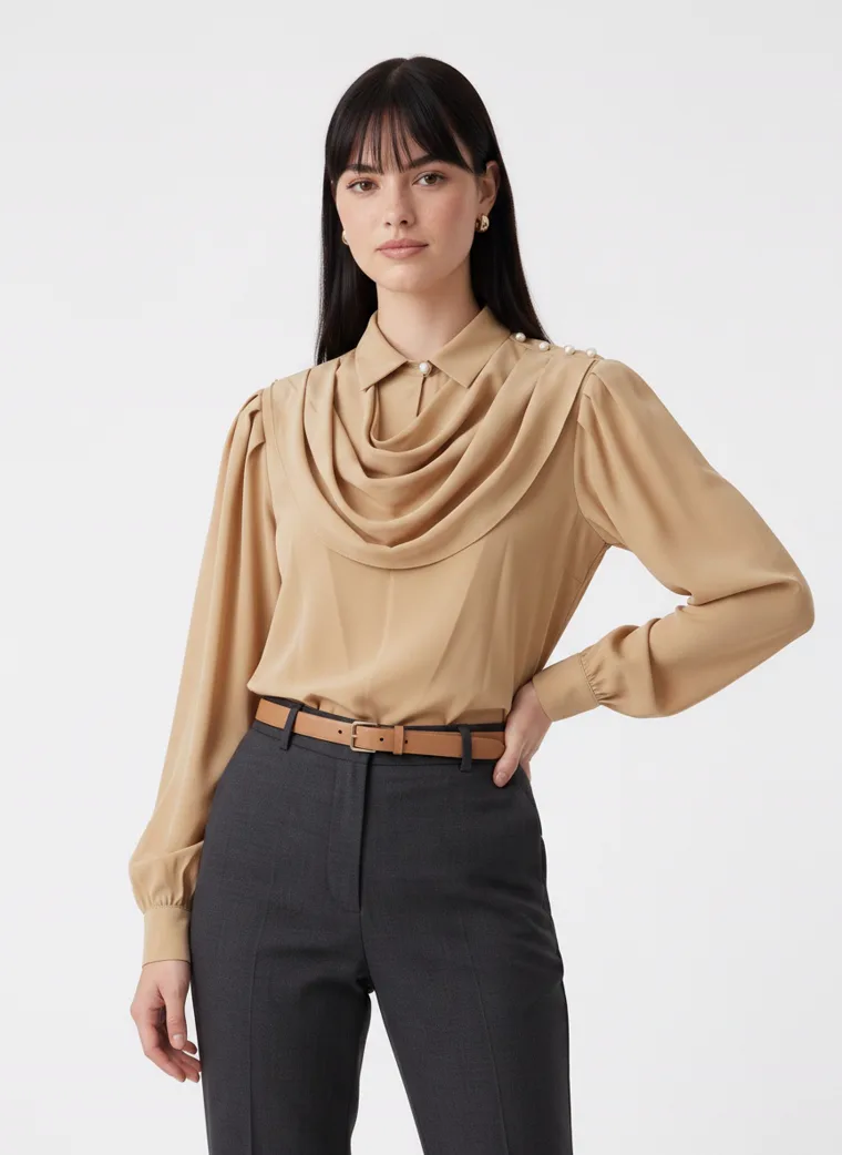
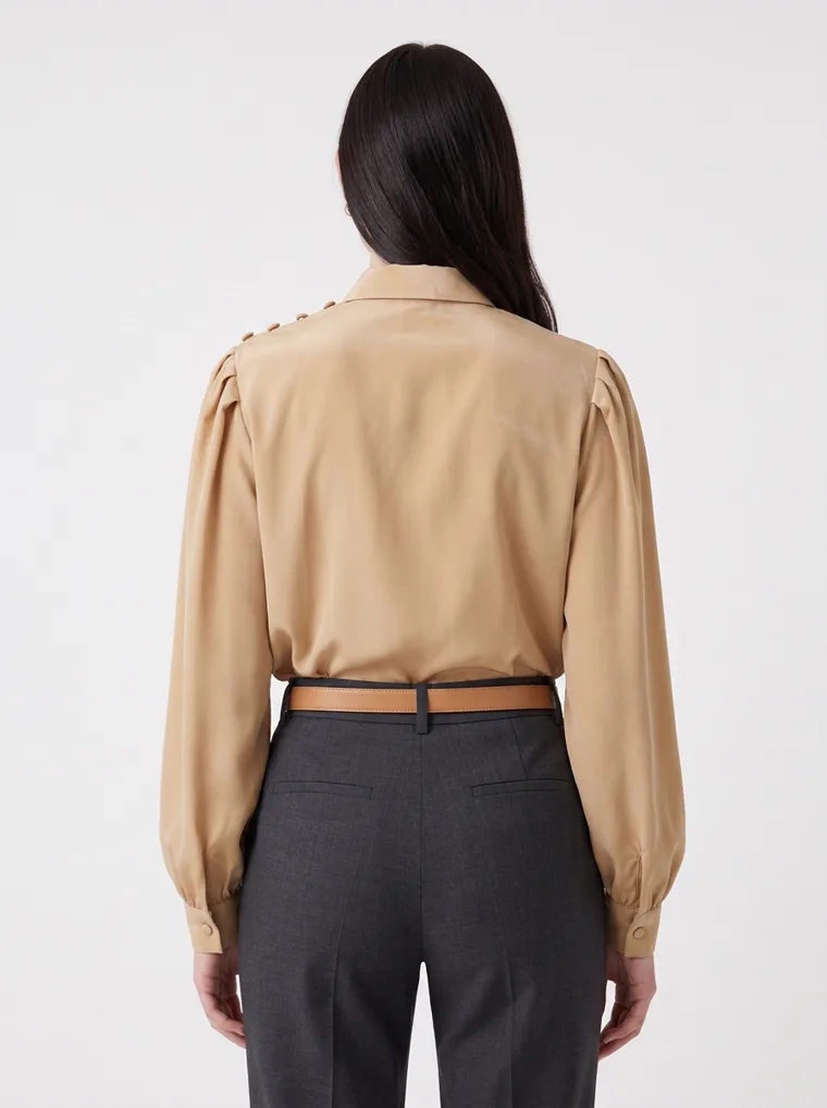
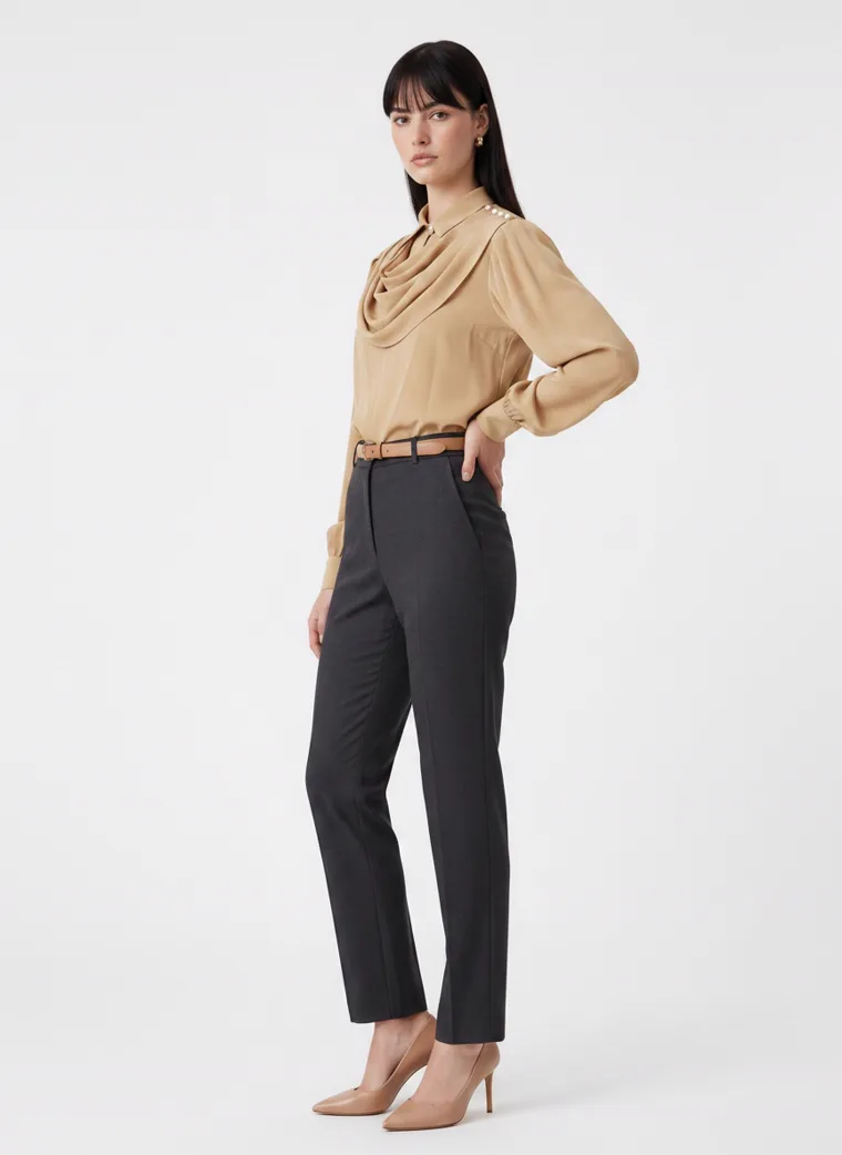
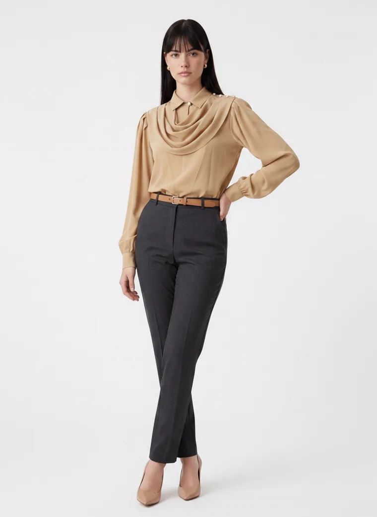
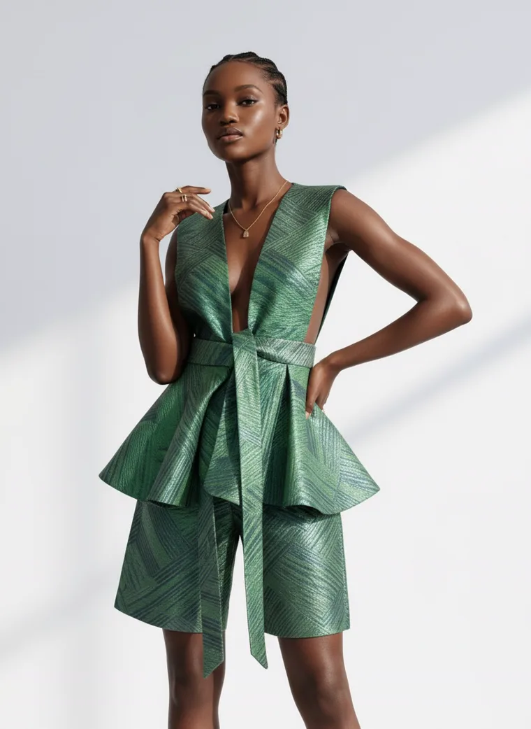
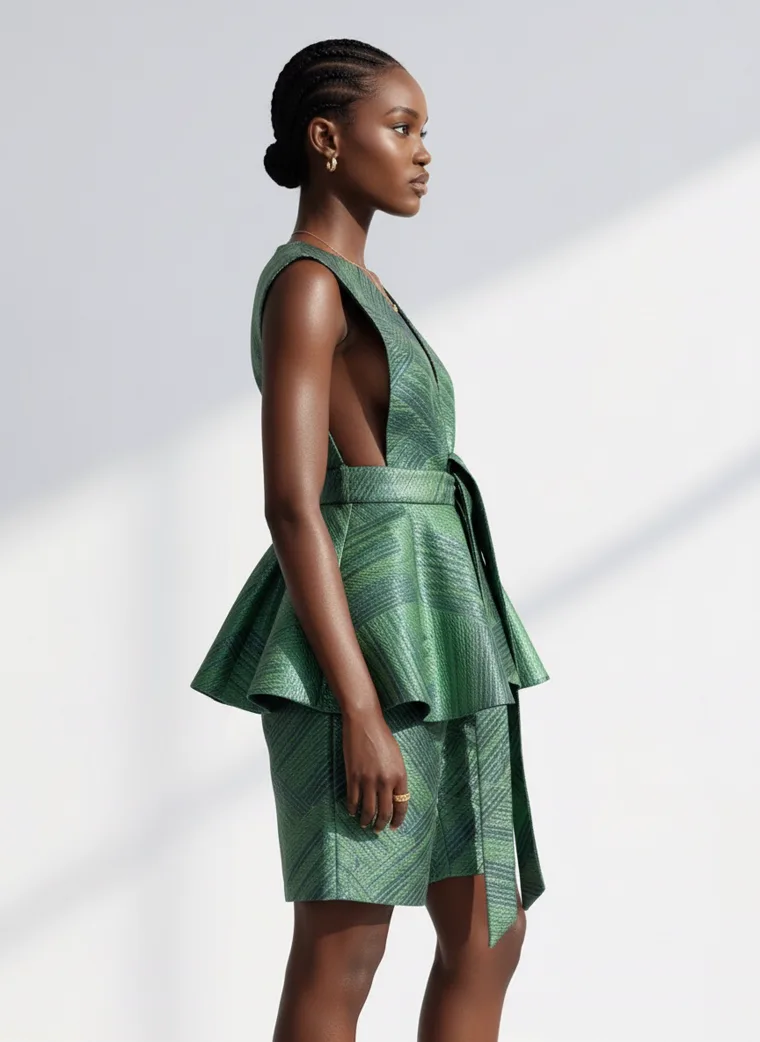
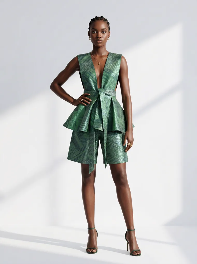
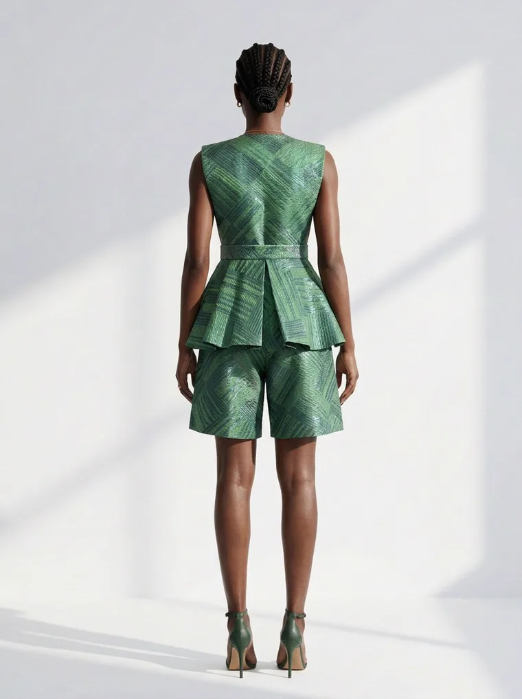
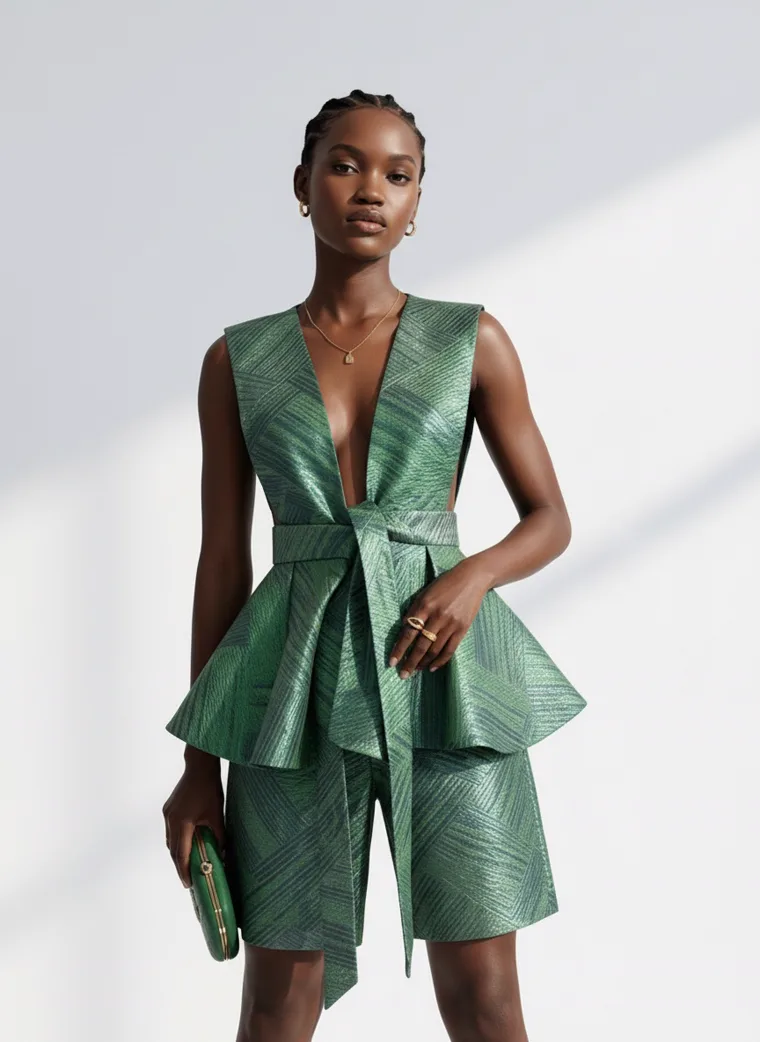
Busy garment, quiet ground. The drape on the blouse and the texture on the peplum are the whole story, and nothing behind them argues.
The garment and the ground cannot both be loud. If the ground has to be busy, the garment must contrast with it in colour. If the palettes agree, the product disappears into the scenery.
If you want the location frame, and for some categories you should, the answer is sequencing rather than sacrifice. Lead with the plain-ground frame so the thumbnail is unmistakable, and put the garden, the street or the harbour in the third or fourth slot where the shopper has already decided what they are looking at. Styling Product Photos with AI covers how to pick that setting well.
Three
Decide which piece is the product
A model wears a whole outfit. You are usually selling one part of it. Shoppers are quick, and if the frame does not tell them which part, they guess, and they guess wrong often enough that it shows up in returns and in bounce.
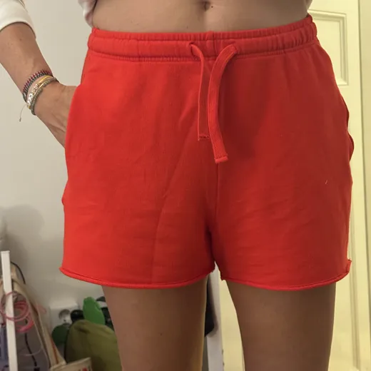
The clearest example in this set is a pair of red drawstring shorts. The seller’s input was a phone photo of the shorts on a person, cropped at the waist, against a bedroom wall. The shorts are the product. The white tee they were styled with is not. So two things had to be true in the output: the tee had to stay plain enough that nobody mistook it for the item, and at least one frame had to crop to the shorts and nothing else.
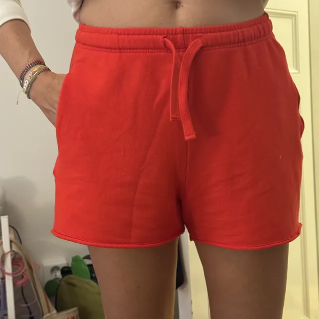
The starting point. Just the shorts, on a person, in a bedroom.
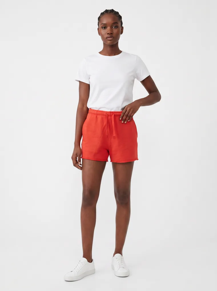
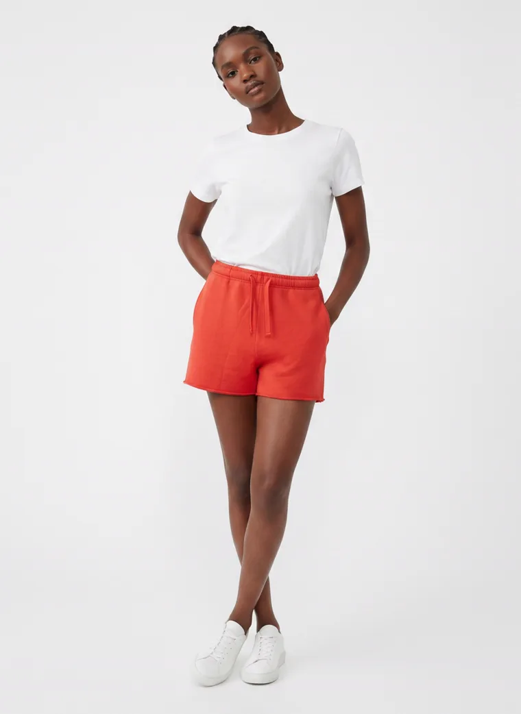
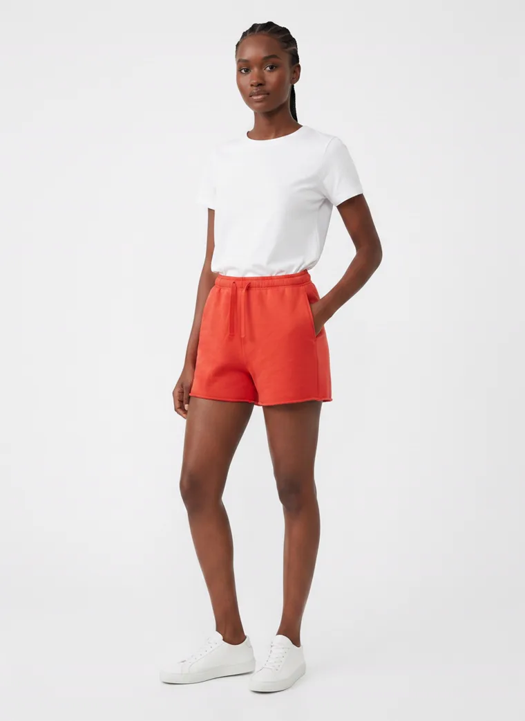
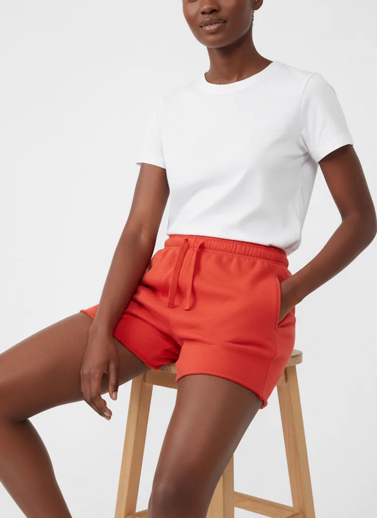
Frames four and five in the rail are the ones that do the selling: the back of the shorts, and the shorts on the stool with the tee out of frame. The full length frames give context. The crops close the sale.
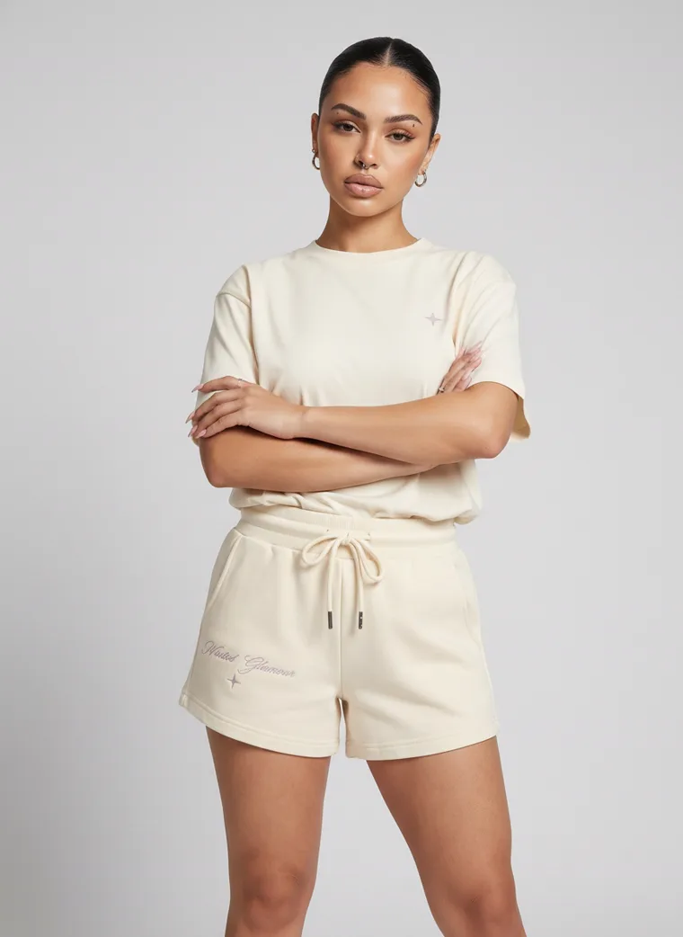
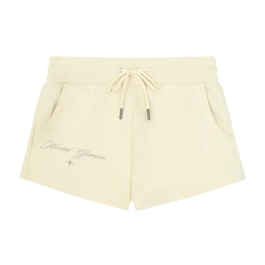
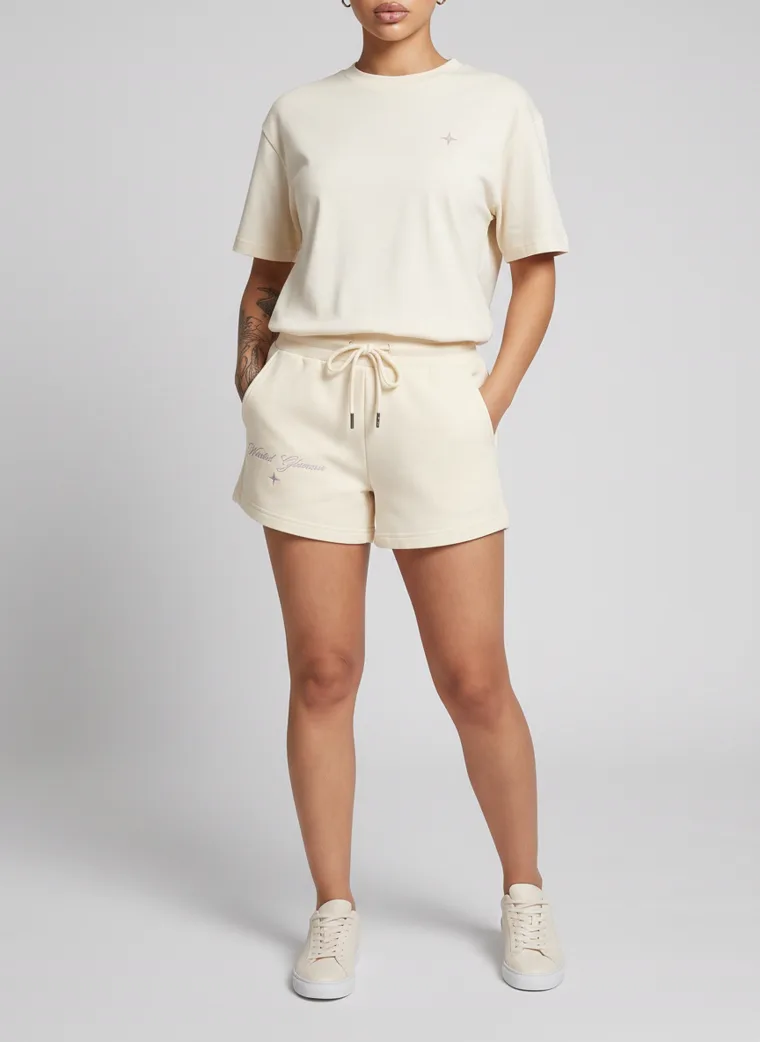
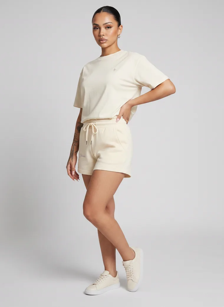
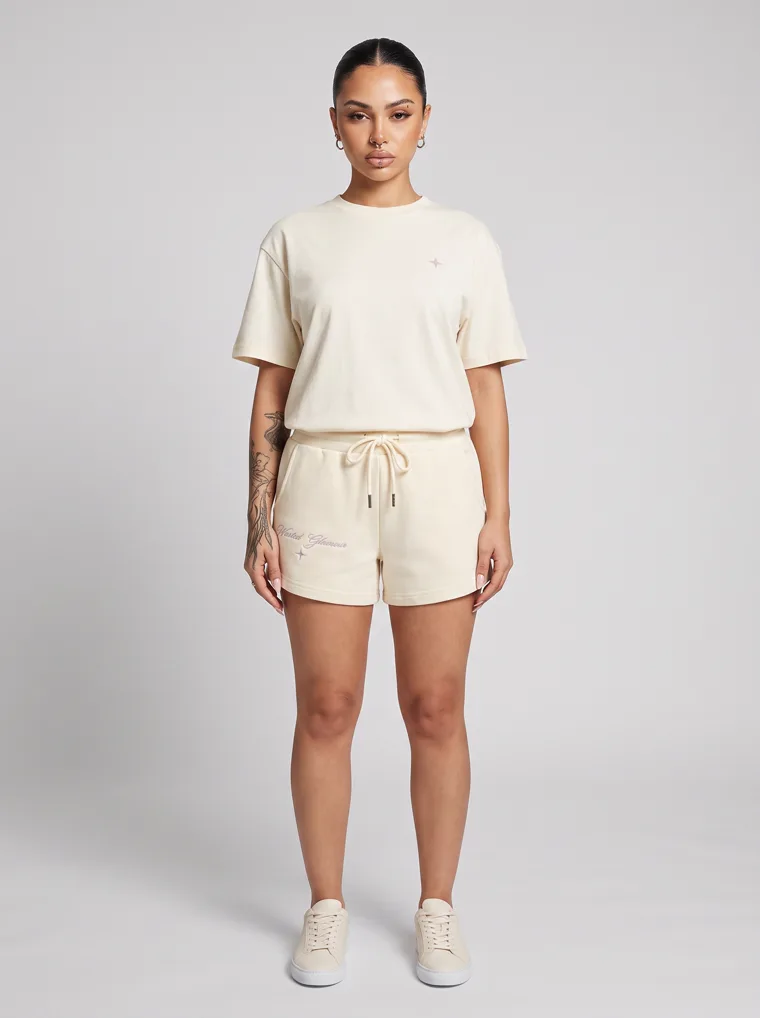
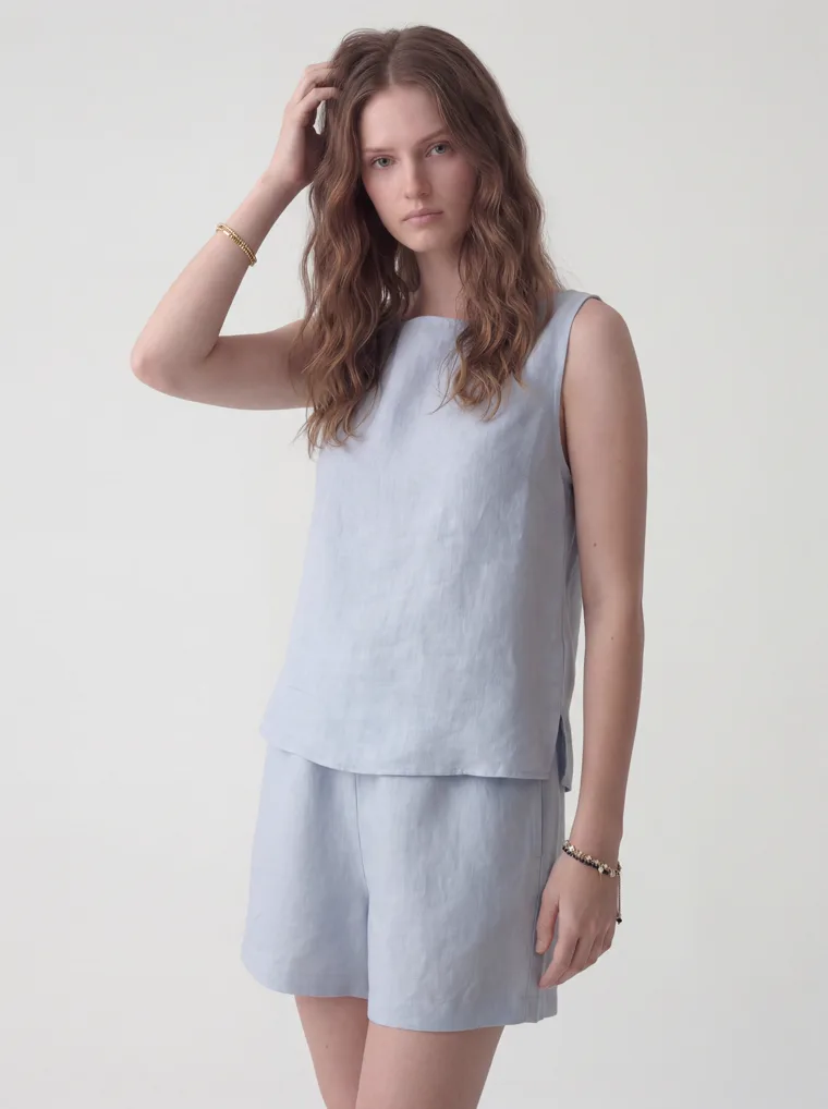
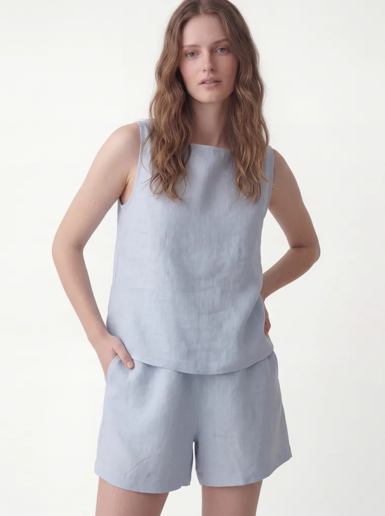
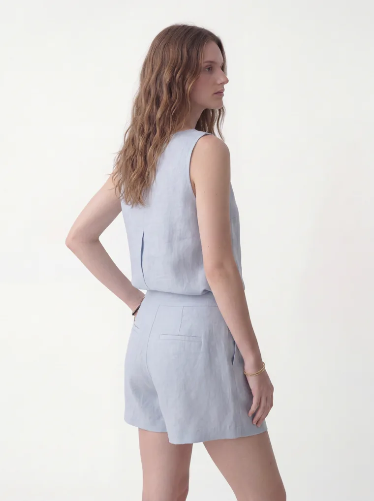
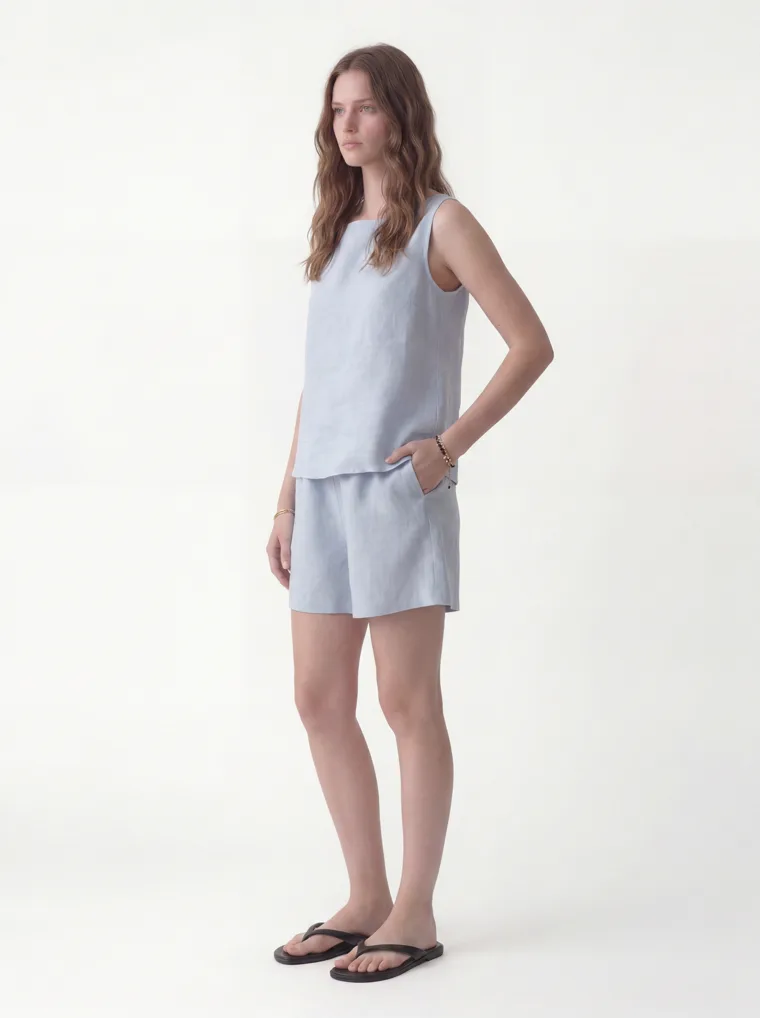
The cream drawstring shorts are the same case. The input was the shorts alone, the boxy tee is styling, and the set carries a crop from the waist down so nobody mistakes the tee for the listing. The pale blue linen top and shorts are sold as a set, and even there the waist-down frame earned its place, because a shopper who wants the shorts wants to see the shorts.
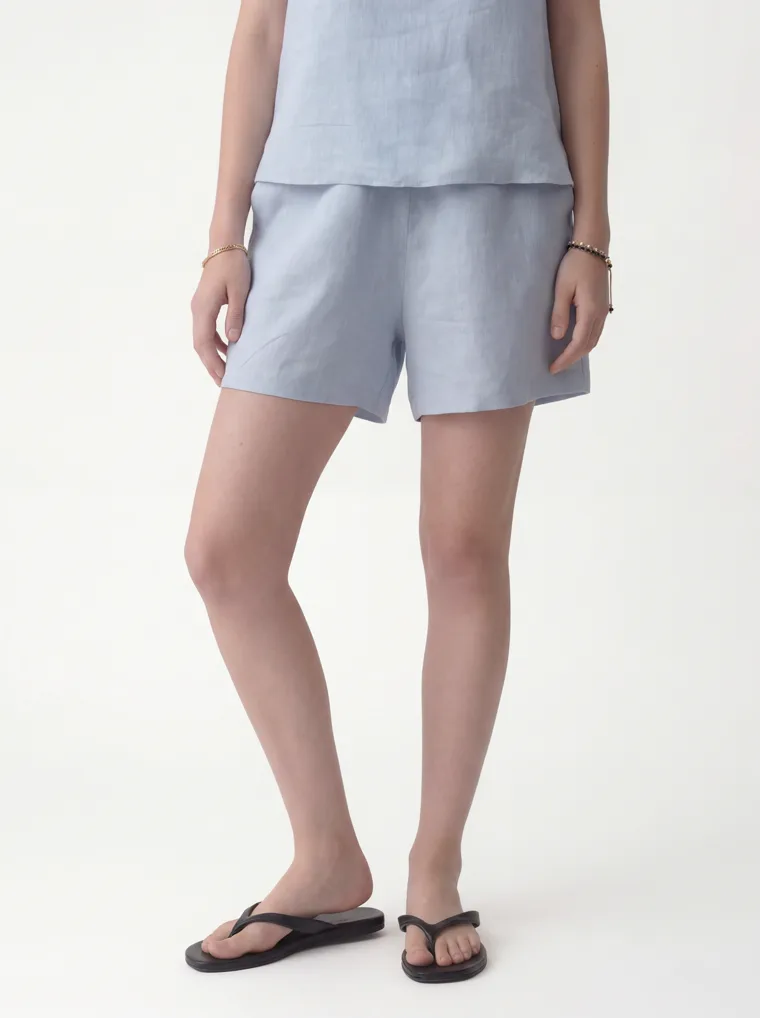
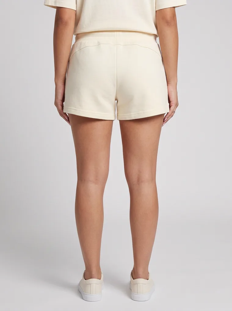
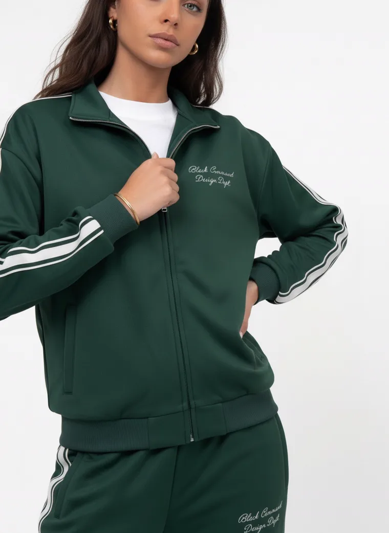
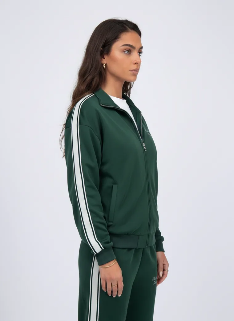
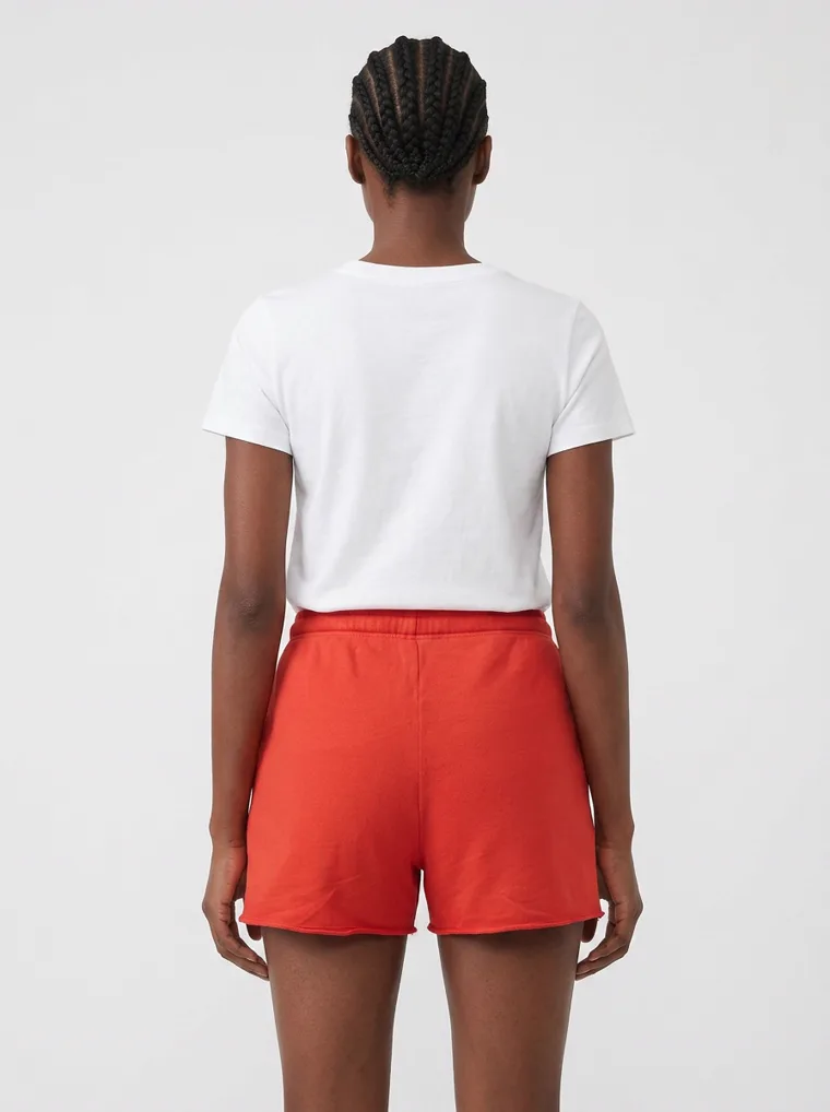
Crops that isolate the SKU. Linen shorts, cream shorts, the track jacket’s chest embroidery, the side stripe, the back of the red shorts. Each one answers a question the full length frame cannot.
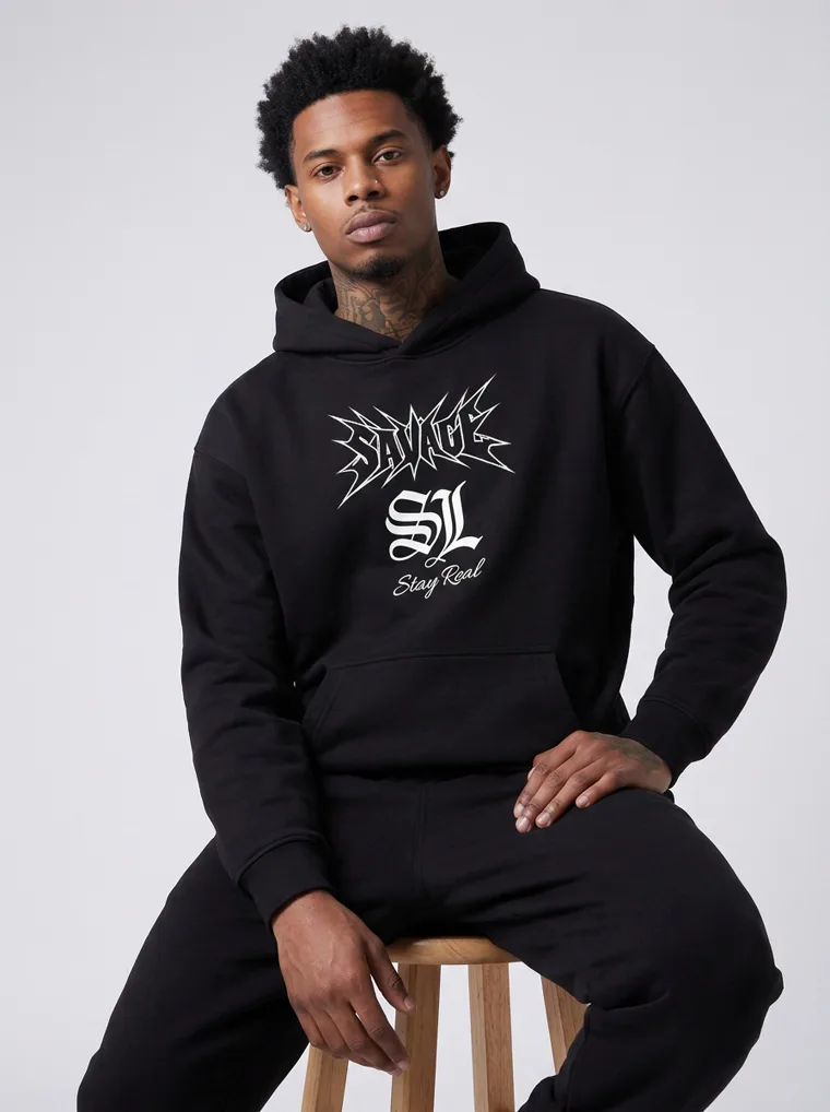
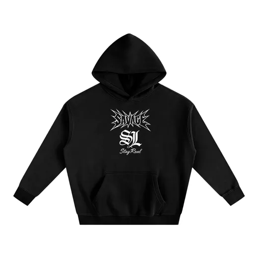
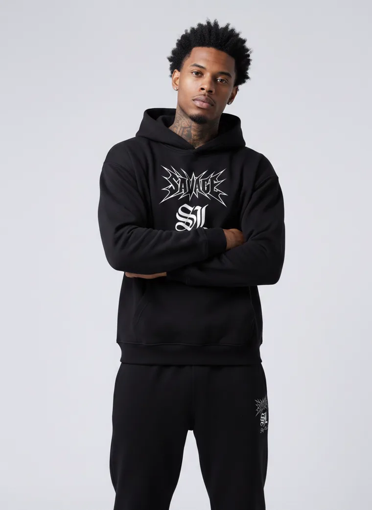
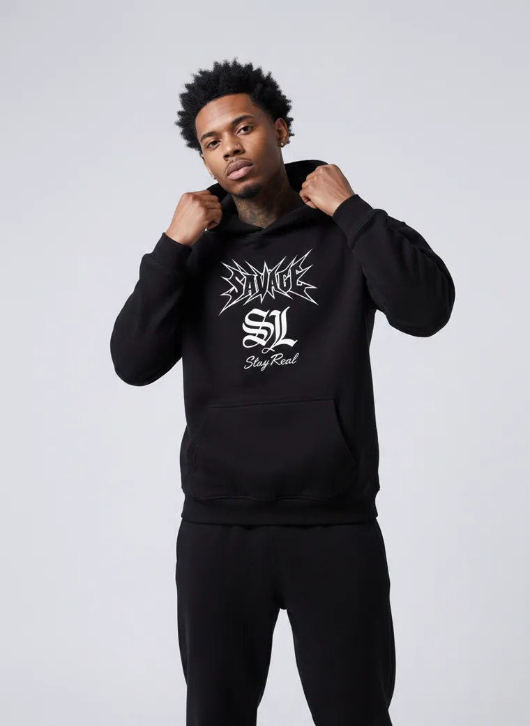
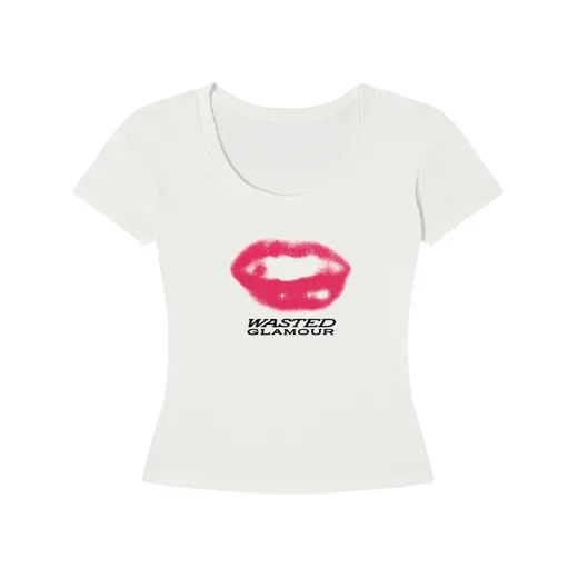
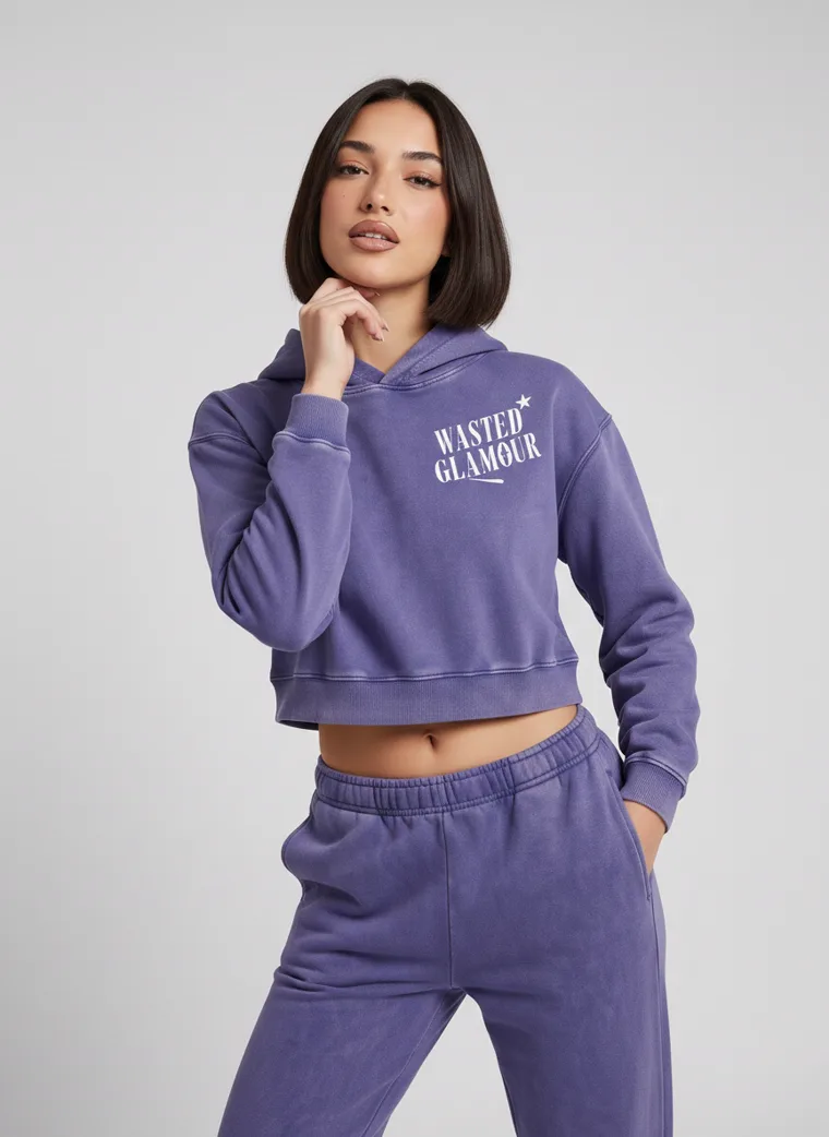
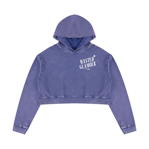
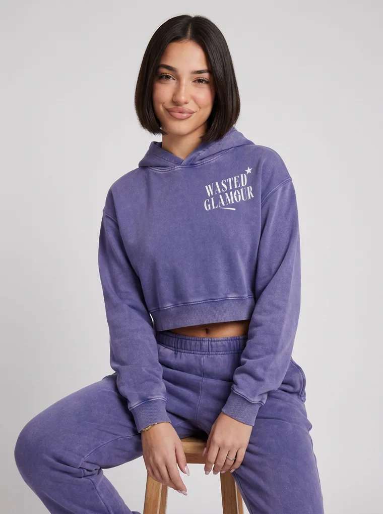
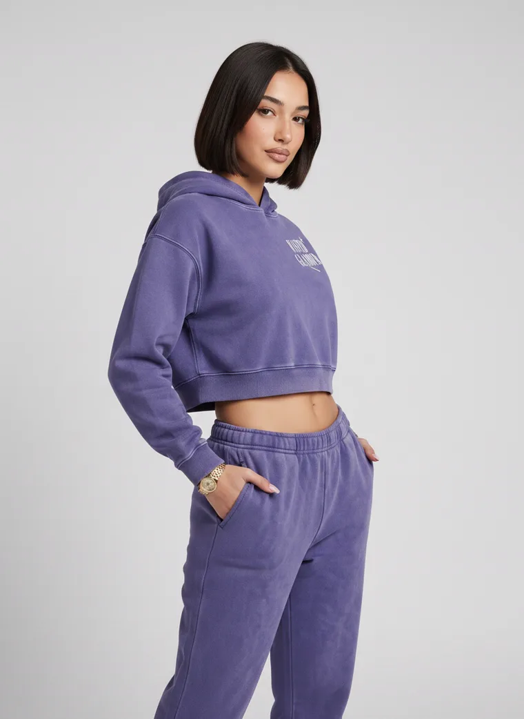
The same decision has a second form, and it catches a lot of streetwear. Sometimes the product is on the front of the garment and sometimes it is not. Three pieces in this set carry their main artwork on the back: a black hoodie with a gothic print, a violet cropped hoodie with a butterfly, and a white tee with a rose and lettering behind a pair of lips on the front. On all three, a front-only stack hides the thing the customer is actually buying.
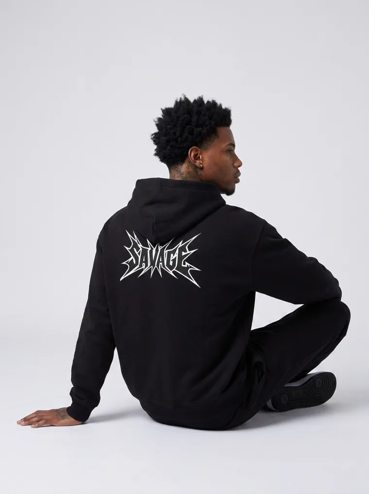
Black hoodie. The back print is the product.
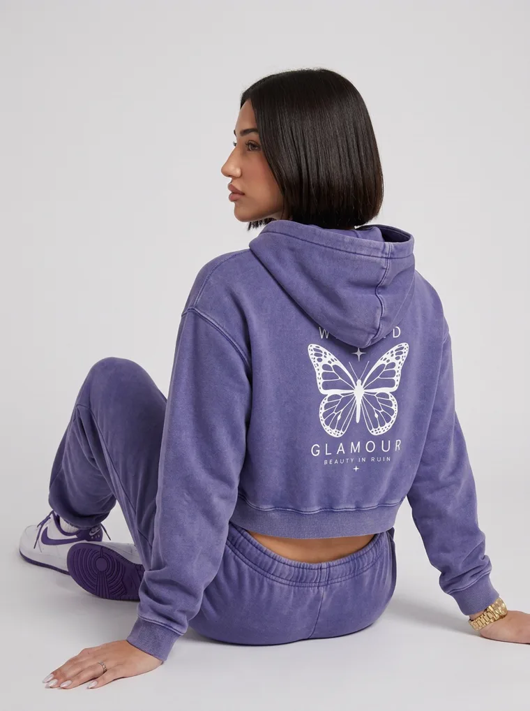
Violet hoodie. The butterfly is the product.
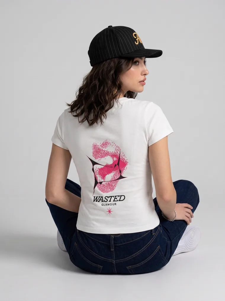
Graphic tee. Lips on the front, the rose and lettering on the back, and the back is the bigger draw.
If the model is wearing more than the product, keep the rest plain and crop one frame to the SKU. If the artwork is on the back, the back frame sells it, so it goes second, not last.
Four
Resolution is a decision, not a default
Sellers tend to treat resolution as a setting to leave alone. It is better treated as part of the shot list, because the right answer depends on what the image is for and what the garment is made of.
The blazer set carries a 4K lead frame, and the fair way to show what that buys is to crop the same patch of the same frame at both resolutions and put them side by side at the same size. Left is the region as a standard 1K frame holds it. Right is the same region from the 4K frame.
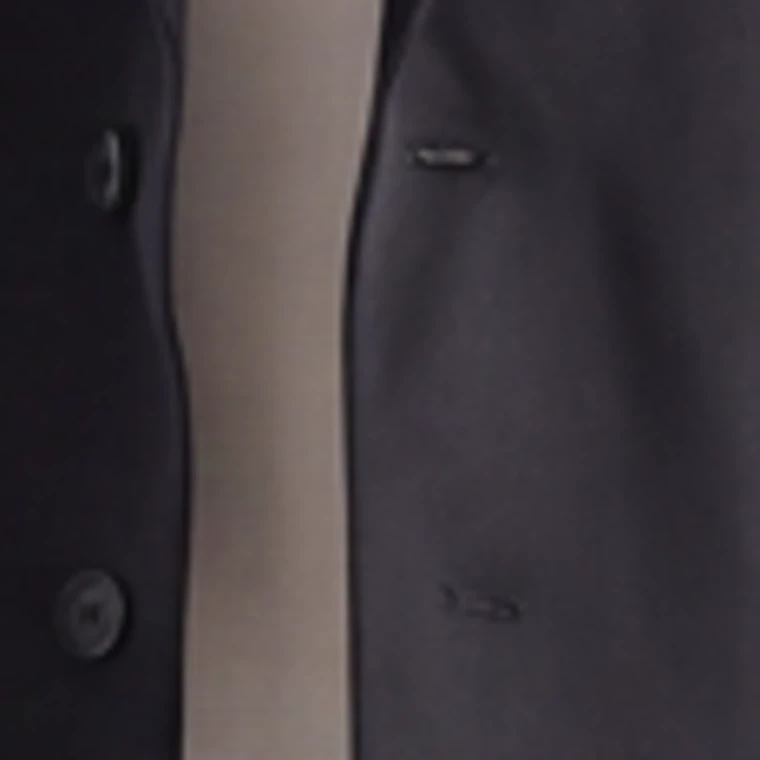
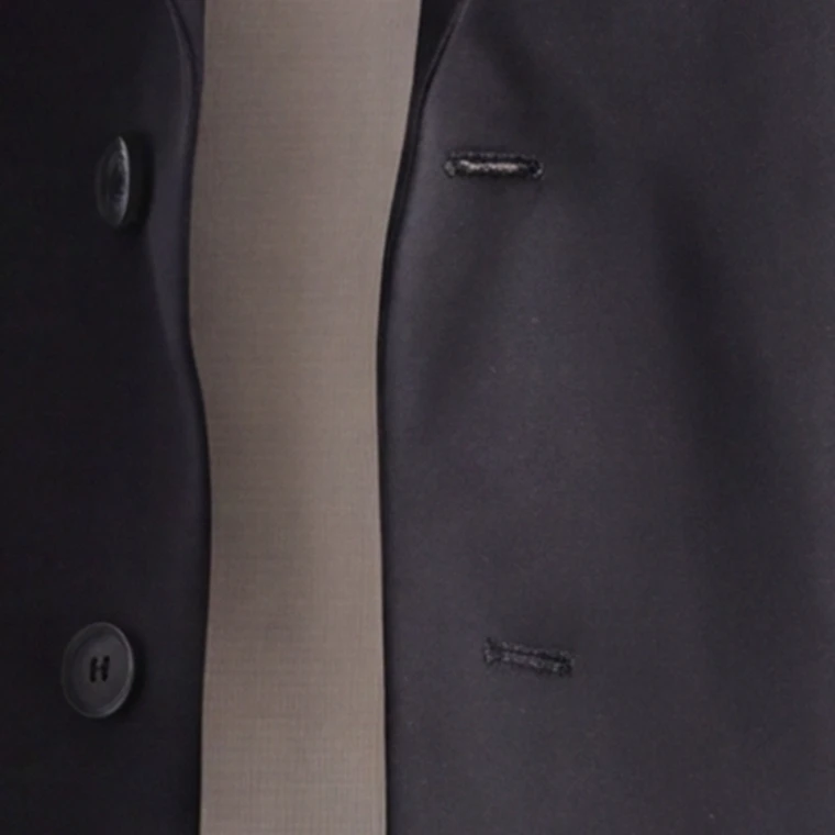
Tailoring. Buttonhole stitching and a belt buckle. The 4K frame is what you would send to print. The 1K frame is what you would put on the product page, and it is the right choice there.
The category this matters most for is anything with small branding. A chest logo, a woven label, an embroidered crest. Those are the details a shopper checks before paying a brand premium, and they are the details that go soft first. The menswear label in the next section built its whole catalog around exactly that kind of detail, and its close-ups are what a 2K detail frame is for.
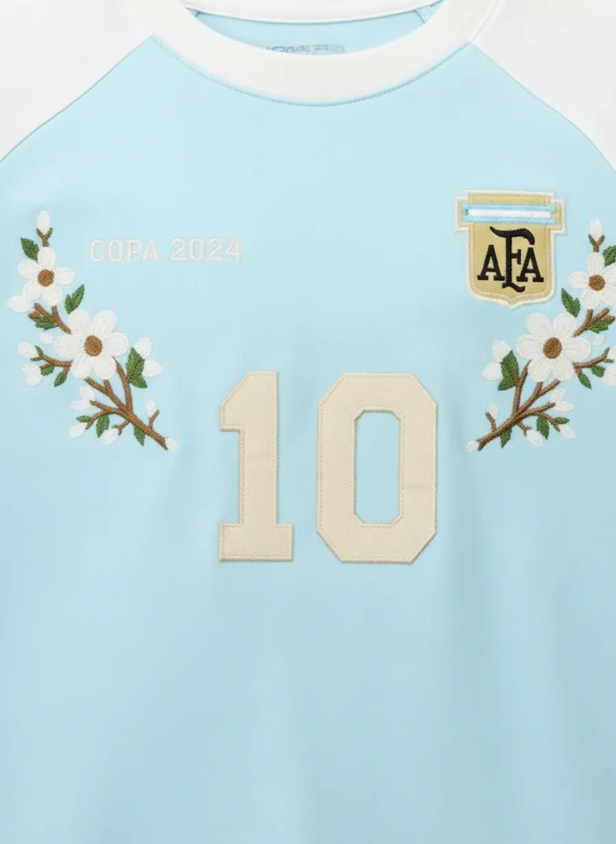
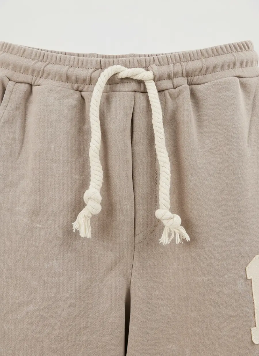
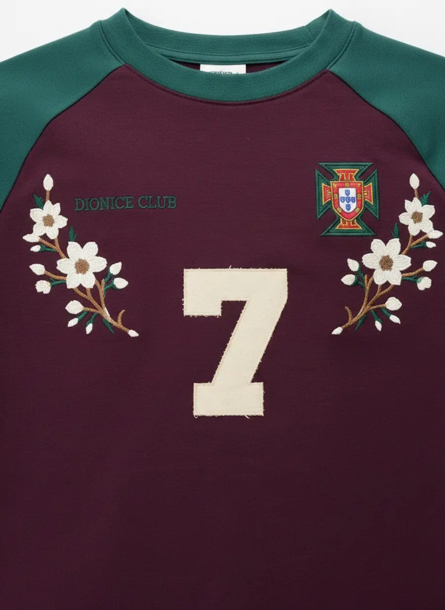
Detail frames from the Bully catalog. Appliqué, embroidery, a drawcord. These are the frames that justify a price, and they are the ones to generate at 2K.
1K for the product page. 2K wherever the garment carries micro detail or the shopper will zoom. 4K only when it goes to print.
There is a second reason to know your output size, which is that Google is about to enforce a floor. That is in section six. For how the tiers map to marketplace pixel minimums, which is a separate question, see Marketplace Image Requirements for Fashion Sellers.
Five
Across a colourway run, the model moves
Everything so far is about one product. Most catalogs are not one product, they are twenty colourways of three styles, and that introduces a problem the single-product decisions do not cover.
The catalog has to cohere, so the same model on the same ground in the same light, or the collection page looks like it was assembled from five different suppliers. But if every colourway is the identical pose with the colour swapped, the shopper reads it as a template, not a shoot, and a template is something people distrust without being able to say why.
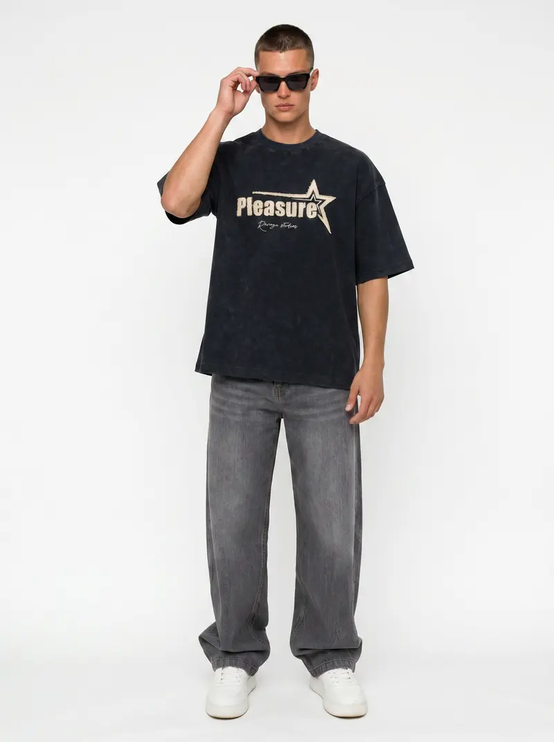
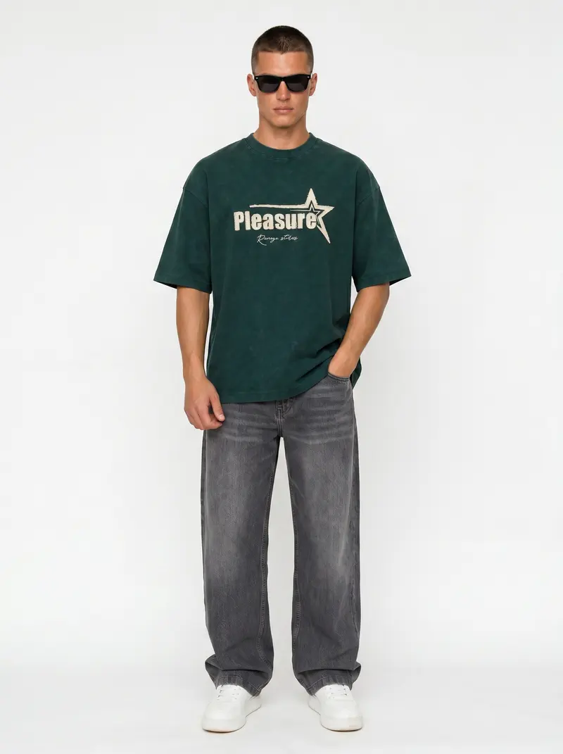
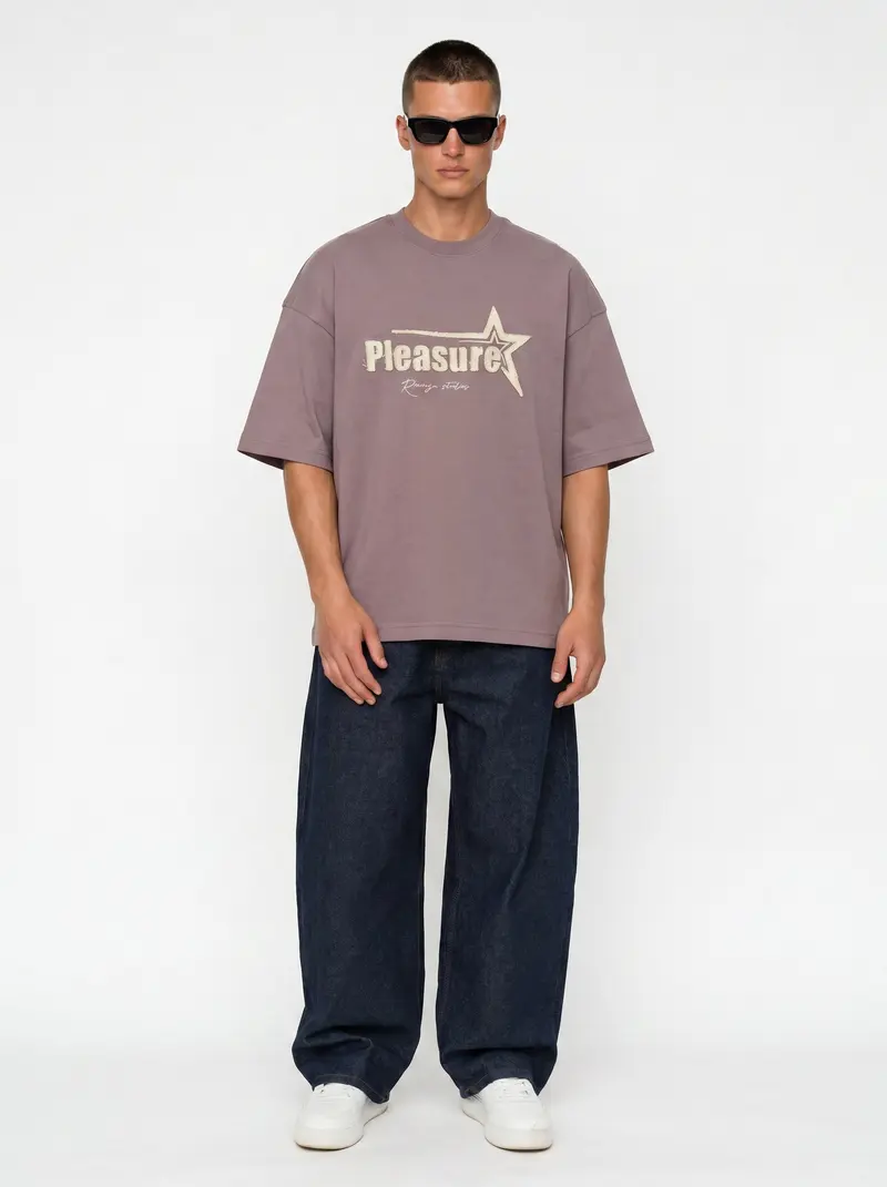
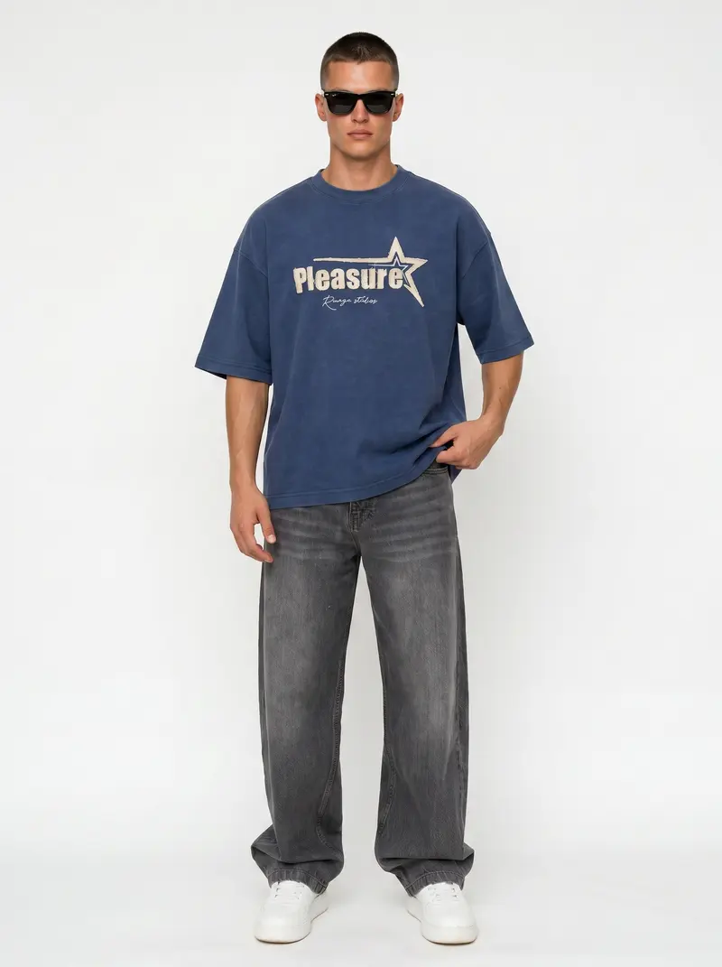
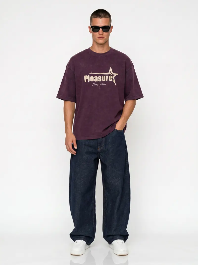
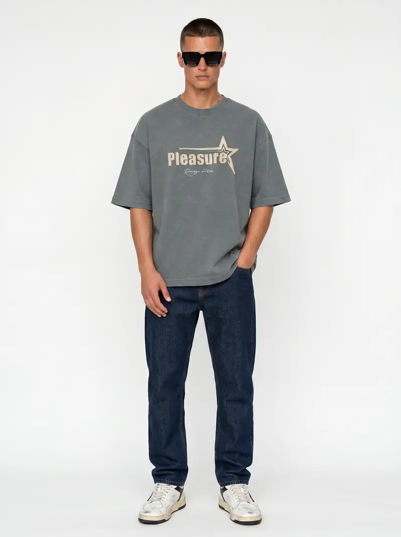
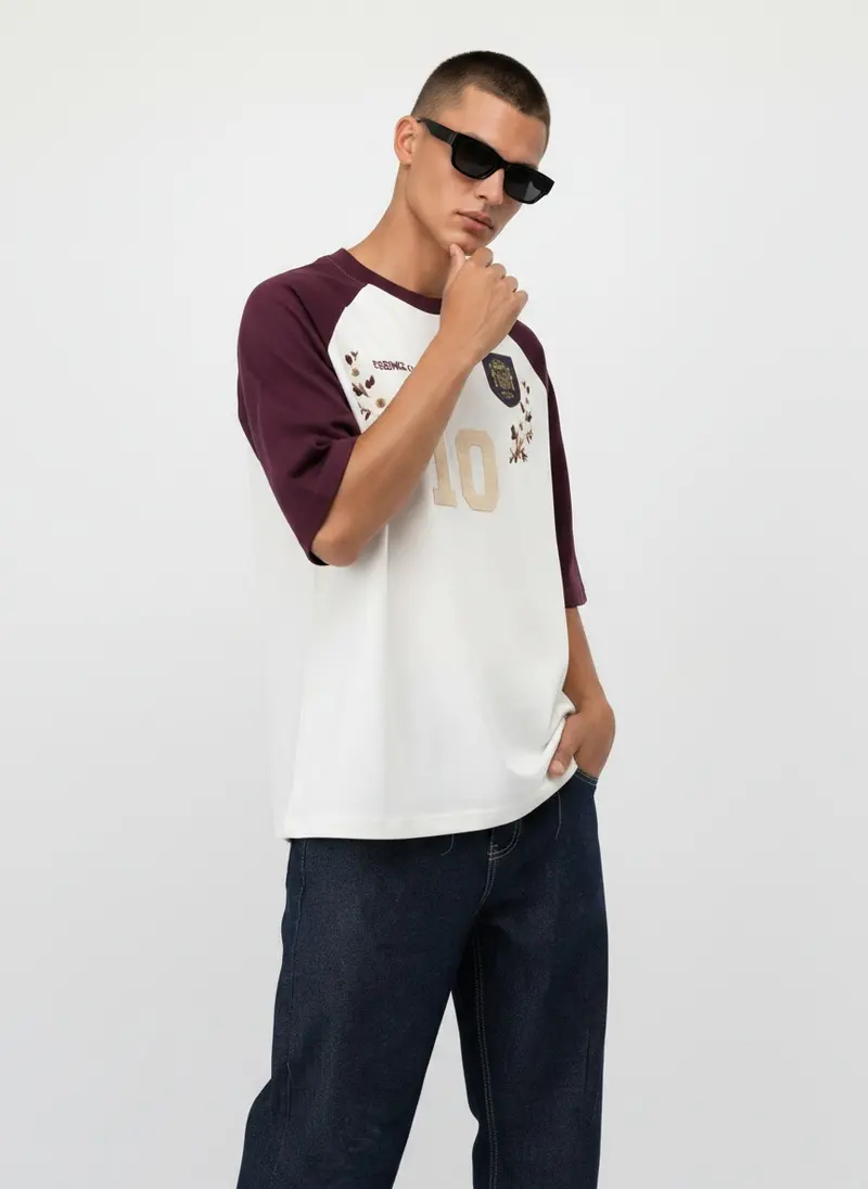
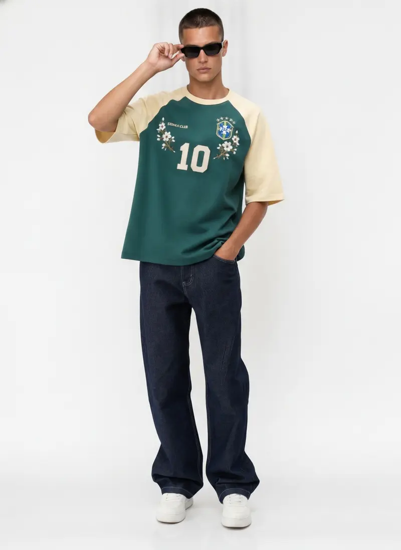
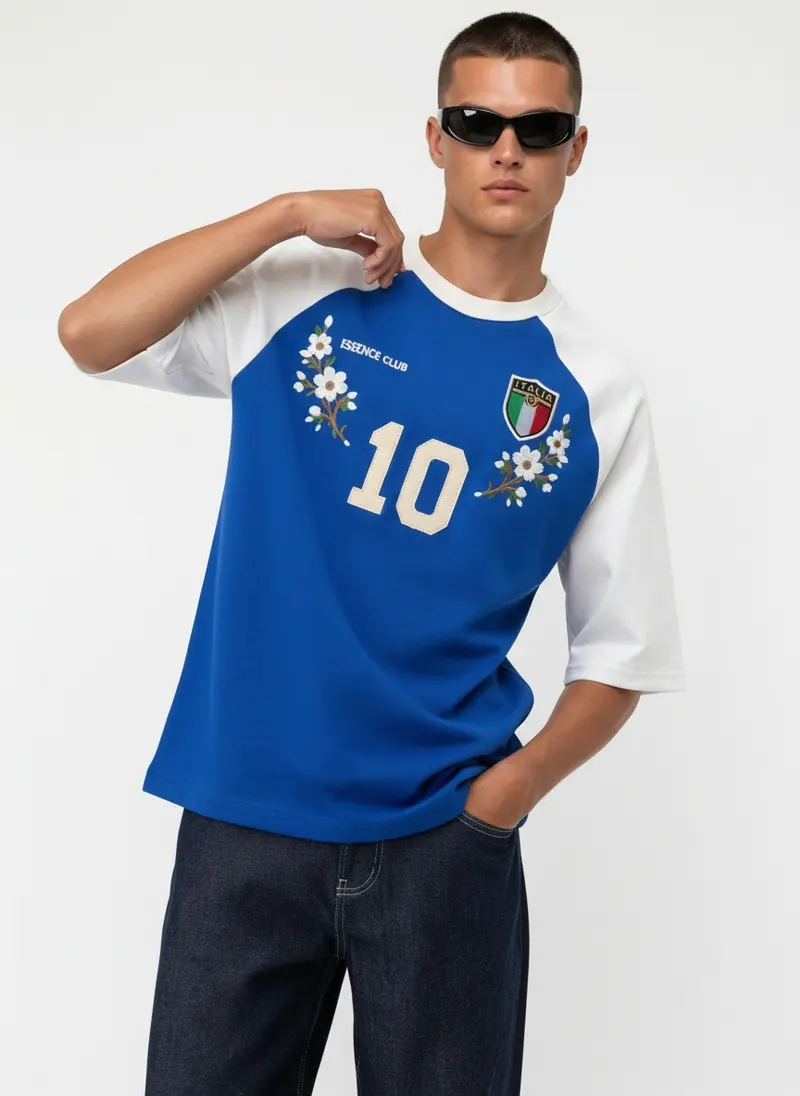
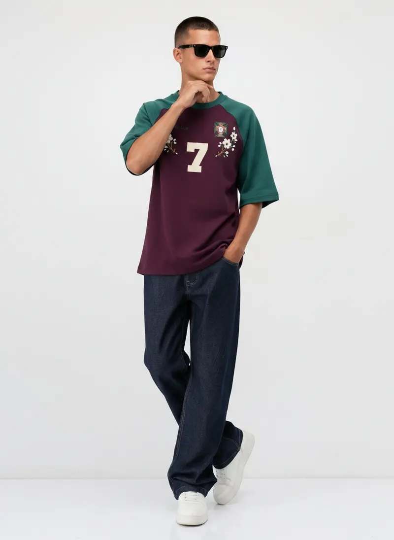
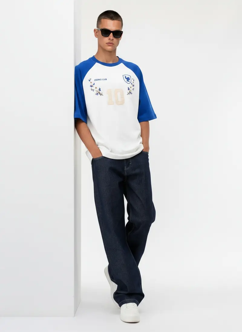
Bully, a menswear label sold through a Türkiye-based wholesaler, built its Summer 2026 catalog this way with MODA AI: three programs, twenty colourways, one model, one white studio. What keeps it from looking cloned is that the model moves through the run the way a model moves through a real shoot. Standing, seated on the stool, leaning, walking, a hand to the sunglasses, and the denim changing under each tee. Each frame is posed and framed for that outfit, not stamped from the one before.
Pleasure Star Tee · six of the colourways
Essence Club Raglan · six of the colourways
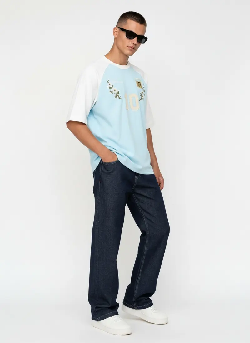
Bully Sweatpant · six of the colourways
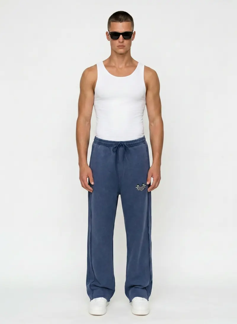

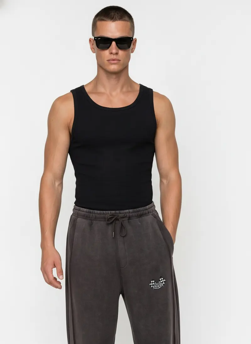
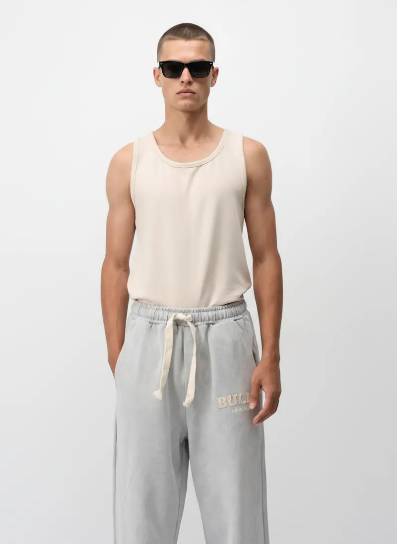
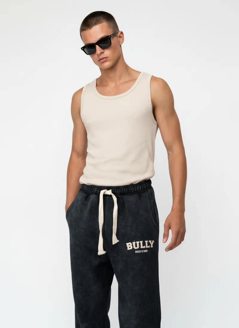
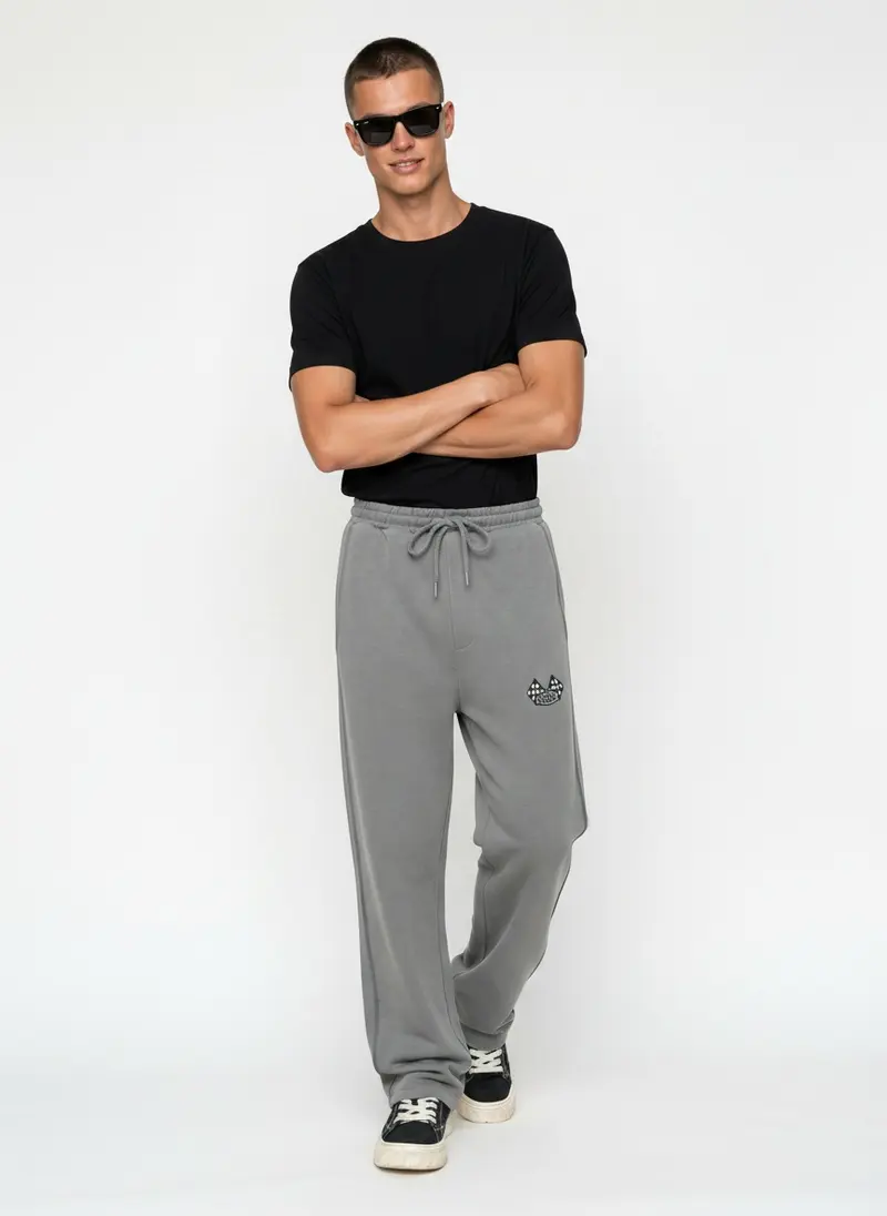
Eighteen of the twenty. Same model, same wall, same light. No two frames posed alike, and the styling under each piece changes with the colour. This is the difference between a collection and a colour picker.
Fix the model, the ground and the light. Let the pose, the prop and the styling move. Consistency is in the first three, credibility is in the last three.
The reasoning behind fixing the first three is laid out in One Model, Four Colors, and the full Bully catalog, including the line sheet it became, is in the Bully case study.
Six
Where the first image actually goes
The reason sections one to three matter more than they used to is that the first image no longer lives on your product page. It is pulled into Google Shopping as the product tile, imported into every marketplace listing, used as the collection thumbnail, and shown on a phone at a couple of hundred pixels wide before anyone taps. Every one of those surfaces is smaller than your PDP, and every one of them punishes a garment that sinks, fights or confuses.
Two Google requirements are worth knowing. Google Merchant Center moves to a 500 by 500 pixel minimum for all product images from 31 January 2027, up from 250 by 250 for apparel today, and warnings on images under the new floor have been showing since July 2026. Google also requires AI generated product images to carry IPTC DigitalSourceType metadata identifying them as such, and asks that it is not stripped on export.
MODA AI output is fully compliant with both. A standard frame is over 1100 pixels on its short edge, well past the new floor, and the 2K and 4K tiers are far beyond it. The platform by platform detail is in the marketplace requirements guide.
Seven
Start from whatever you actually have
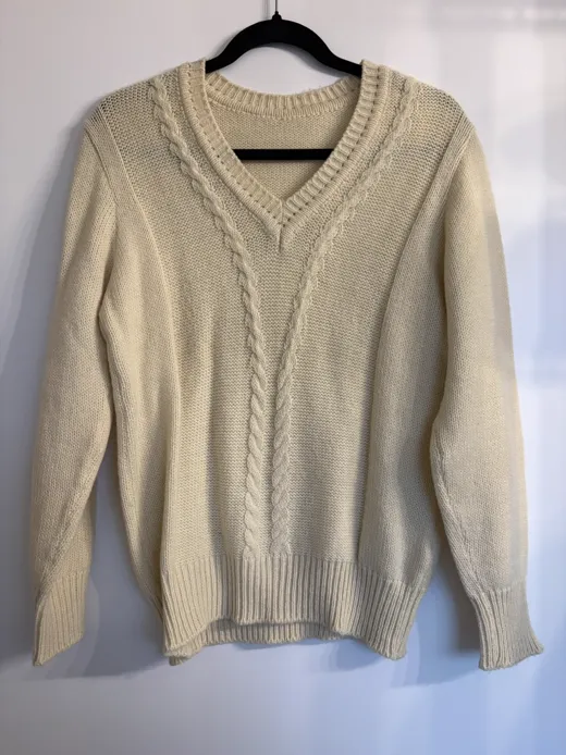
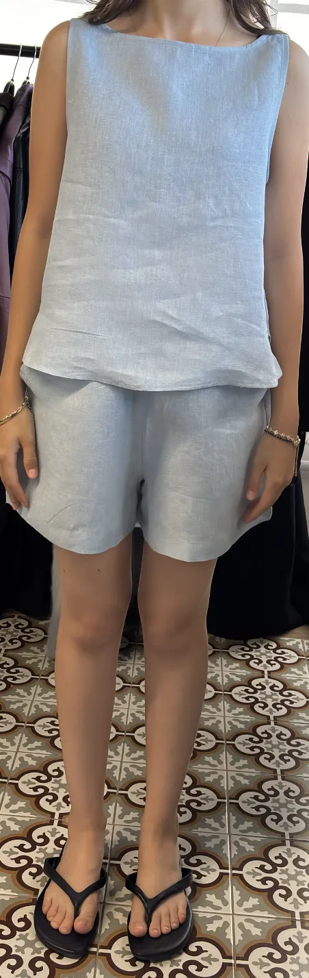
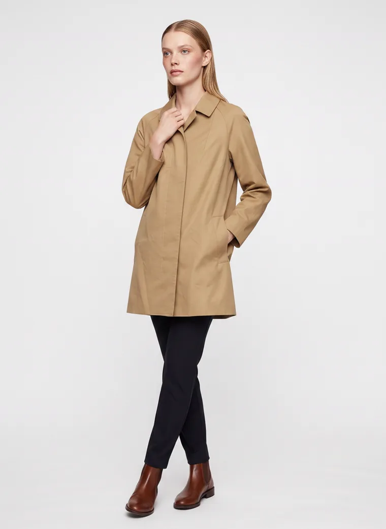
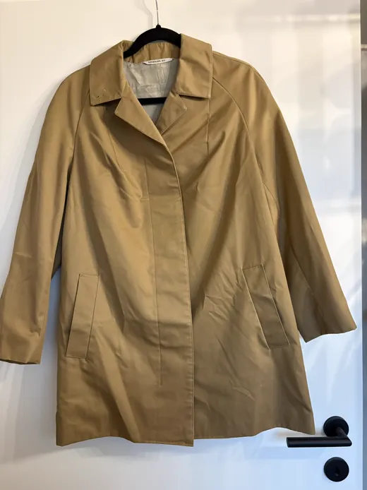
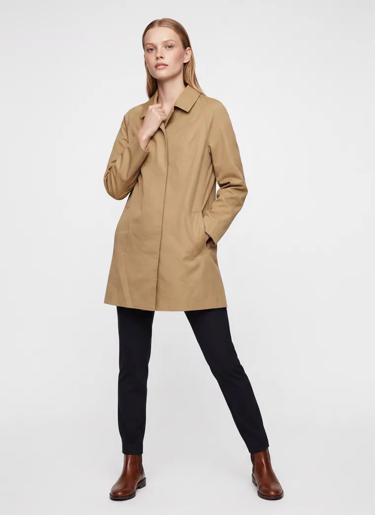
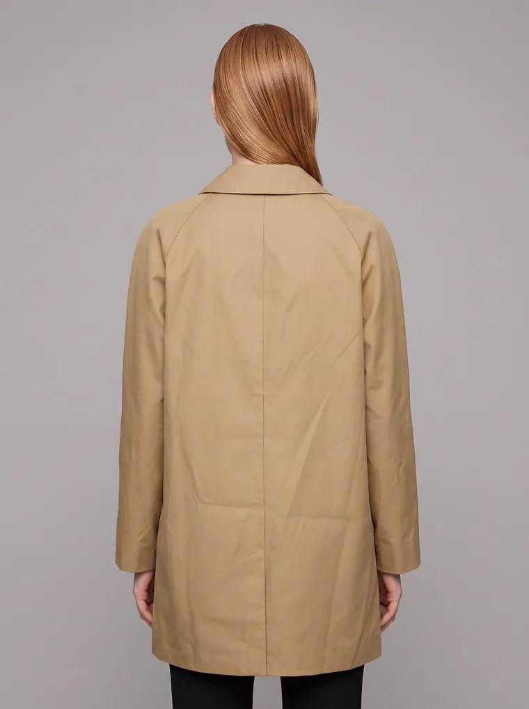
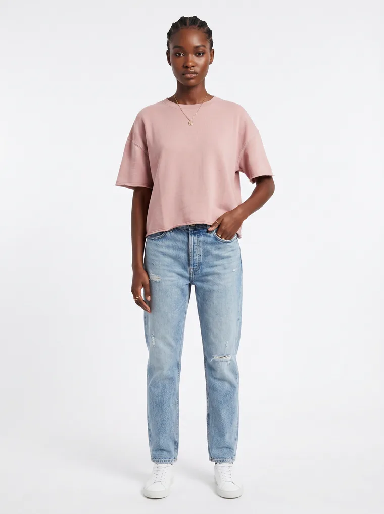
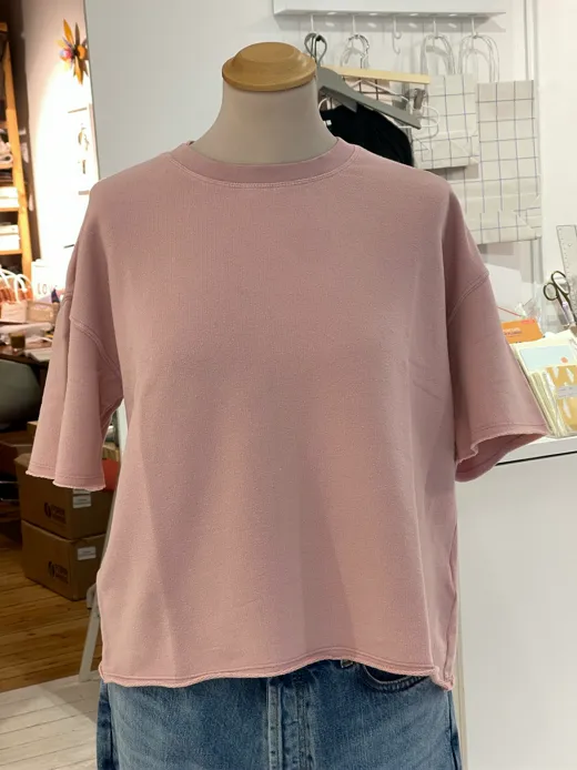
A last point, and a short one because it has been covered elsewhere. Every set in this guide was generated, and the starting points were not glamorous. A camel coat on a hanger by a door. A blush tee on a mannequin in a stockroom. A linen set photographed on patterned floor tiles. Red shorts against a bedroom wall. A cream jumper on a hanger against a curtain. The decisions above do not need a studio to be made. They need a background reference, a clear idea of which piece is the product, and a resolution matched to the job.
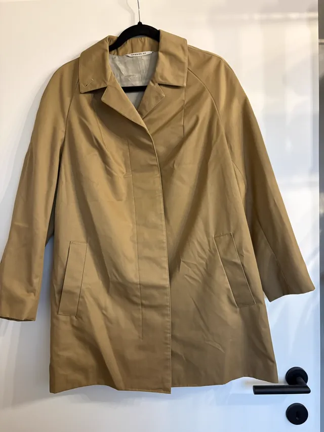
Coat on a hanger.
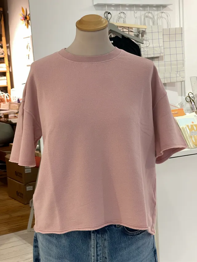
Tee on a stockroom mannequin.
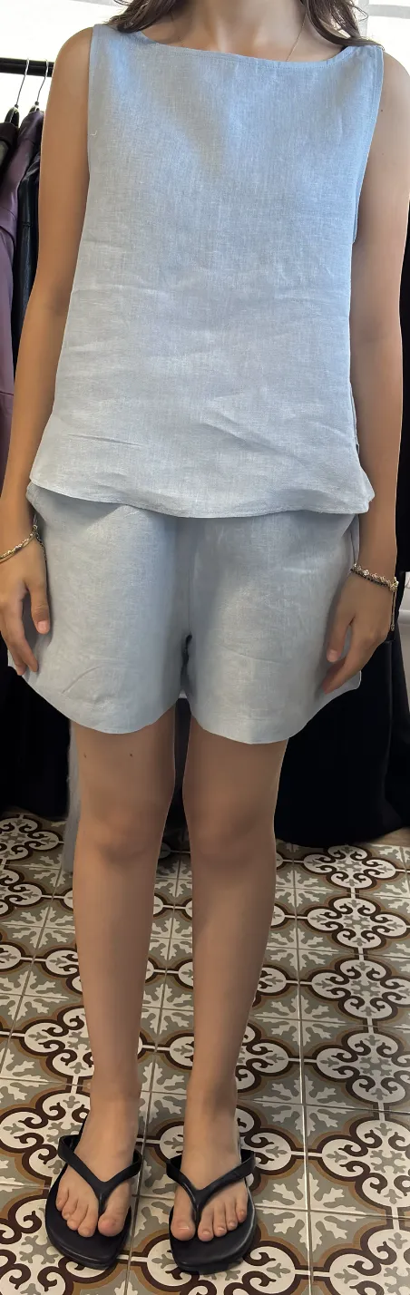
Linen set on floor tiles.
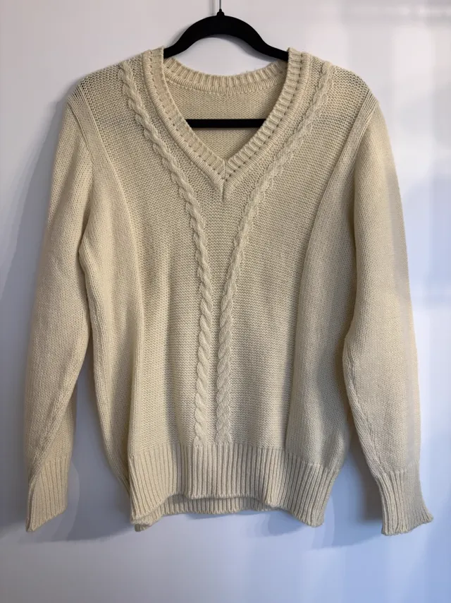
Jumper on a hanger.
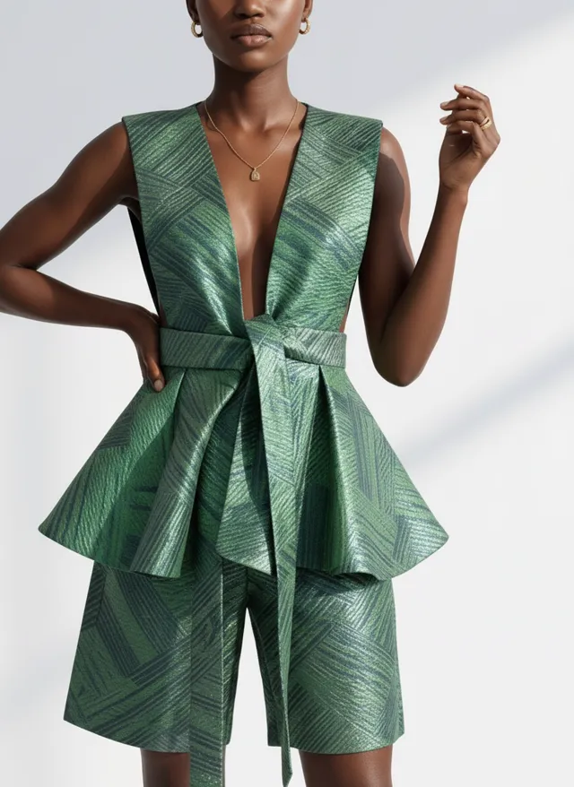
Peplum dress on a shop mannequin.
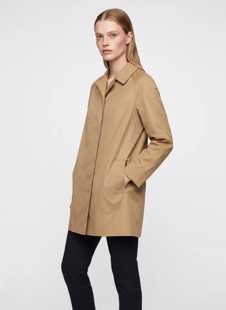
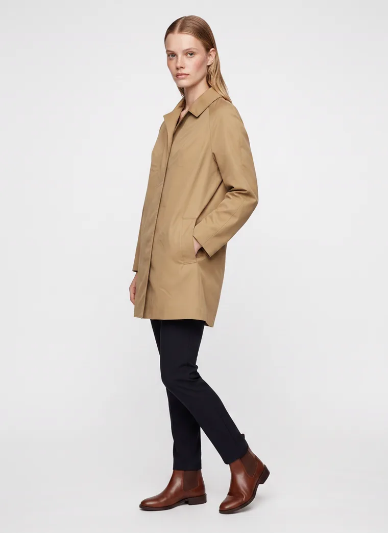
Five of the twenty-one starting points. The outputs from each are in the gallery below. The single-input guides go deeper: from a flat lay, from a hanger shot, from a mannequin.
Flat lays, hanger shots and mannequin and on-body inputs each have their own guide.
The checklist
Before the image goes live
01
Shrink it first.
Look at the lead frame at phone thumbnail size before you judge it at full size. What did you notice first? If the answer is not the product, keep going.
02
Ground against garment.
Pale garment, coloured ground or a strong accent. Busy garment, plain ground. Never pale on pale, never loud on loud.
03
Which piece is for sale.
Styling pieces stay neutral. At least one frame crops to the SKU. If the artwork is on the back, the back frame goes second.
04
Resolution matched to use.
1K for the product page. 2K for micro detail and anything the shopper zooms into. 4K only for print.
05
Across the run.
Model, ground and light fixed. Pose, prop and styling moving. If every colourway is the same pose, it reads as a template.
06
Feed ready.
Over 500 by 500 for Google from January 2027. Product filling most of the frame. IPTC DigitalSourceType tag intact on generated images.
07
Alt text and file names.
Describe the garment, the colour and the frame. It is the cheapest search signal in the catalog and the one most sellers skip.
The Sets
All twenty-one, as product pages
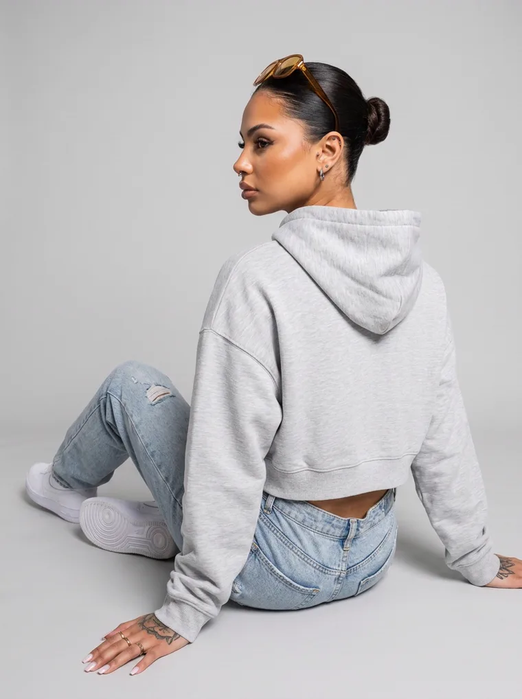
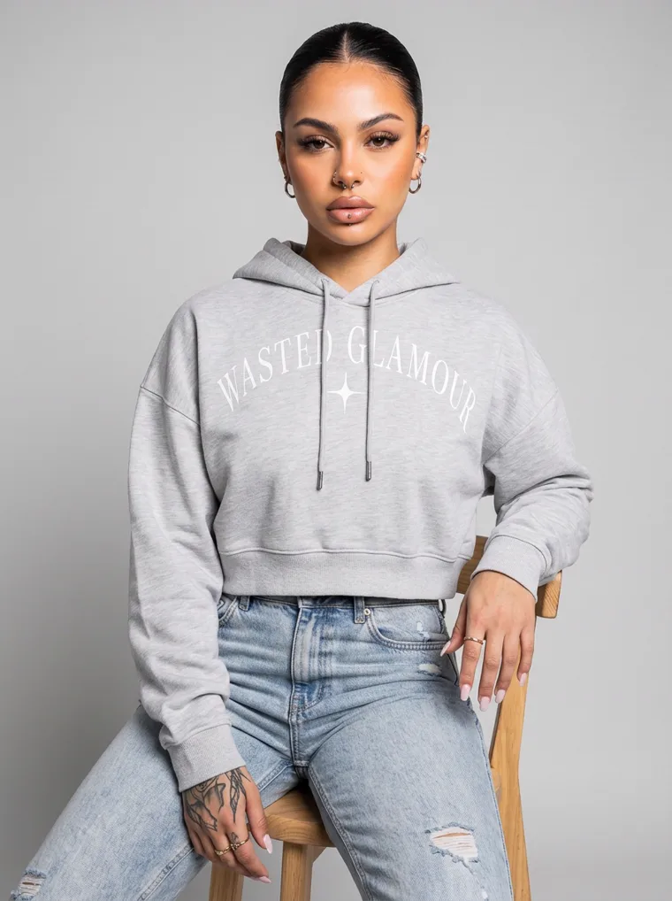
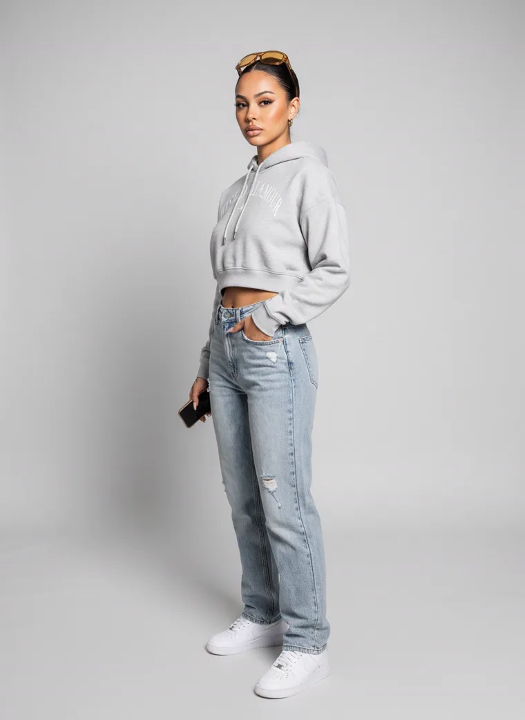
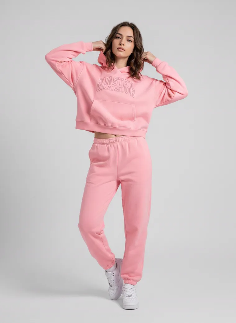
Lead frame and a rail of four, the way each one would sit on a store. Menswear first, then womenswear. Tap the small square on any lead to see the photo it started from.
Menswear

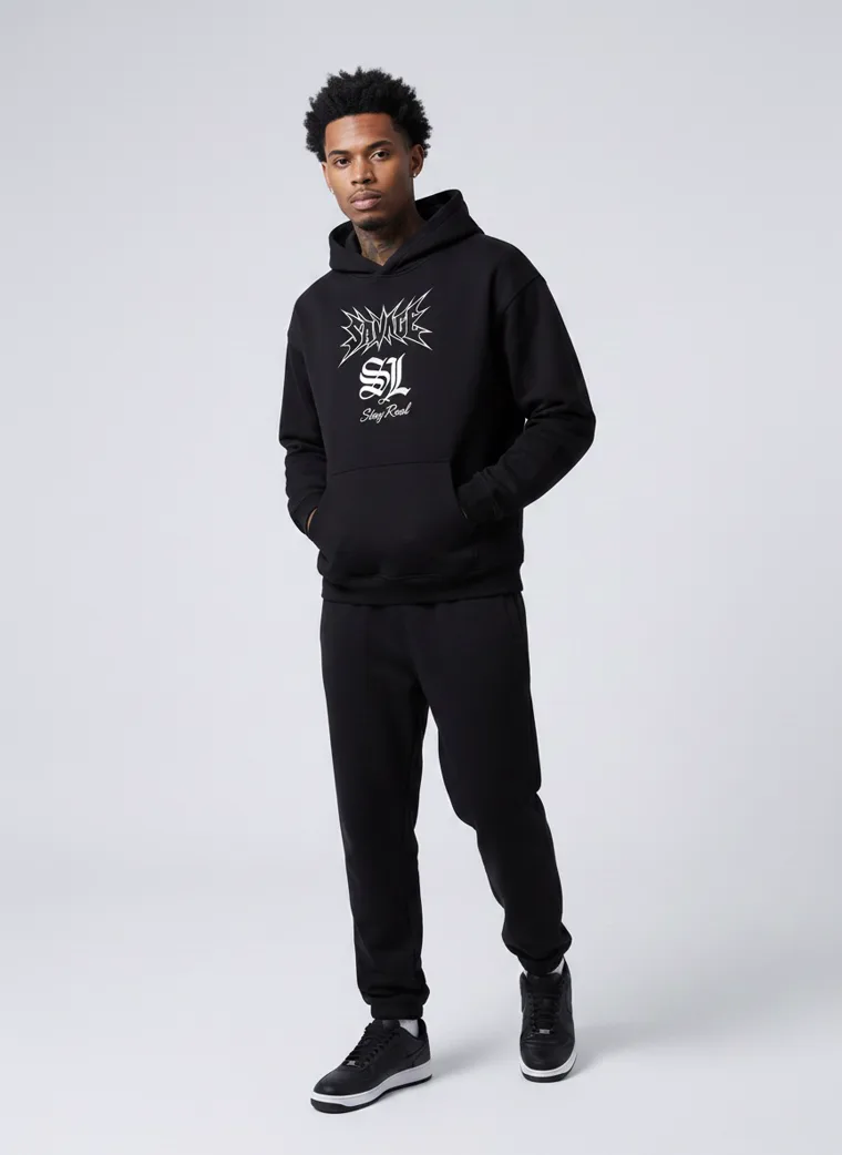
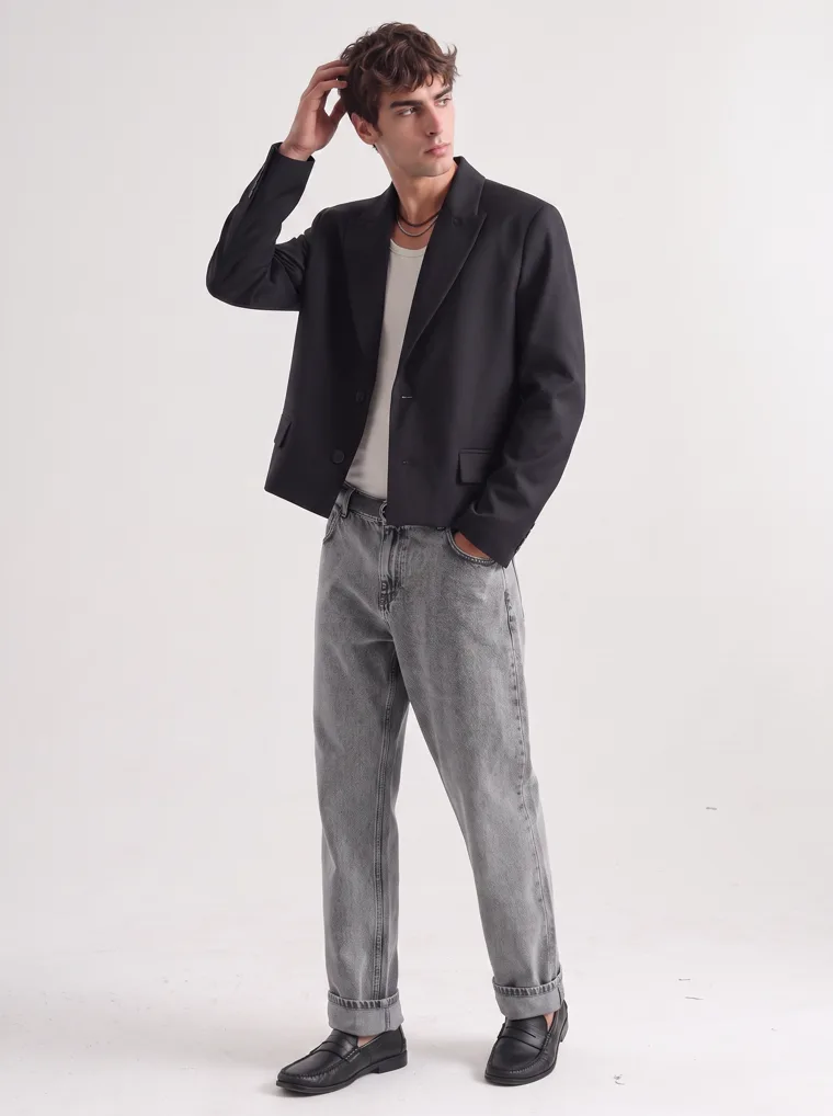
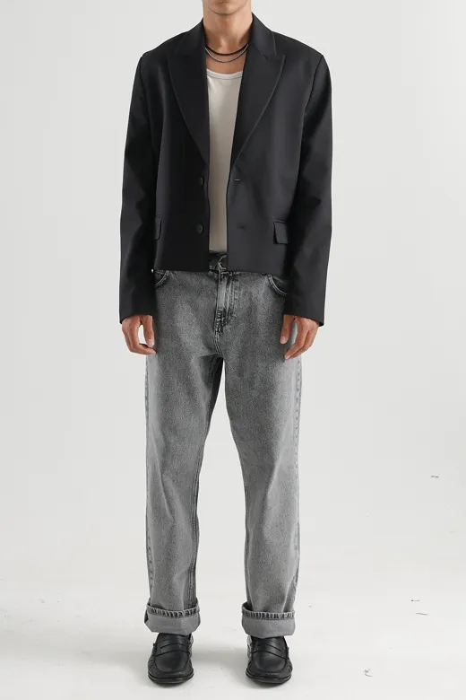
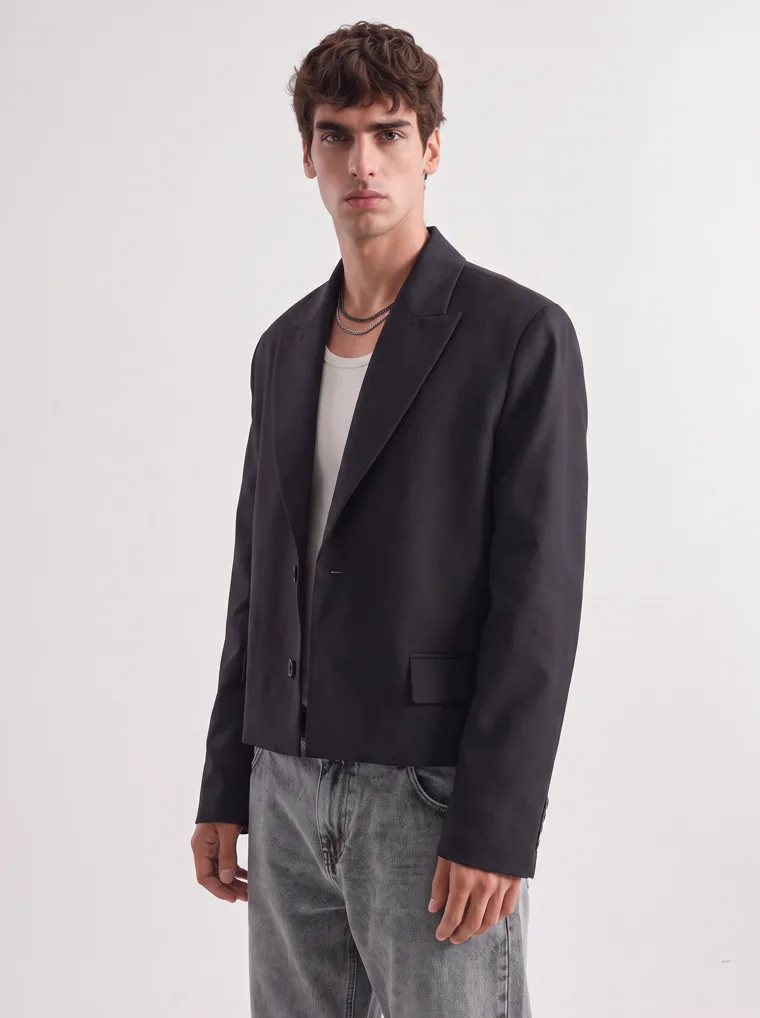
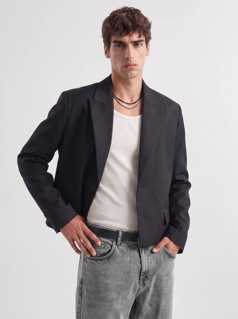
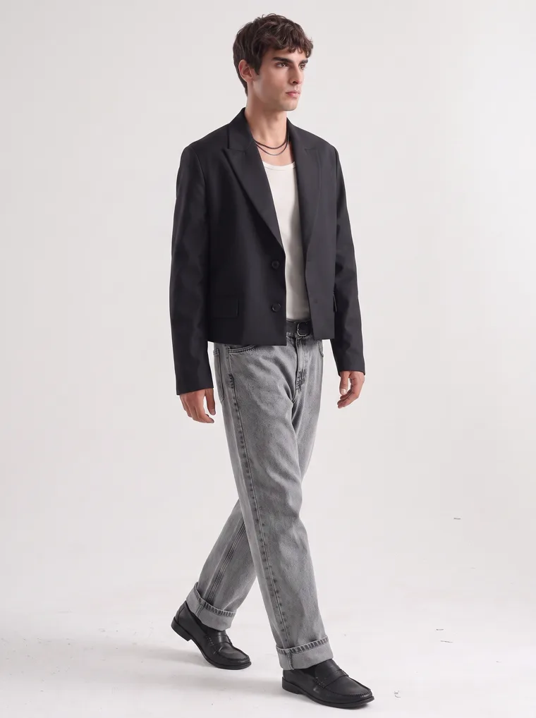
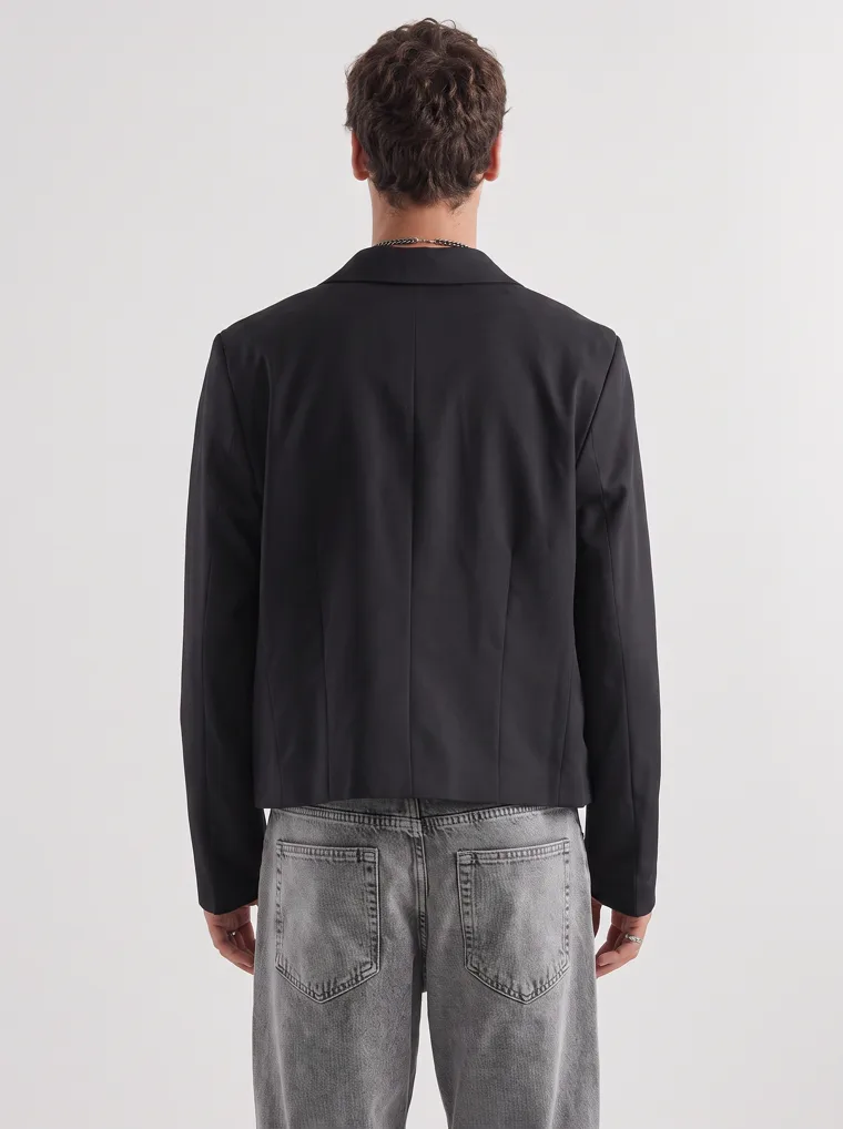
Womenswear
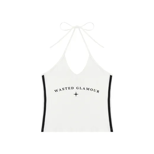
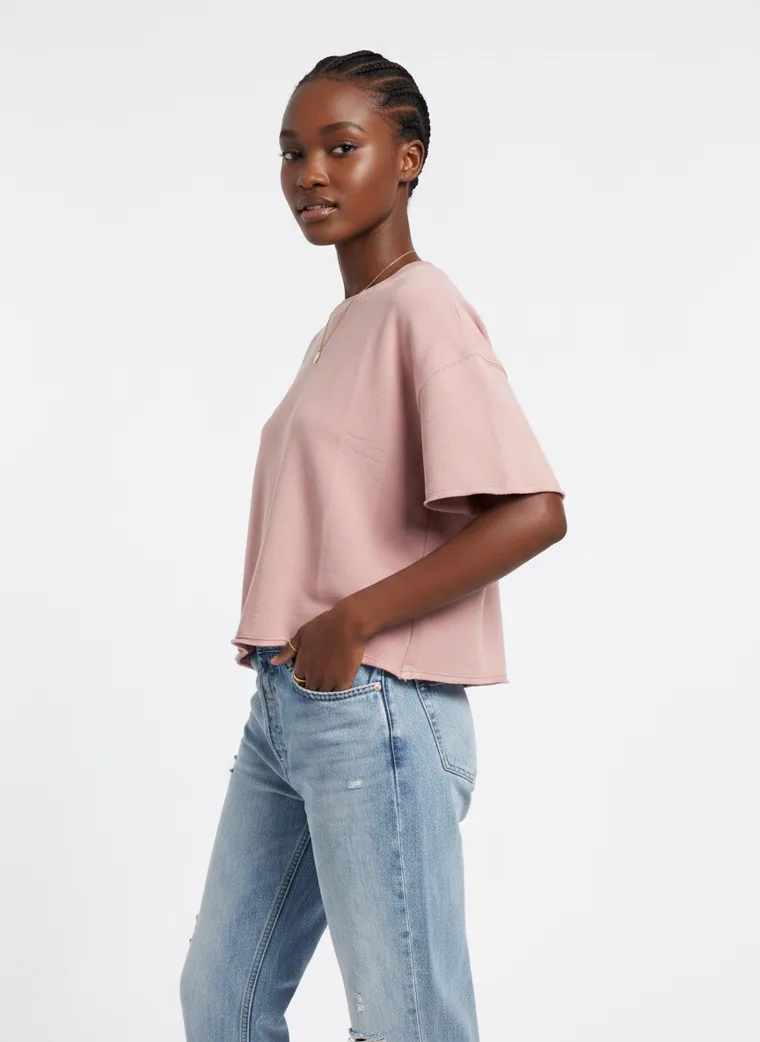
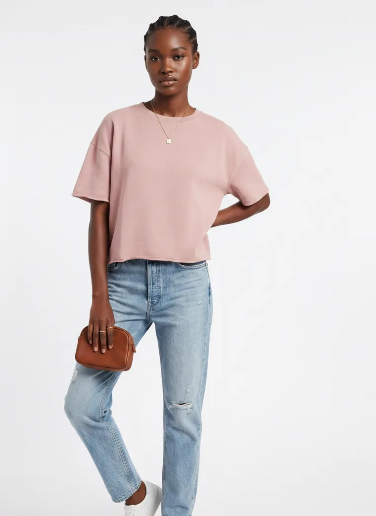
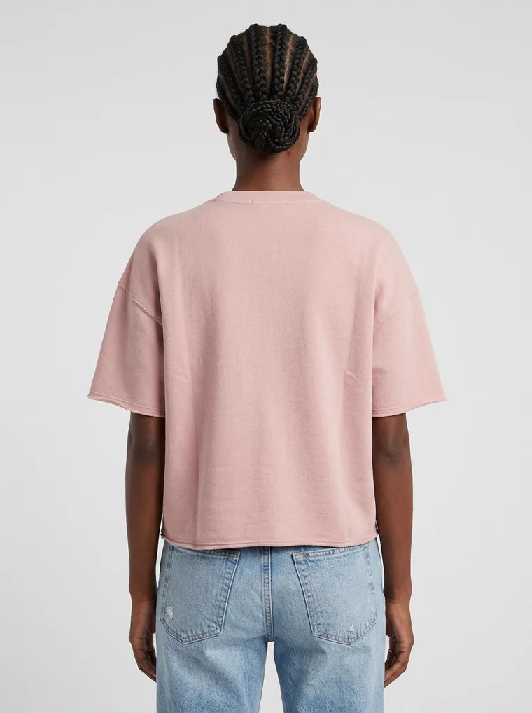
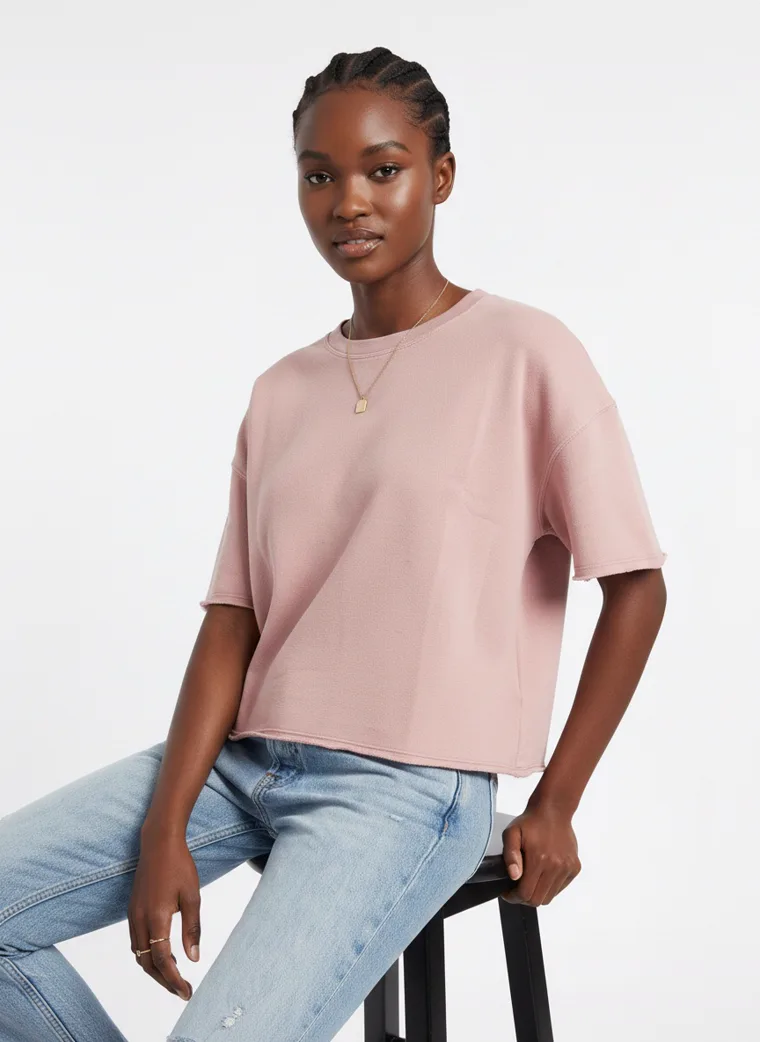
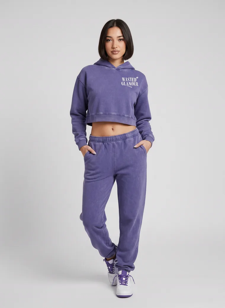
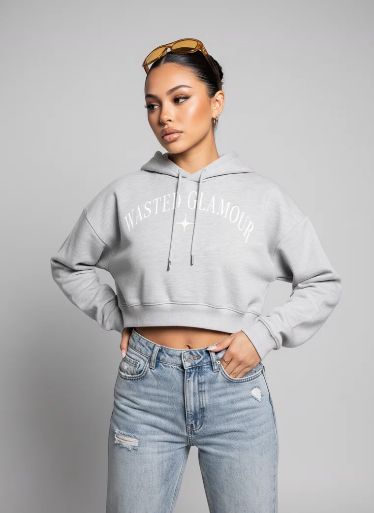
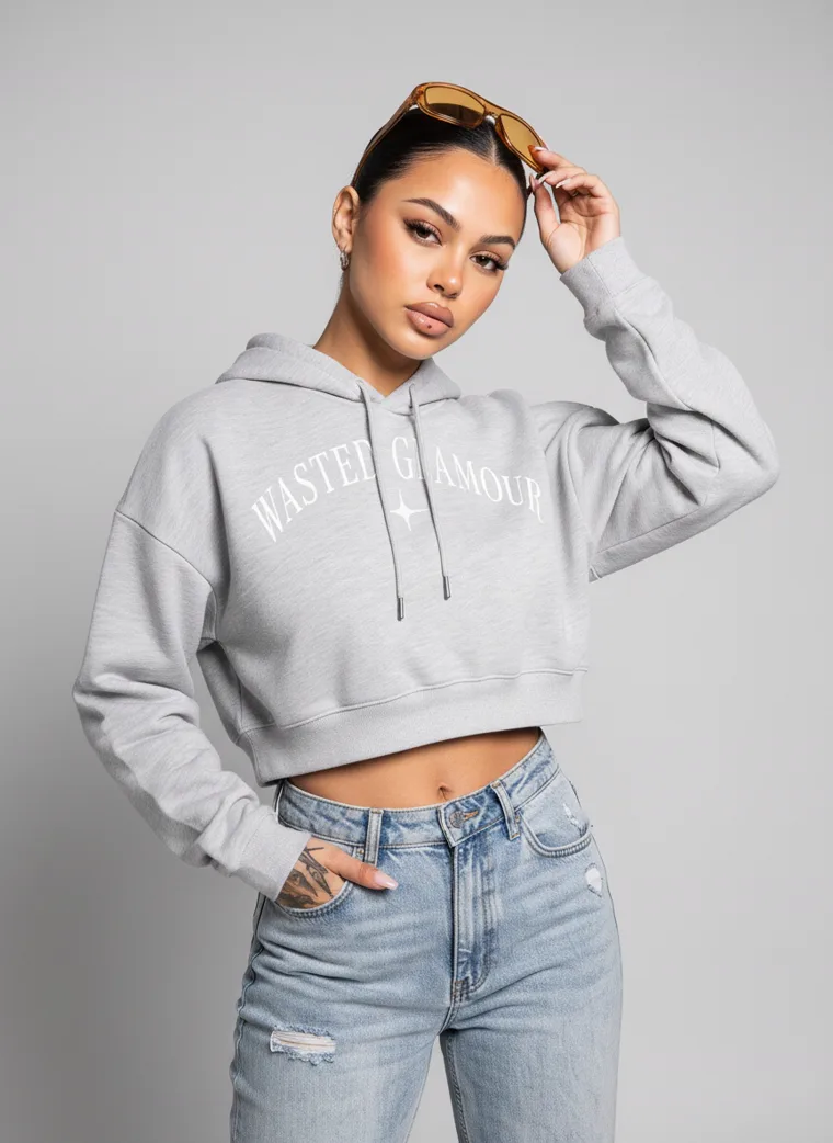
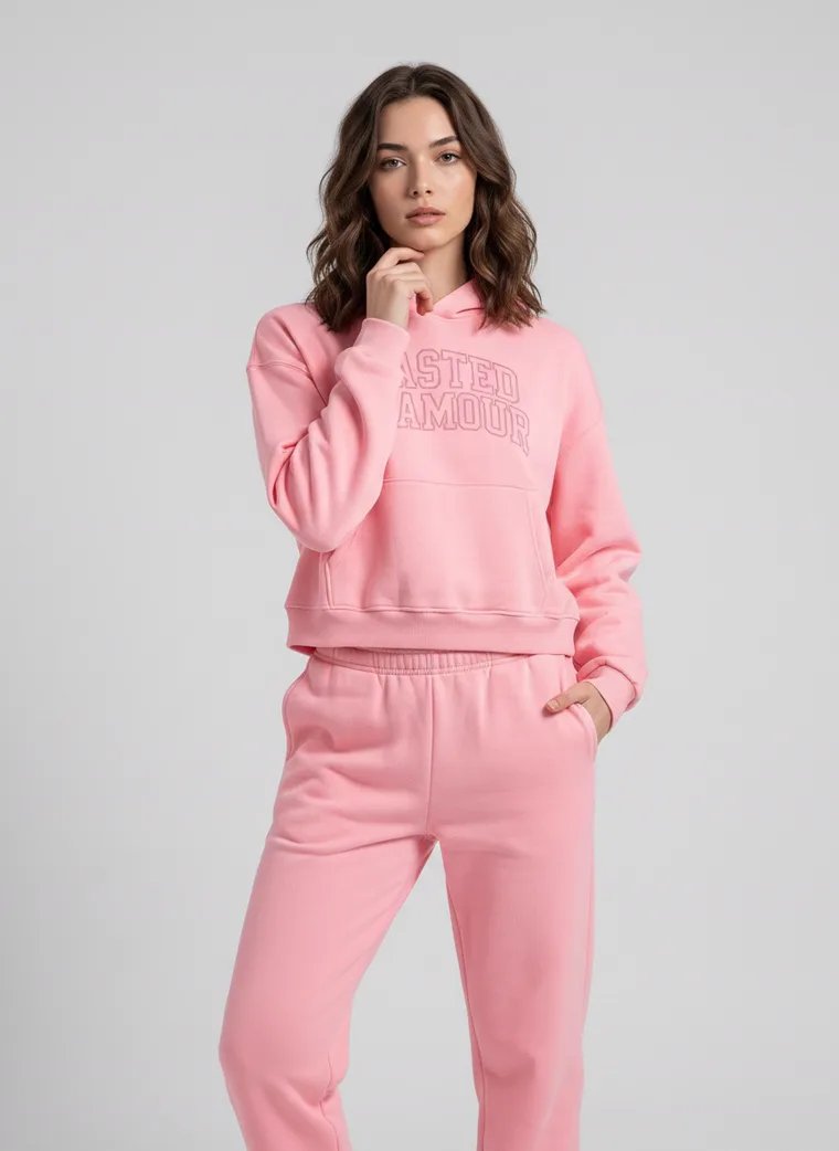
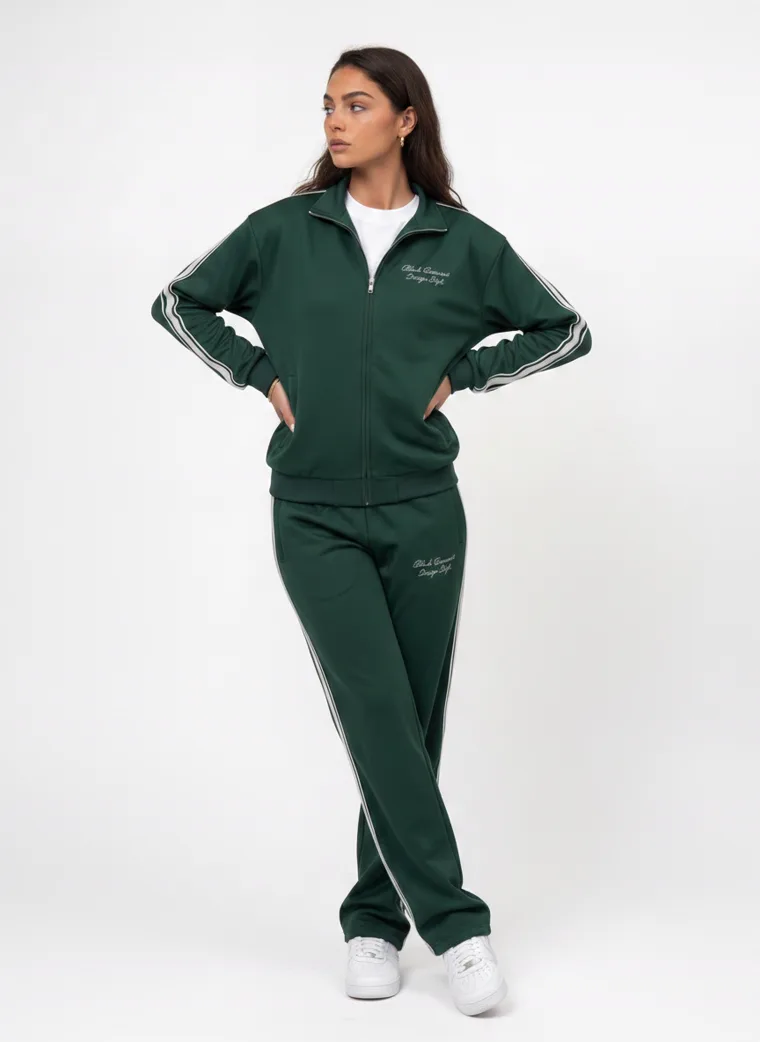
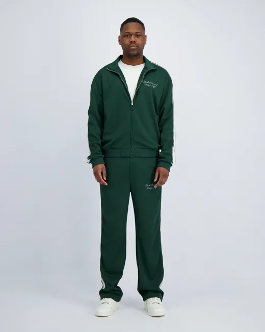
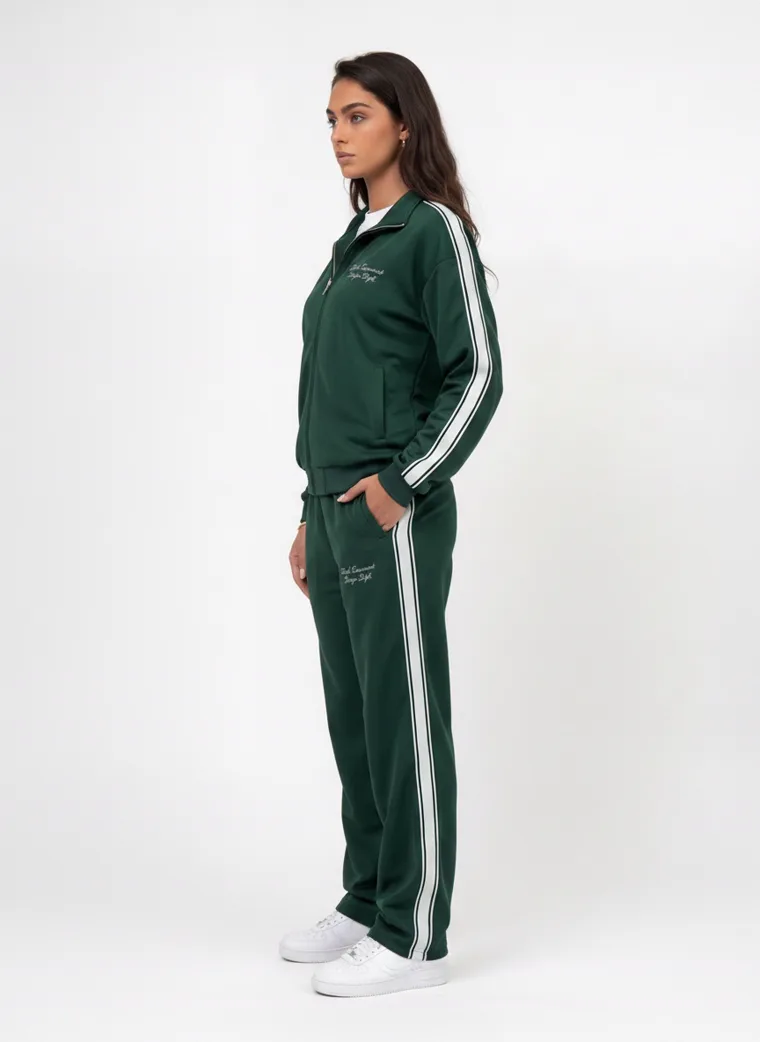
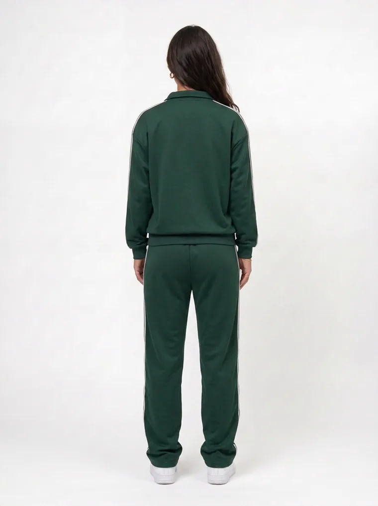
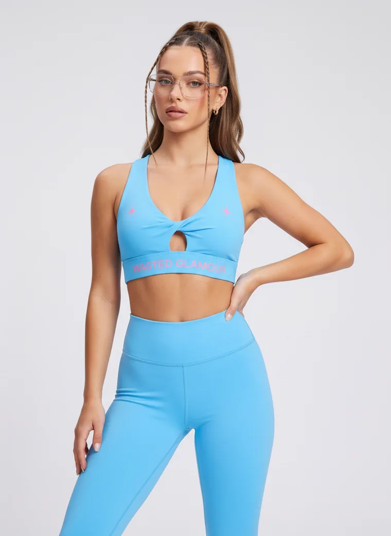
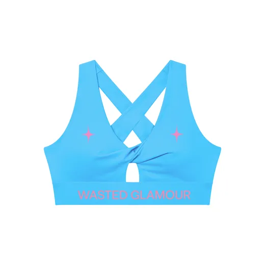
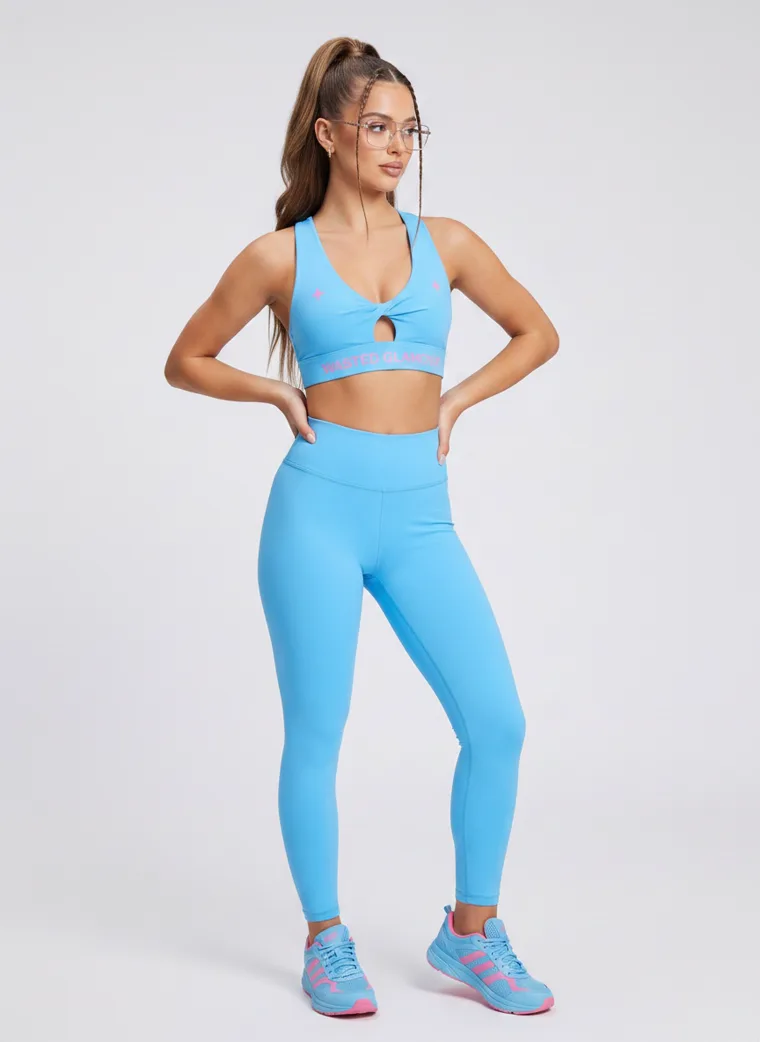
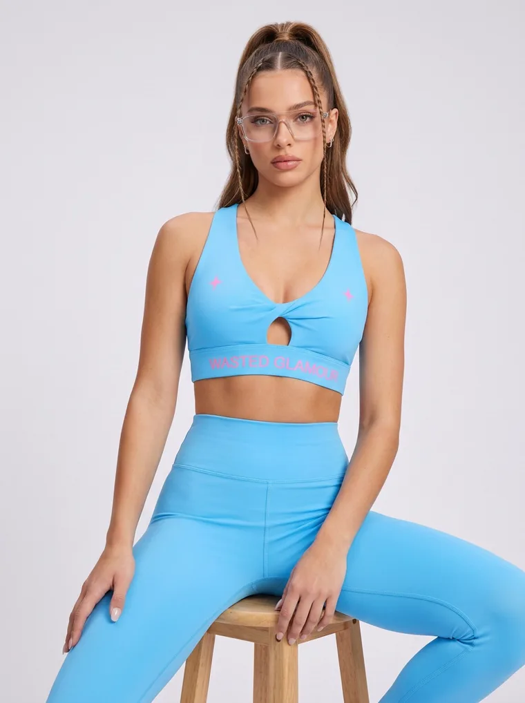
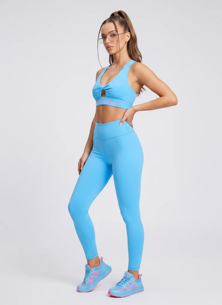
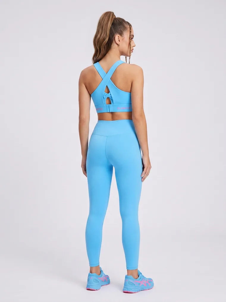
A note on how these were made
Every set on this page was produced with MODA AI, five catalog frames per product from one garment upload, plus the twenty Bully colourways. The decisions in this guide are the ones the tool asks you to make: which background reference, which shot list, which resolution tier. The background reference is what solved the whites. The shot list is where the crop to the shorts came from. The tier is why the linen weave resolves.
That is the honest answer to why a generated catalog can look better than a rushed real one. Not because the model is synthetic, but because the four decisions get made deliberately, every time, for every product, instead of once at the start of a long shoot day and then forgotten by the fortieth garment.
Frequently asked questions
What background should I use for white or pale clothing?
Not another pale one. A white or cream garment on a white or light grey ground loses its edges, and at thumbnail size it can disappear. Use a coloured or mid tone ground, or rely on a strong accent or on edge light. If you generate, the background reference is how you choose the ground, so a blue, sand or slate reference solves it before the first frame exists.
Can I photograph a printed or embroidered garment on a busy background?
Sometimes, but deliberately. What saves a garment on a busy ground is colour contrast with that ground, not harmony with it. A pink shirt on green foliage lifts off the background. A pink kurta in a pink rose garden blends into it, however beautiful the frame. The safe rule is a busy garment on a quiet ground, and if you want the location frame, put it third or fourth rather than first.
How do I show which item is for sale when the model is wearing several pieces?
Keep the styling pieces neutral and include at least one frame that crops tightly to the item you are selling. If you sell shorts and style them with a tee, the shorts need a frame of their own. If the artwork is on the back, the back view is the frame that sells, so it belongs early in the stack.
Should I generate product images at 1K, 2K or 4K?
Match it to the job. 1K is the standard for Shopify product pages. 2K is for garments with micro detail, small logos, prints and embroidery, and for any zoom in or detail frame. 4K is for large format print such as standees and in store display.
What is the Google Shopping image size requirement for 2027?
Google Merchant Center has announced a minimum of 500 by 500 pixels for all product images, enforced from 31 January 2027. The current apparel minimum is 250 by 250, so older catalogs often fall short, and warnings began in July 2026. Google also expects AI generated product images to keep their IPTC DigitalSourceType metadata.
Make the product the first thing they see.
Background reference, shot list, resolution tier. Three settings, four decisions, every product. Free to try from the Shopify App Store.
Get Started FreeOr browse the full lookbook