Seasonal Edit · FW26
Fall/Winter 2026 Fashion Trends, in 20 Looks
The runway gives us the extreme version of a season. The product page is where those ideas have to become clothes people actually wear.
September 2, 2026 · 12 min read
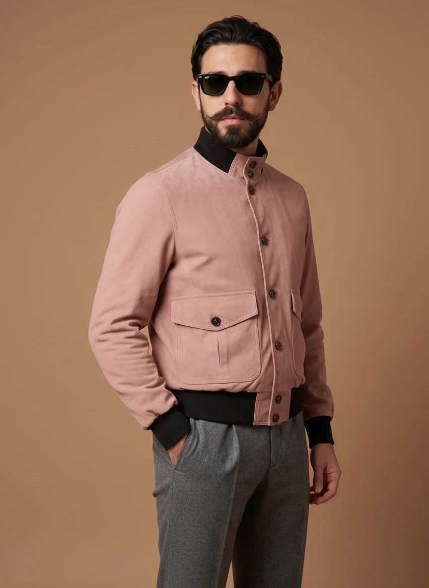
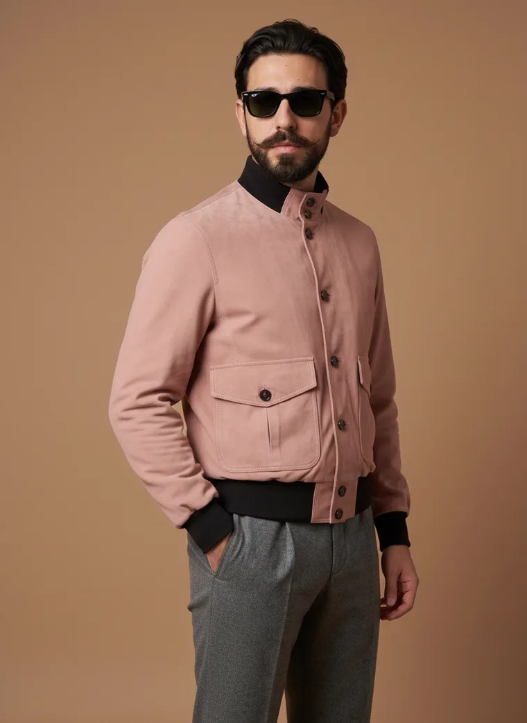
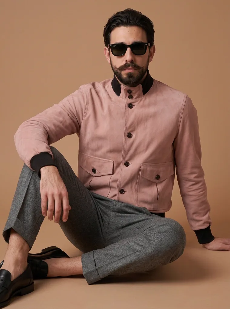
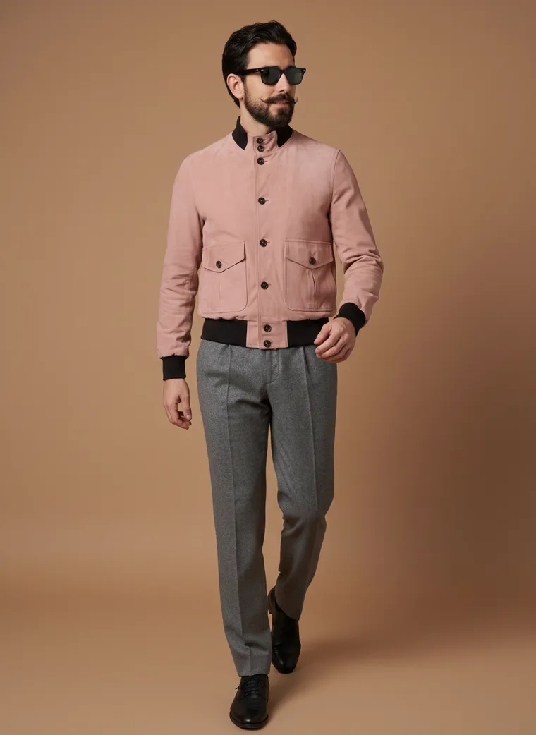
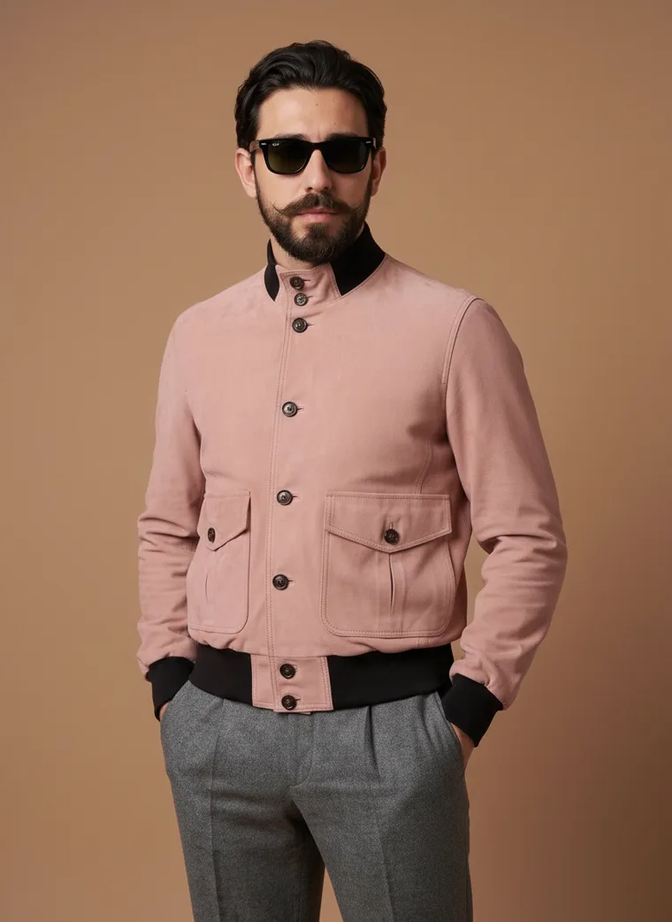
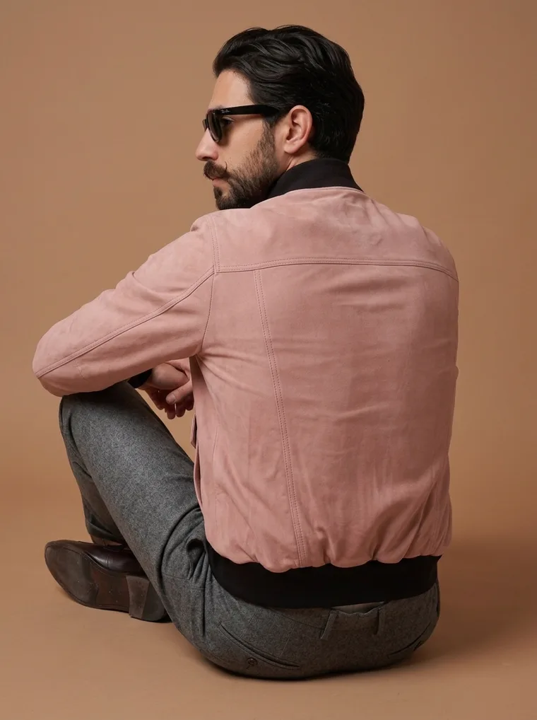
Look 01. A blush bomber over grey wool. Nothing about it is difficult to wear, and none of it would have looked like this three seasons ago.
Fall/Winter 2026 is an interesting season to buy for, because the distance between the runway and the shop floor is smaller than usual.
After several years of very restrained dressing, the correction is not toward chaos. The clothes are still clean, still practical, still recognisable. They simply have more personality than they did, and most of that personality is arriving through colour rather than construction.
That matters commercially, because colour is the cheapest trend to adopt. A brand can move its whole range into the season by changing dye lots. It cannot do the same with sequins.
This edit reads FW26 through twenty commercial looks rather than runway pieces. Menswear, womenswear, kidswear, knitwear, ethnicwear, athleisure, loungewear and streetwear. The same ideas keep surfacing across all of them.
One
The palette got warmer, not louder
For several seasons, neutral meant a narrow wardrobe. Black, grey, beige, cream. FW26 opens that definition up without asking anyone to wear anything difficult.
Brown is the foundation. WGSN, working with Coloro, built the FW26/27 palette around warm earthy tones such as Cocoa Powder set against light nuances such as Wax Paper. Pantone’s fall palette runs through Arabian Spice, Toffee, Coffee Bean and Hot Chocolate. Two different forecasters, both landing on brown as a foundational colour for 2026.
Around it sit burgundy, olive, peach and tobacco, all behaving like neutrals rather than accents. And the thing anchoring the whole palette is cream, not black. That single substitution is what makes an autumn range read warm instead of severe.
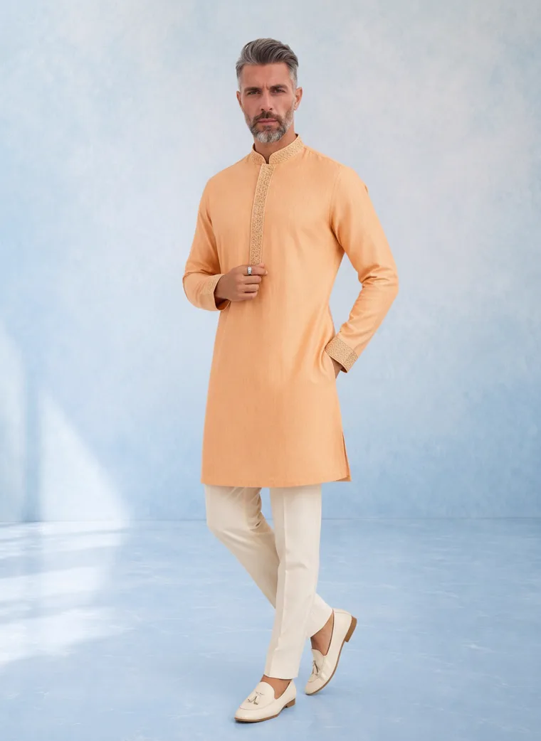
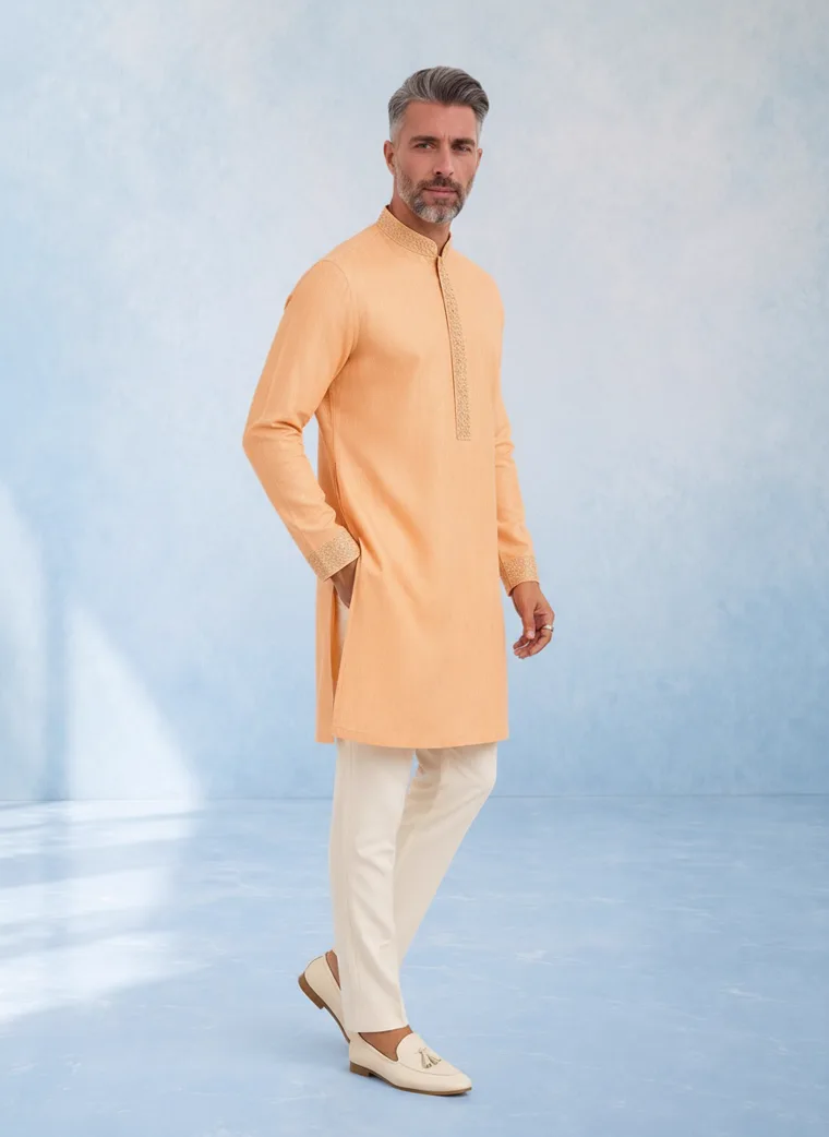
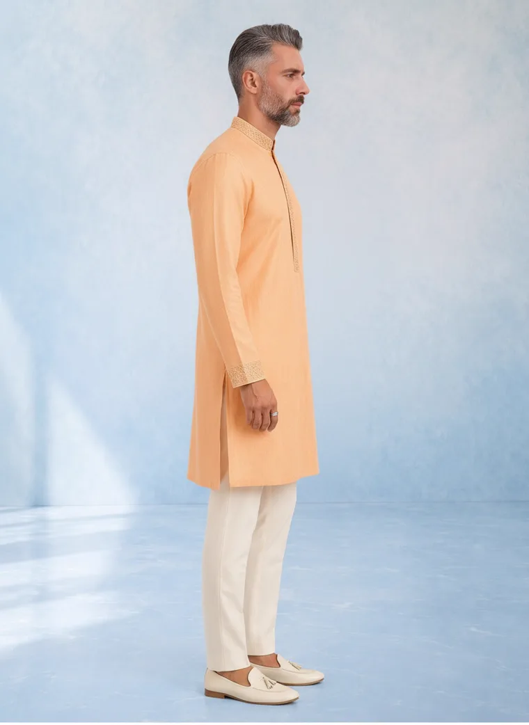
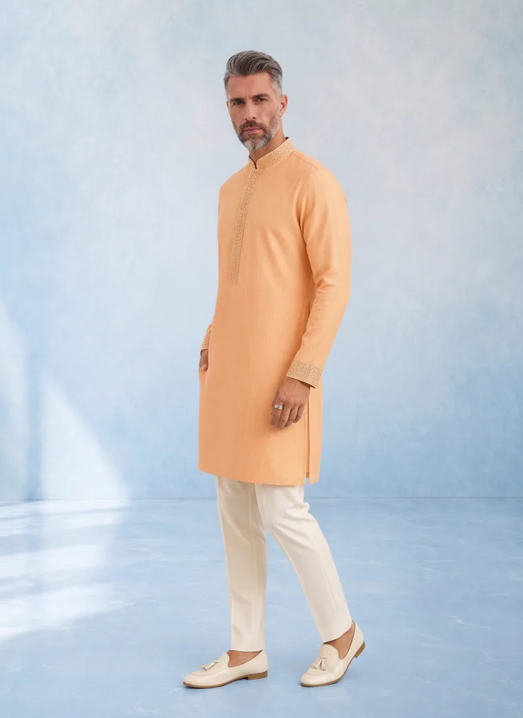
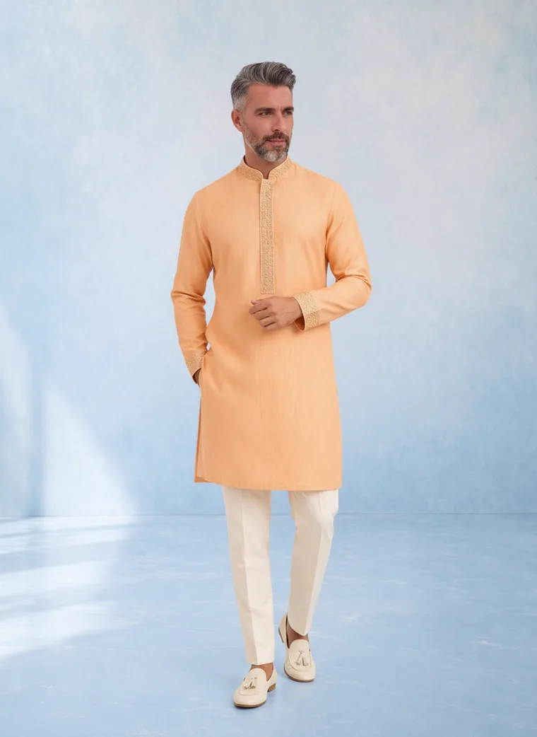
Look 03. Peach against cream. The styling is doing almost nothing, which is the point. The colour is the whole proposition.
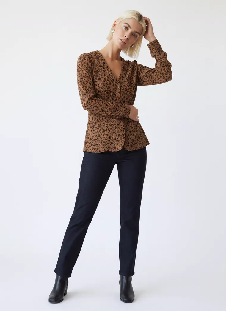
Look 10. Tobacco and indigo. Grounded rather than autumnal.
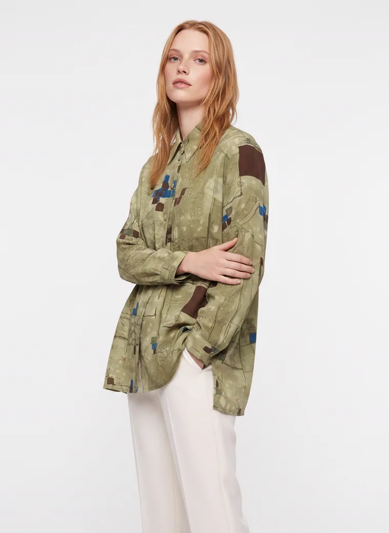
Look 08. Olive against cream, which reads almost as beige once the eye adjusts.
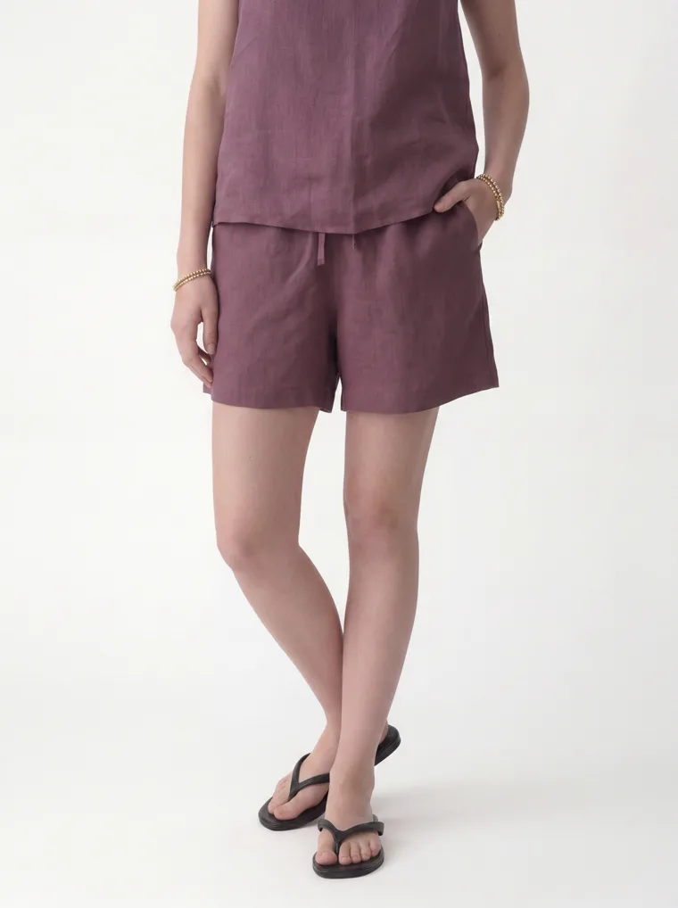
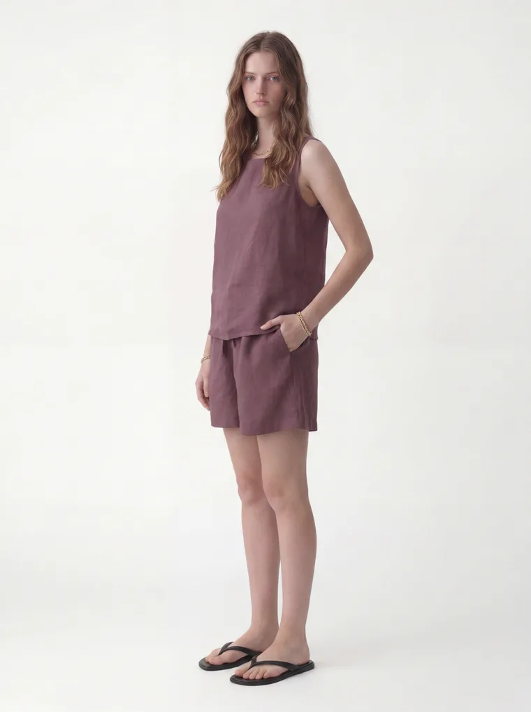
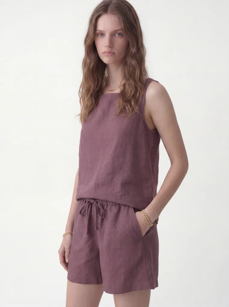
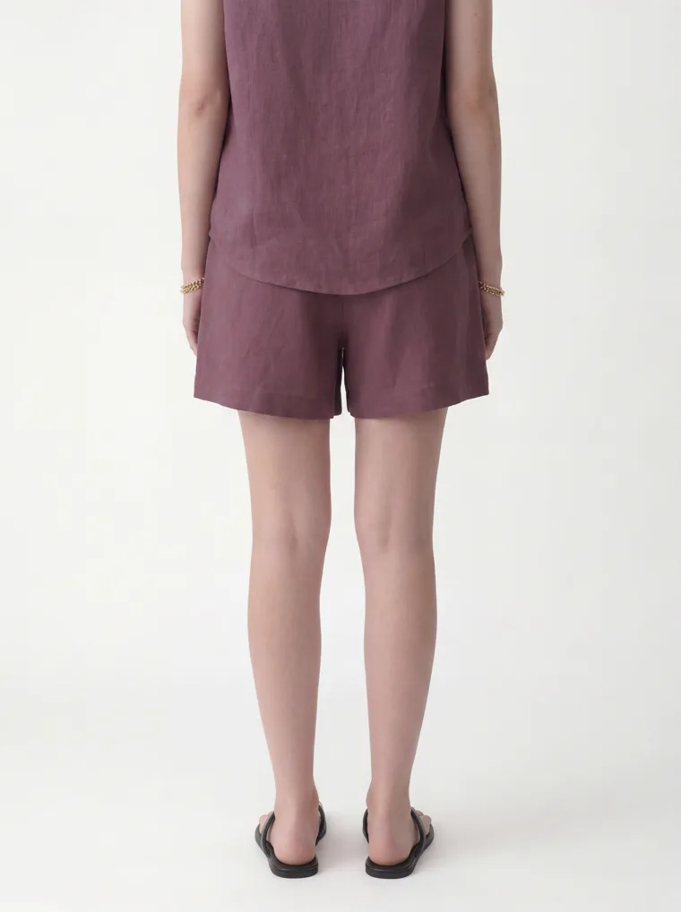
The quieter shades benefit most from the shift. The mauve linen set below is more interesting precisely because it refuses to commit. It sits between brown, plum and pink without declaring itself as any of them, and that ambiguity is what makes it feel current rather than seasonal.
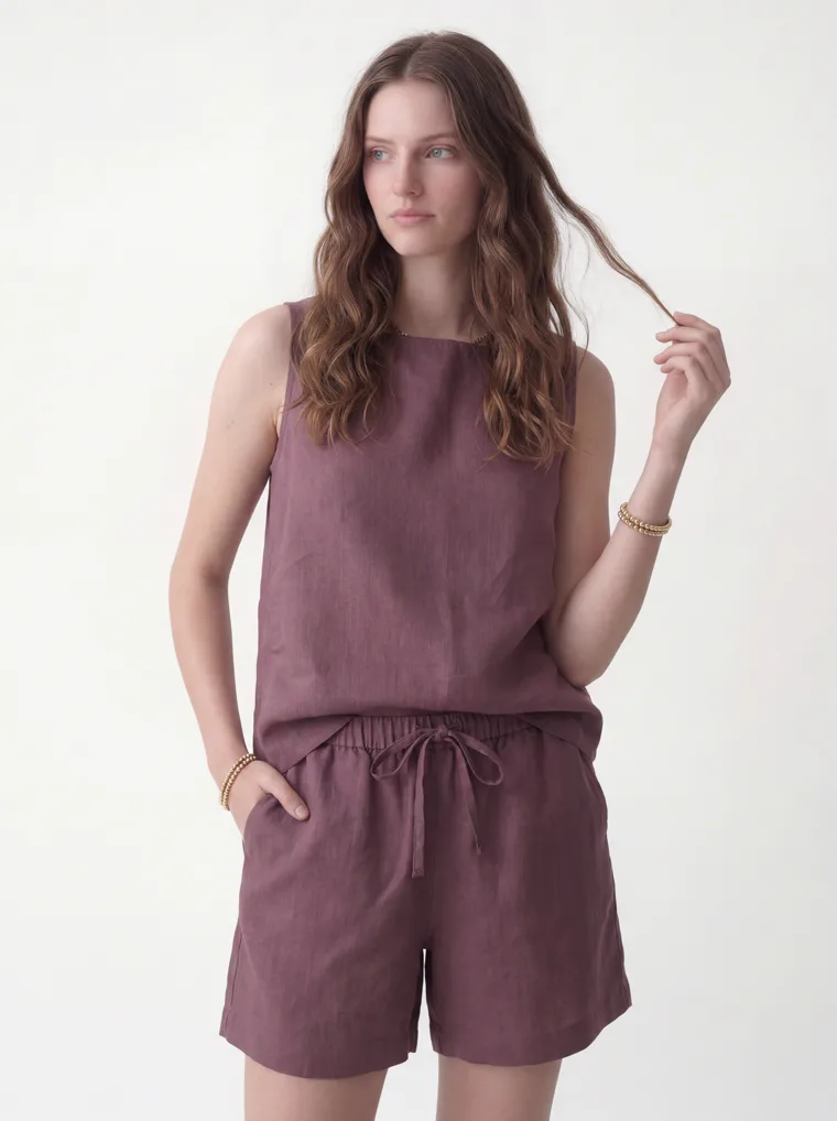
Look 11. Mauve linen. A colour that is difficult to name, which is usually a sign it will date slowly.
The useful FW26 instruction is not to buy more colour. It is to let colour carry more of the mood.
Two
Familiar clothes, easier proportions
A blazer still looks like a blazer. A sweater is still a sweater. What has gone is the stiffness.
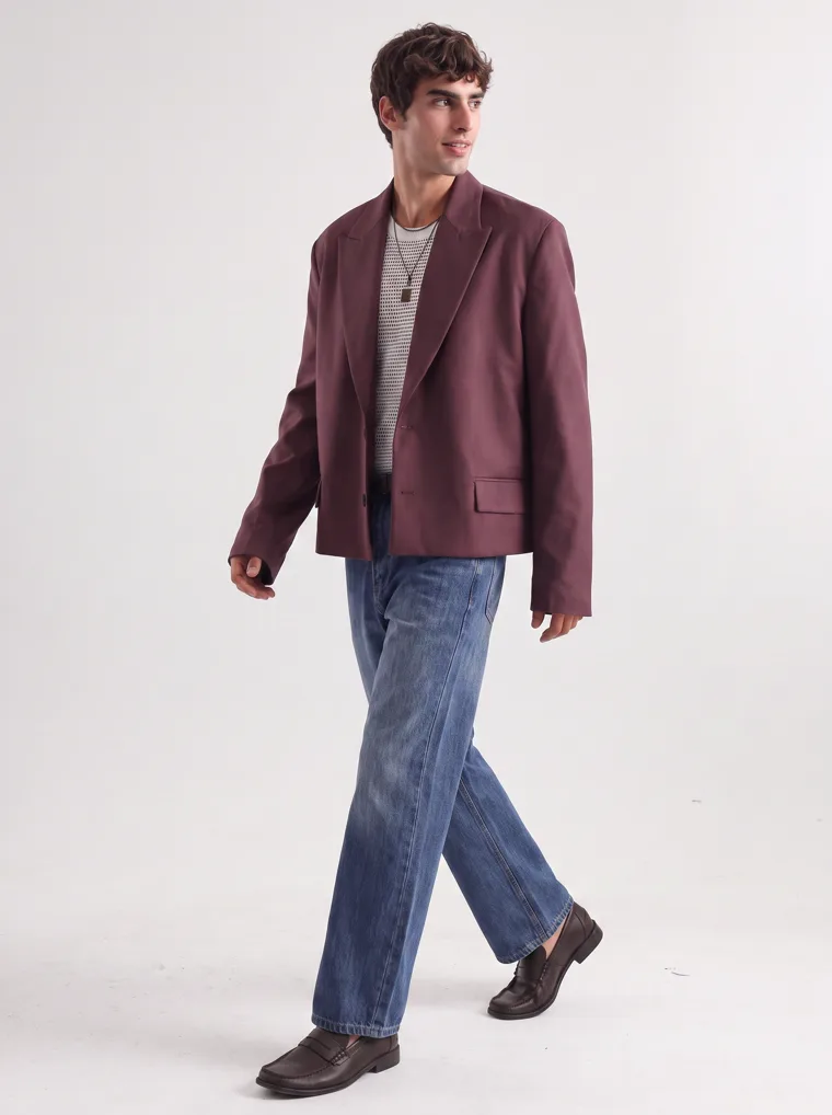
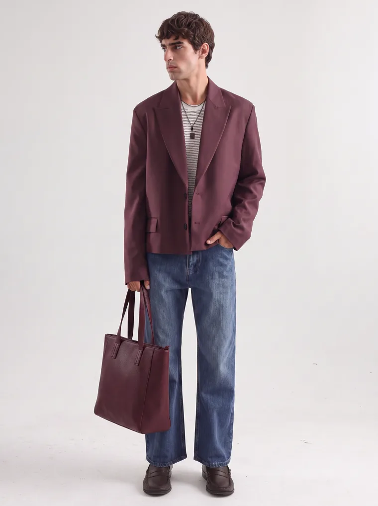
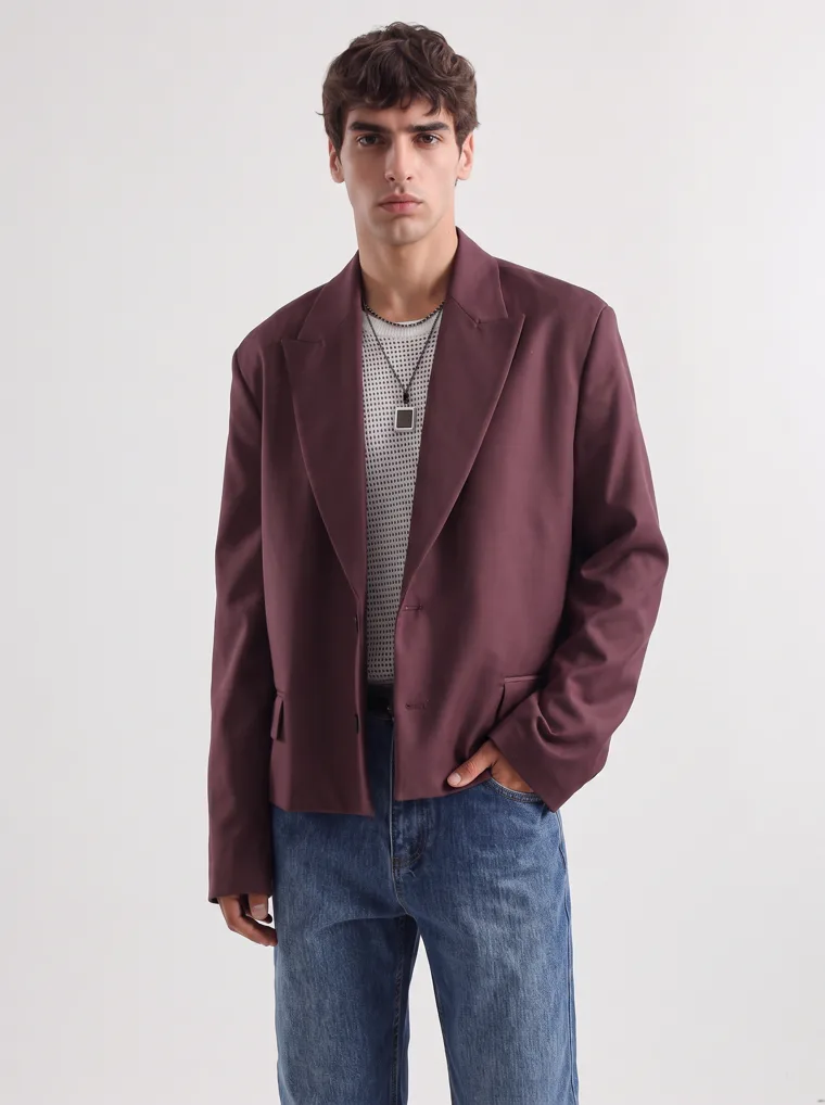
The burgundy jacket works because of what surrounds it. Denim underneath, an untucked knit, room through the body. It has structure without reading as officewear, and it is the clearest example in this edit of a runway colour arriving inside an entirely ordinary garment.
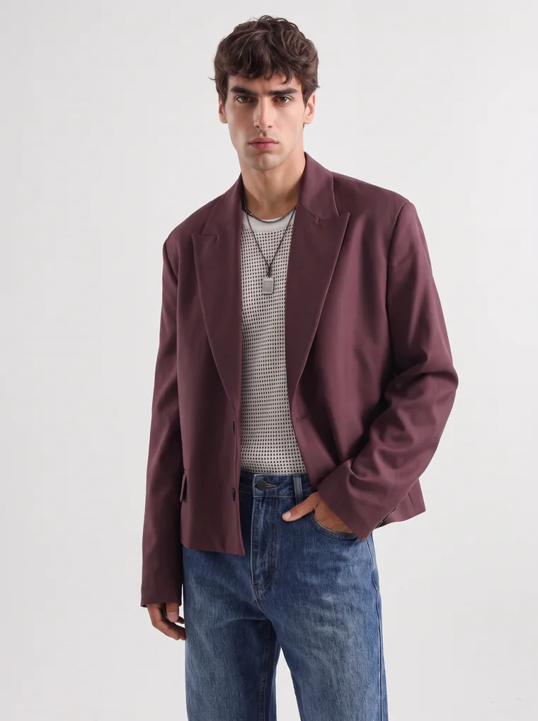
Look 02. Burgundy, which several forecasters place among the season’s defining shades, arriving as a soft blazer rather than as eveningwear.
Proportion is difficult to photograph and easy to underestimate. A garment that looks unremarkable flat can read completely differently once it moves, which is the argument for showing at least one piece per range in motion.
Look 01 in motion. The bomber holds its shape while the trousers move, which is the balance the whole season is trying to strike.
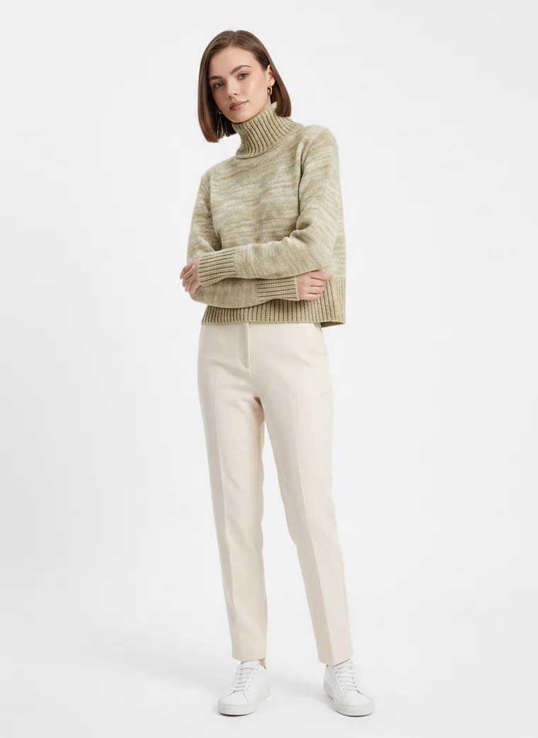
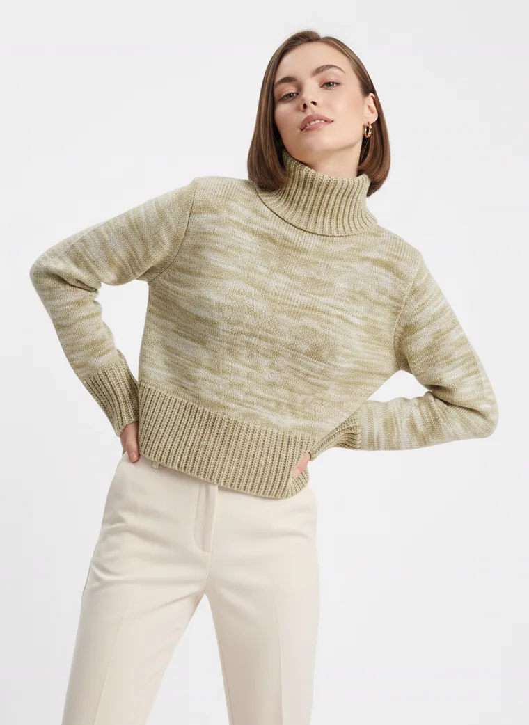
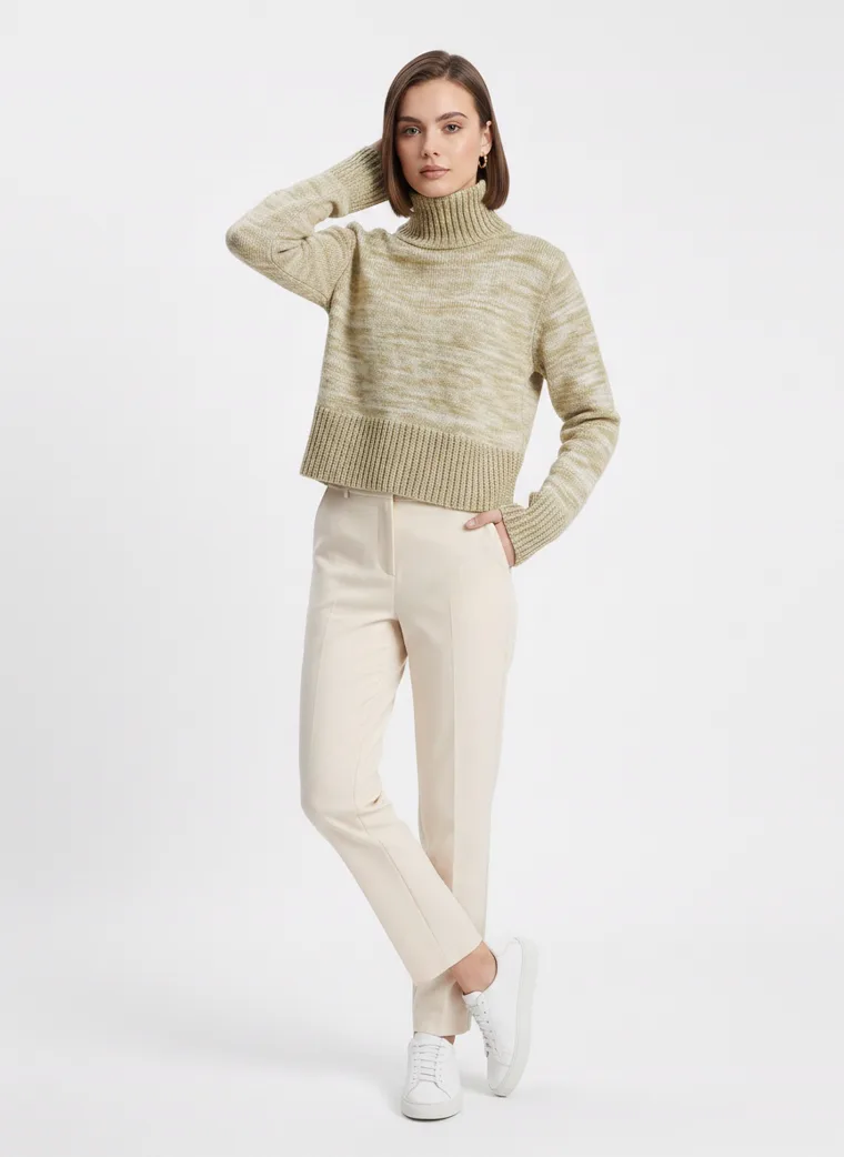
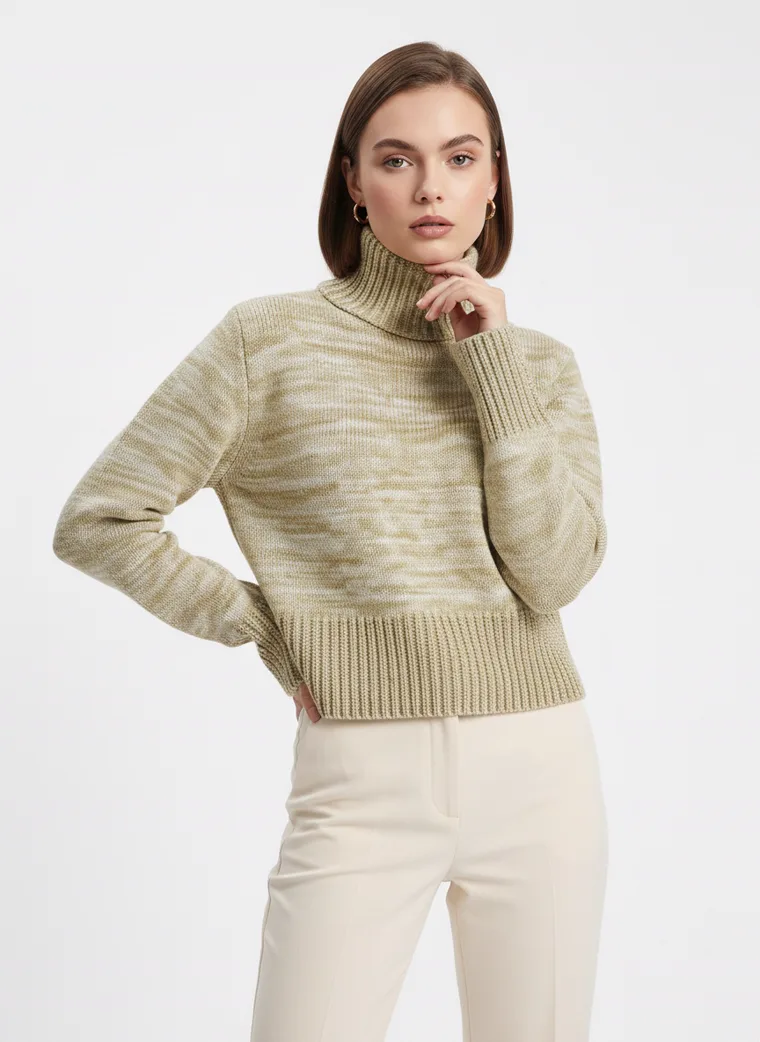
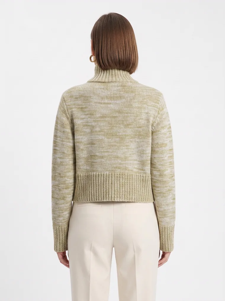
The knit does the opposite of the blazer and arrives at the same place. Soft, close enough to hold a shape, never severe. Sage against cream, one more warm neutral doing the work black used to do.
Look 09. Soft knit in sage.
Clean rather than rigid, shaped rather than over styled. That balance is probably the most commercially useful thing about FW26, because it does not require an exaggerated runway proportion to feel current. Usually the difference is a little more room, a softer trouser, or a knit allowed to be the entire look.
Three
The set became a uniform
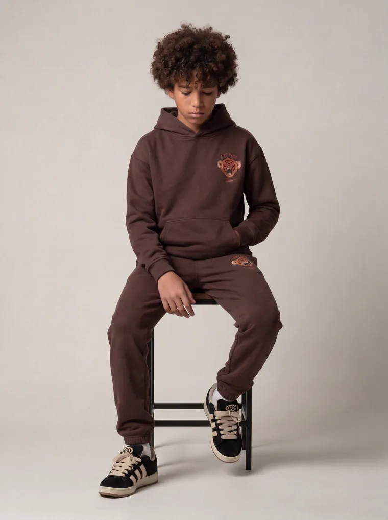
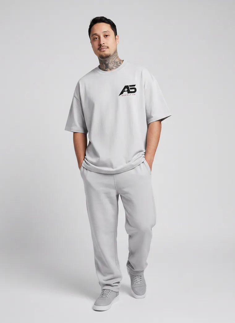
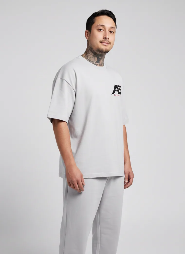
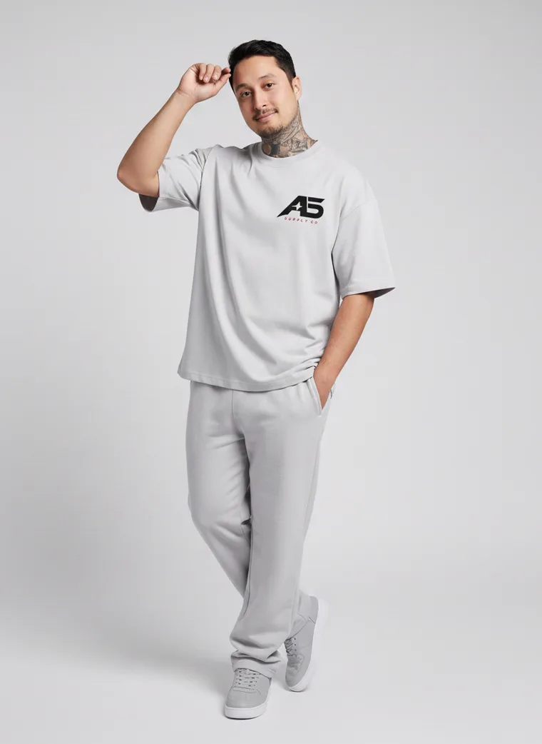
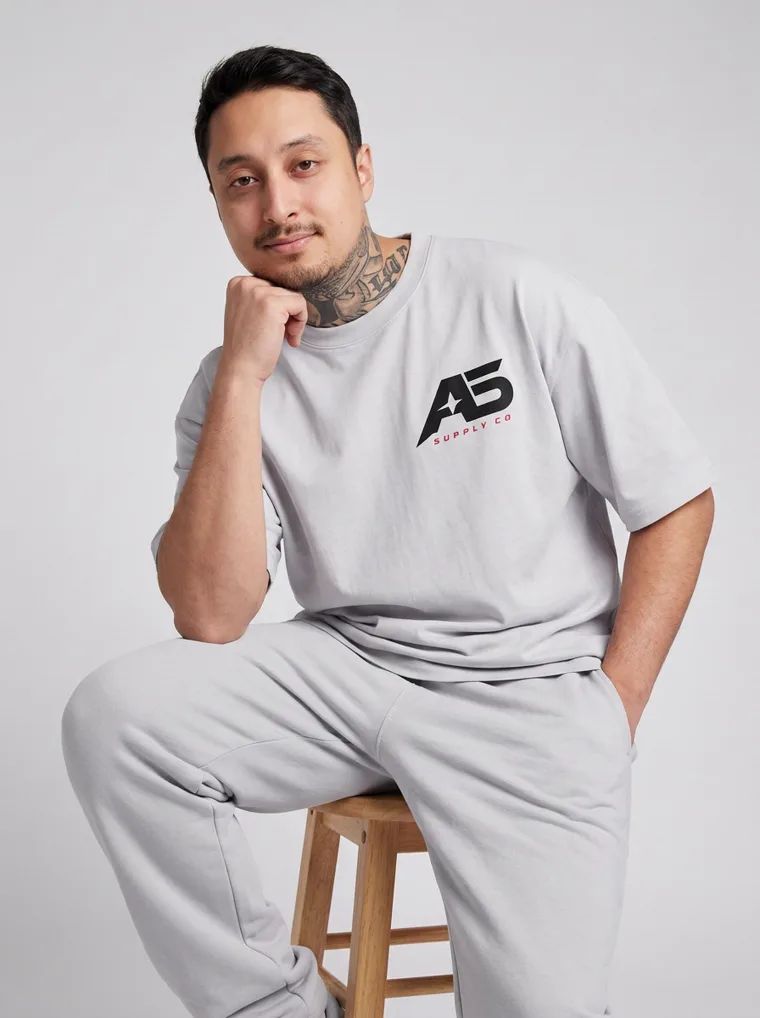
Look across the twenty and one idea appears more than any other. One colour, top and bottom, very little negotiation in between.
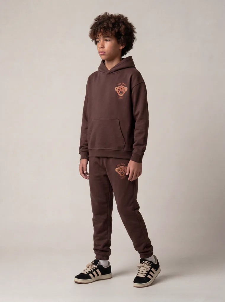
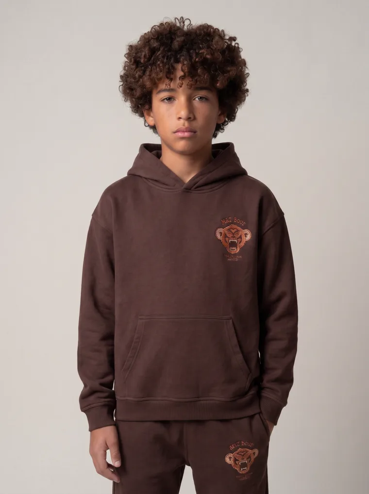
It is not confined to activewear. It runs through menswear, kidswear, loungewear and gym ranges without changing shape, which is unusual for a trend and a strong signal that it is a structural shift rather than a seasonal flourish.
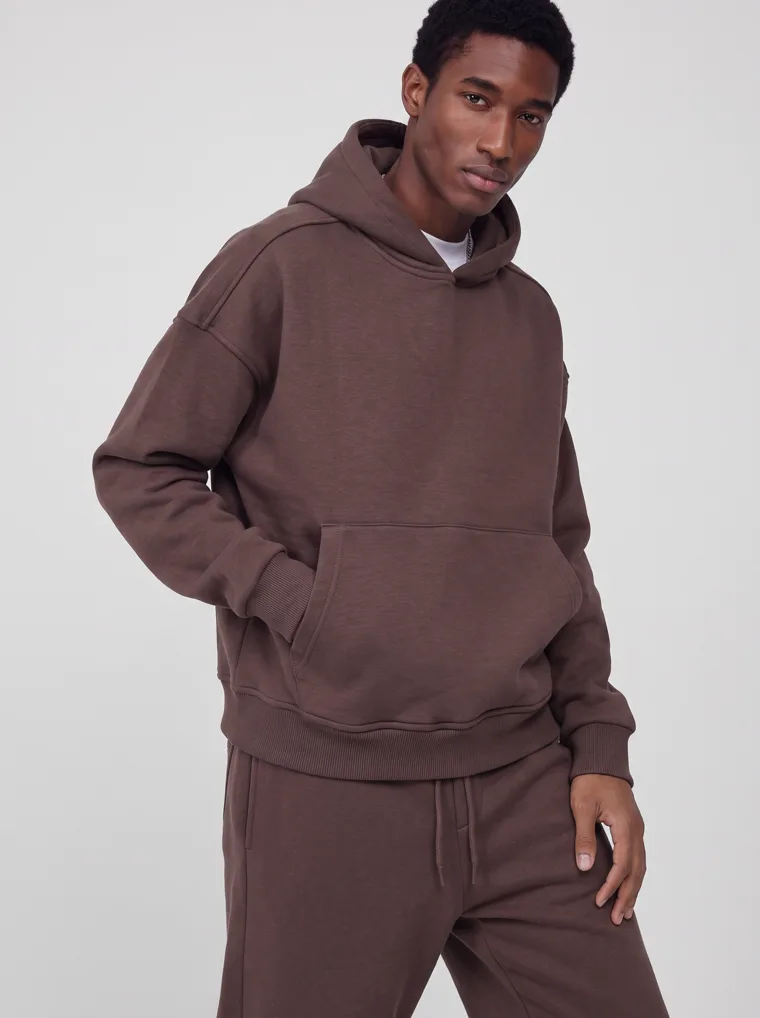
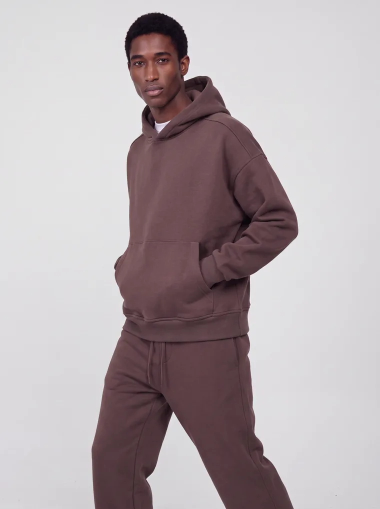
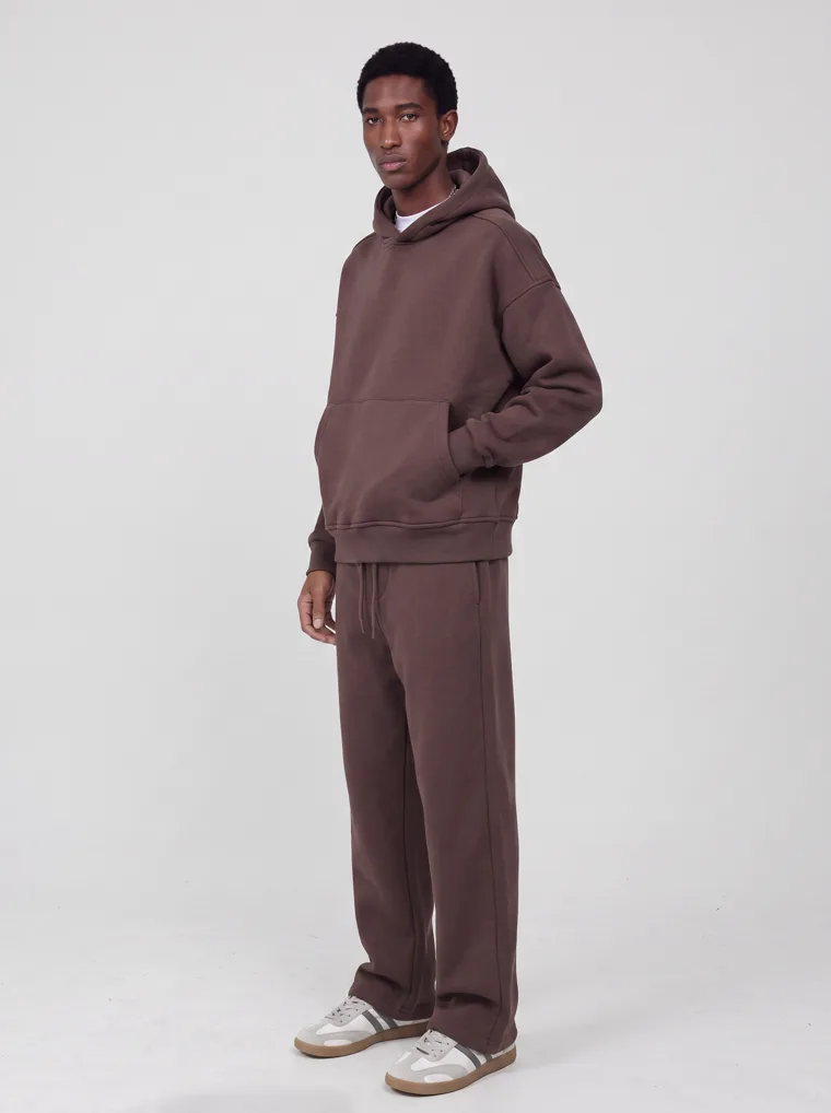
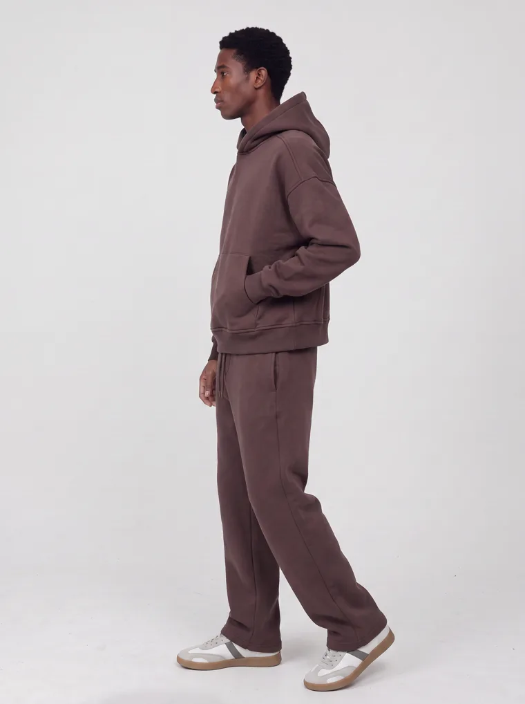
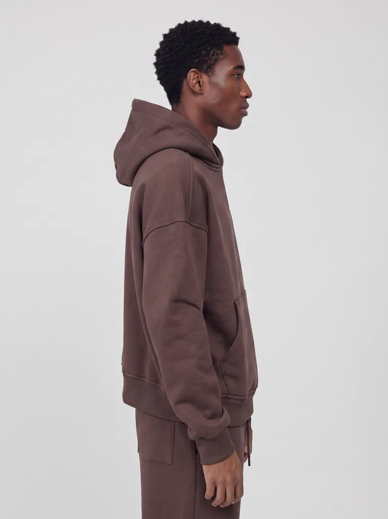
Chocolate
Chocolate
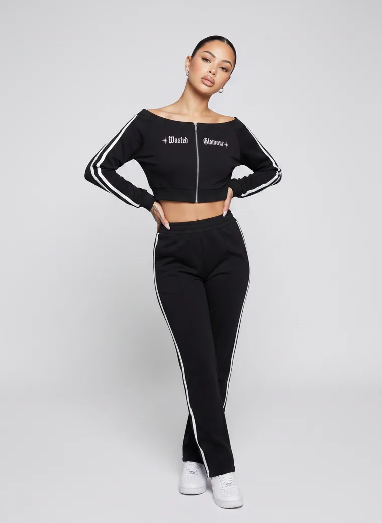
Black
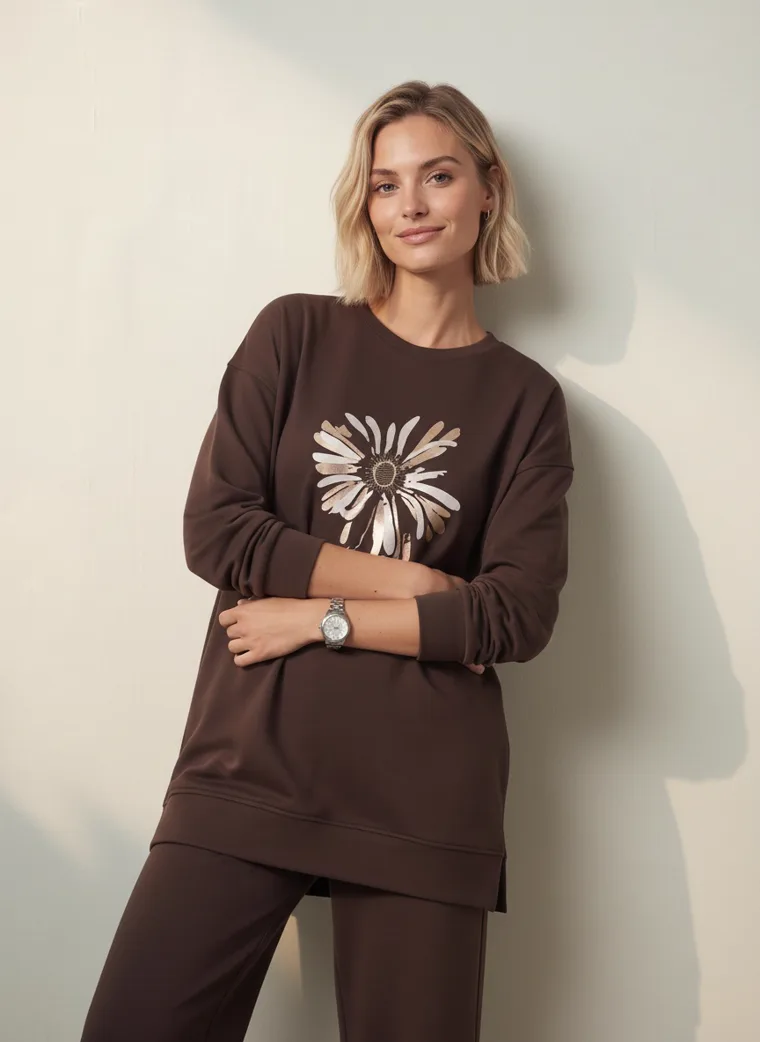
Chocolate
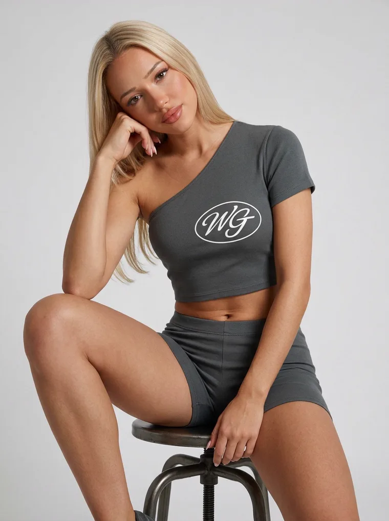
Charcoal
Menswear, kidswear, womenswear, loungewear, gym. Five different jobs, one identical visual logic.
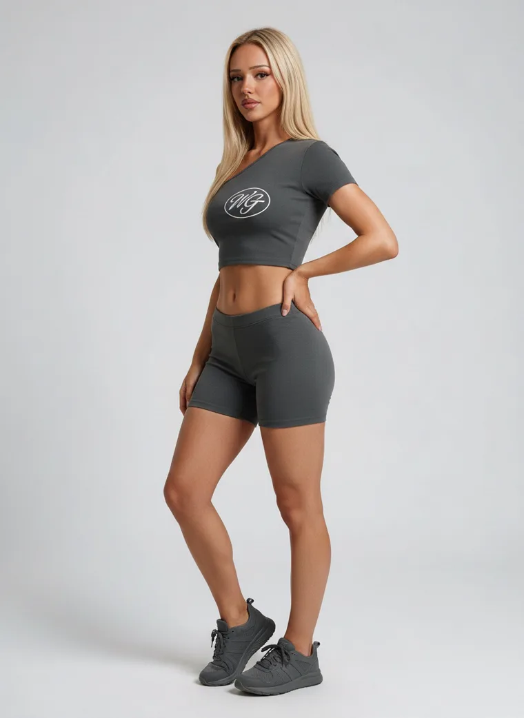
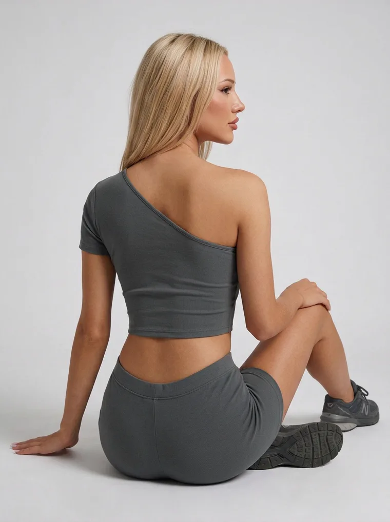
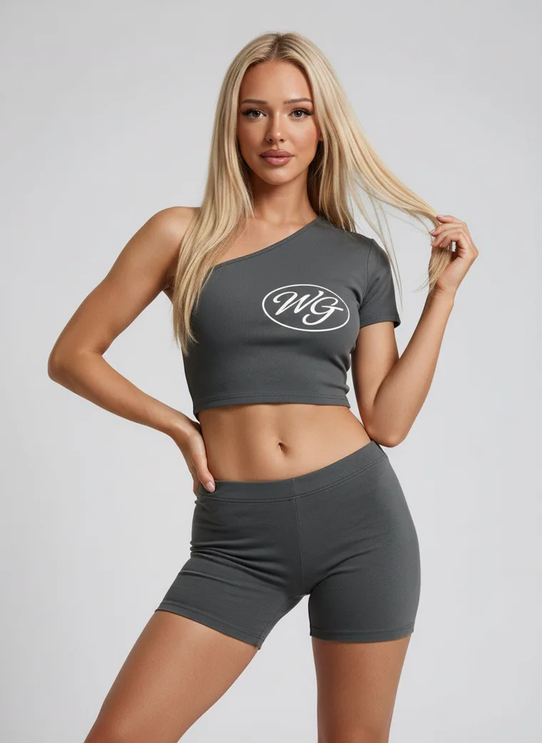
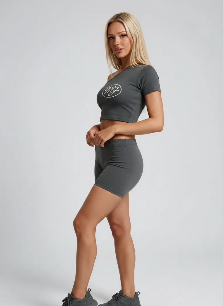
A tonal set creates a silhouette before it creates an outfit. There is less styling noise, so proportion becomes easier to read. A hoodie and sweatpant start to feel intentional. A crop top and short become one graphic shape. A lounge set can leave the house without looking like sleepwear.
Commercially it does something else too. It sells two pieces as one decision, and it removes the styling question that stops people buying. For a range with plenty of runway complexity above it, the simpler translation may be the more useful one. Make fewer pieces compete with each other.
Four
Sport stopped announcing itself
Activewear used to arrive with a full set of signals. Running shoe, technical fabric, gym setting, performance pose. That border has almost disappeared.
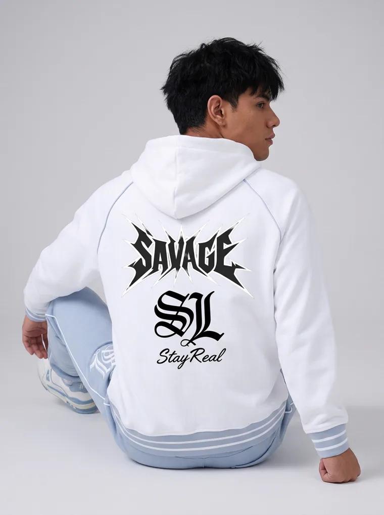
Look 05. A hoodie that sits inside streetwear without needing to explain itself.
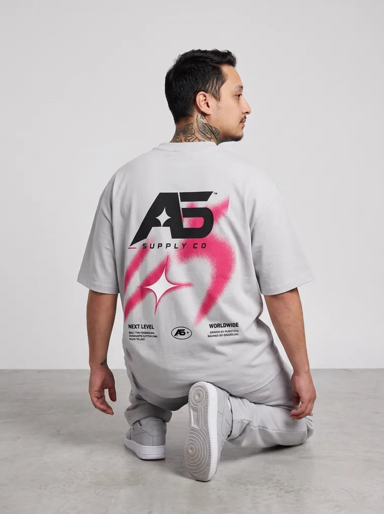
Look 06. Tonal grey, worn as an outfit rather than as kit.
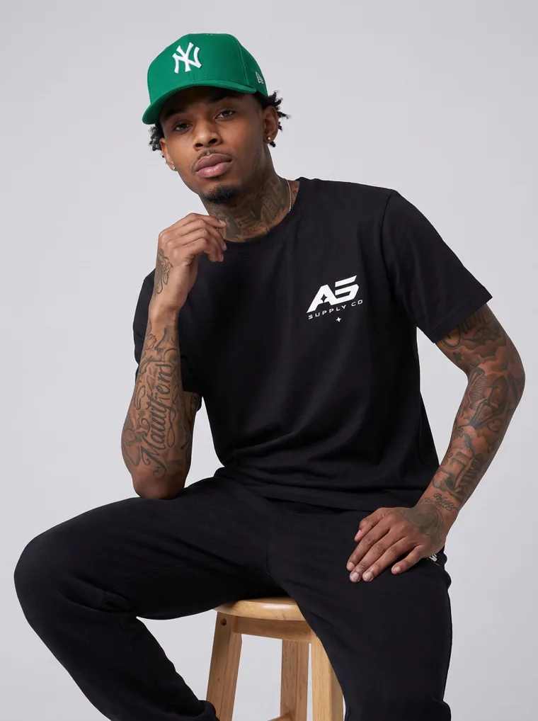
Look 07. The cap doing as much styling work as a jacket would.
The womenswear version makes the commercial point most clearly. Nothing here has been elevated through an elaborate setting. The colour does it, the silhouette does it, and the way it is worn does it. Sport no longer needs a separate visual language of its own.
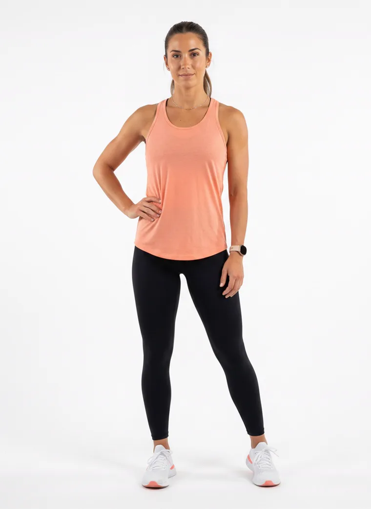
Look 17. Peach again, this time on a gym vest. The season’s palette does not stop at the studio door.
Five
When the shape stays simple, the surface talks
A more expressive season does not mean more pieces per outfit. Often the silhouette stays almost aggressively plain and all the personality moves onto the garment itself.
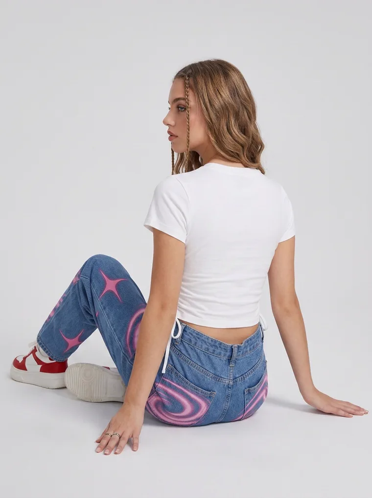
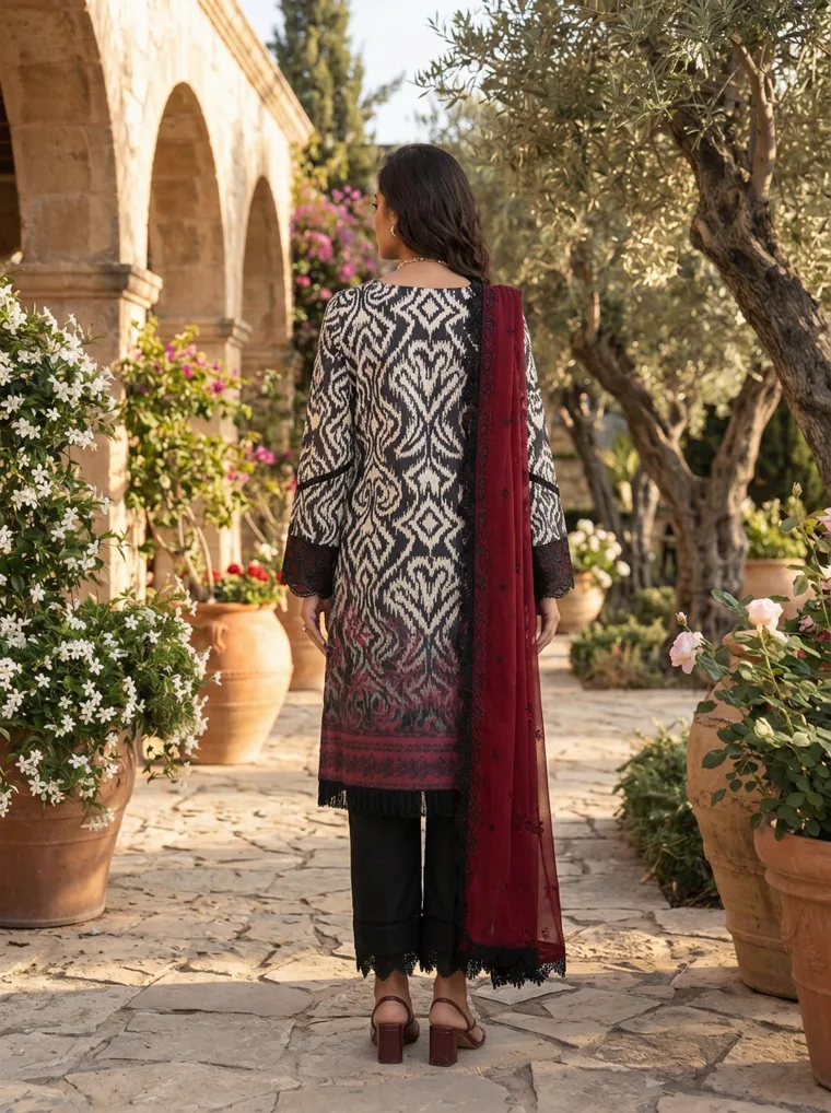
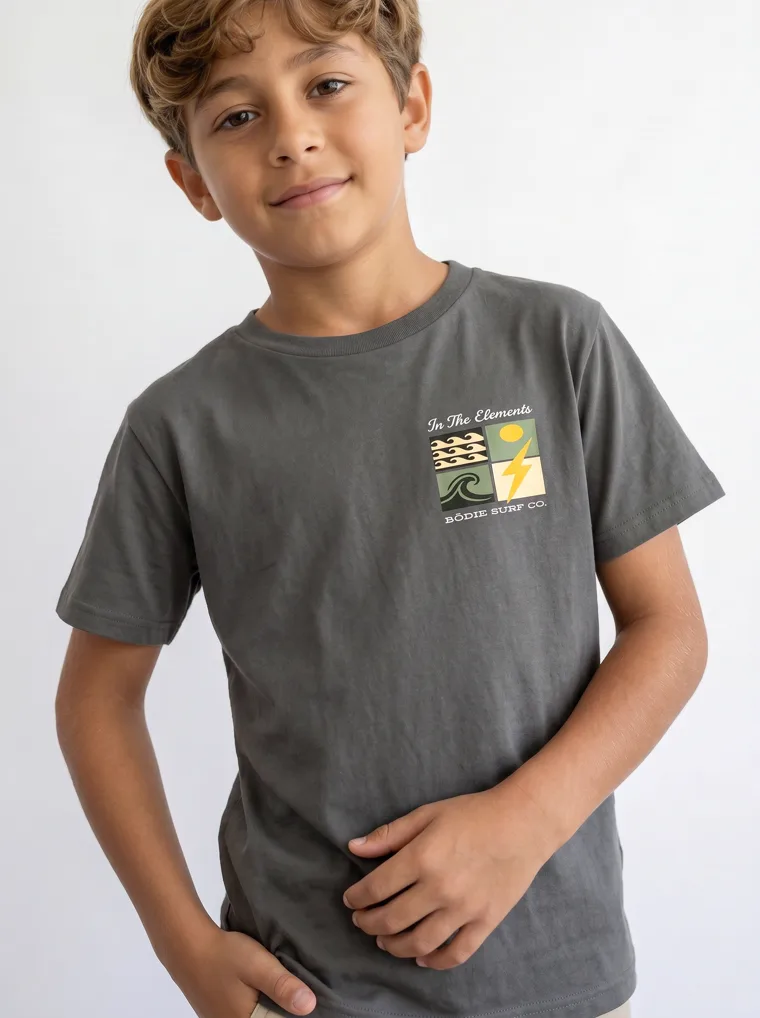
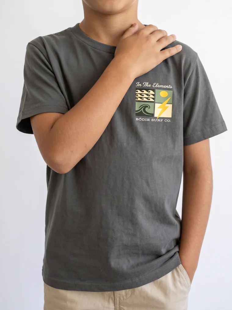
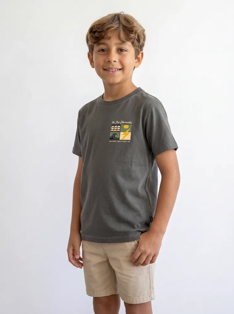
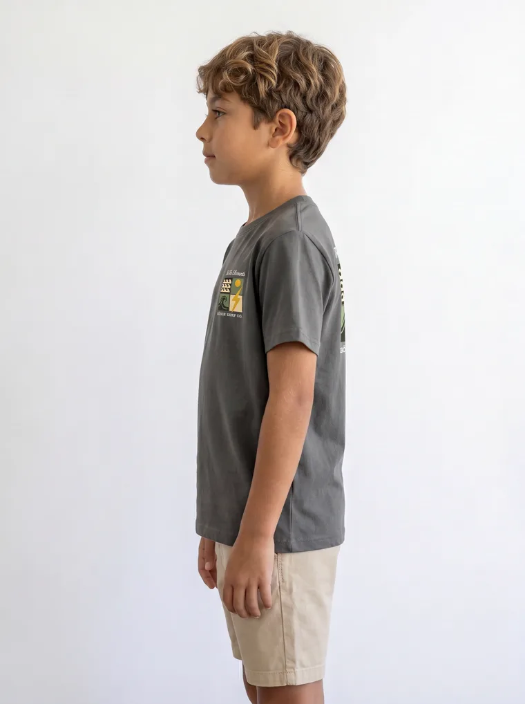
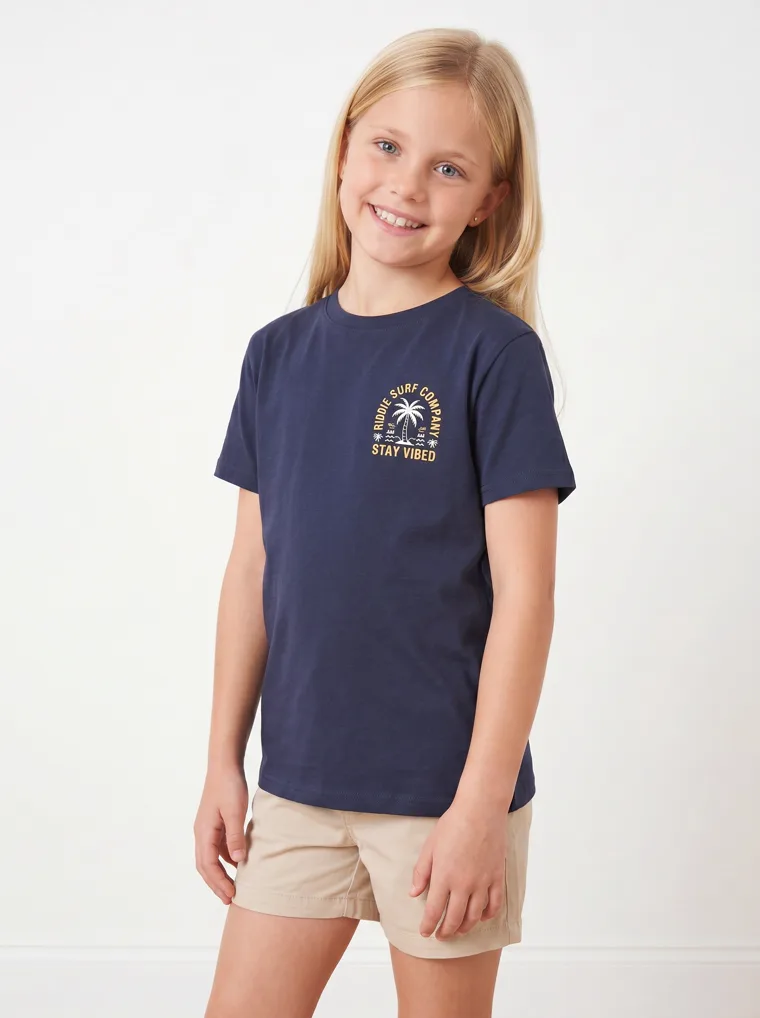
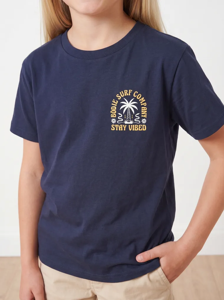
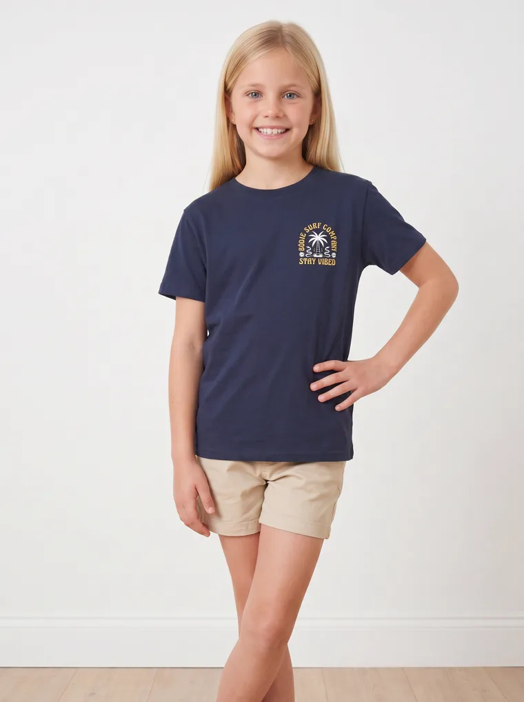
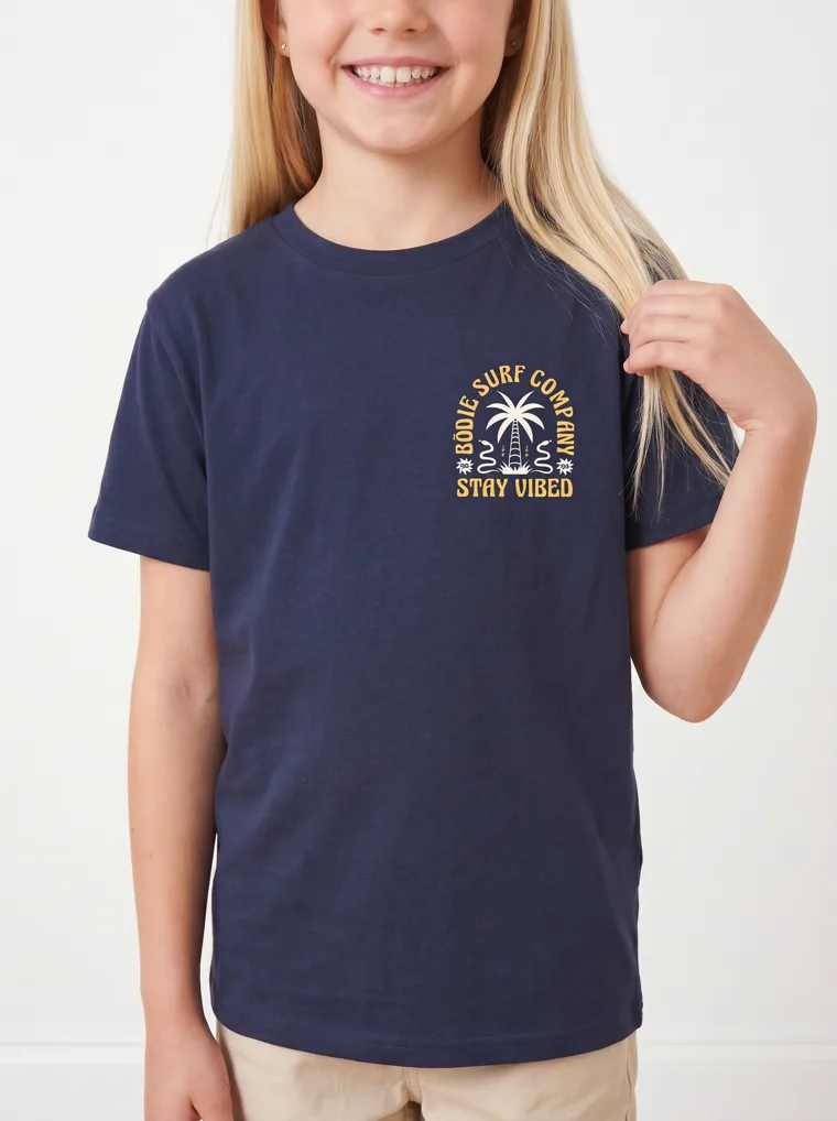
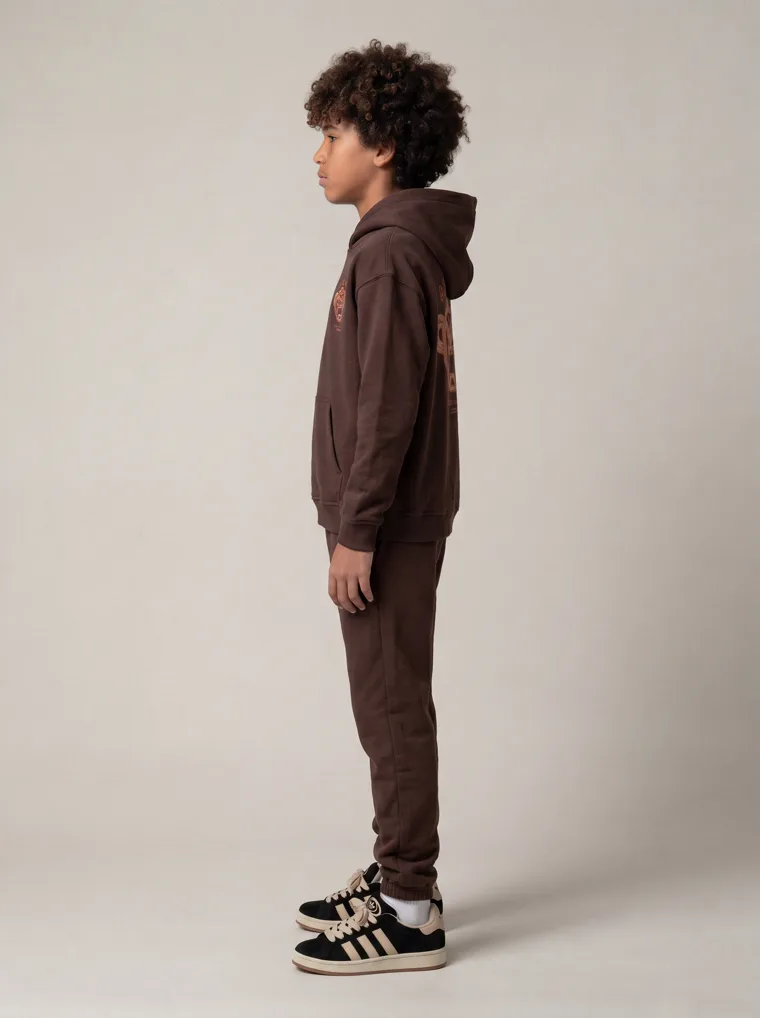
A grey kids tee is a grey kids tee, until the graphic becomes the reason you look twice. Worth noting for anyone photographing these: on a graphic piece the back view is not an optional extra, because the back is frequently where the design actually lives and often the reason someone buys.
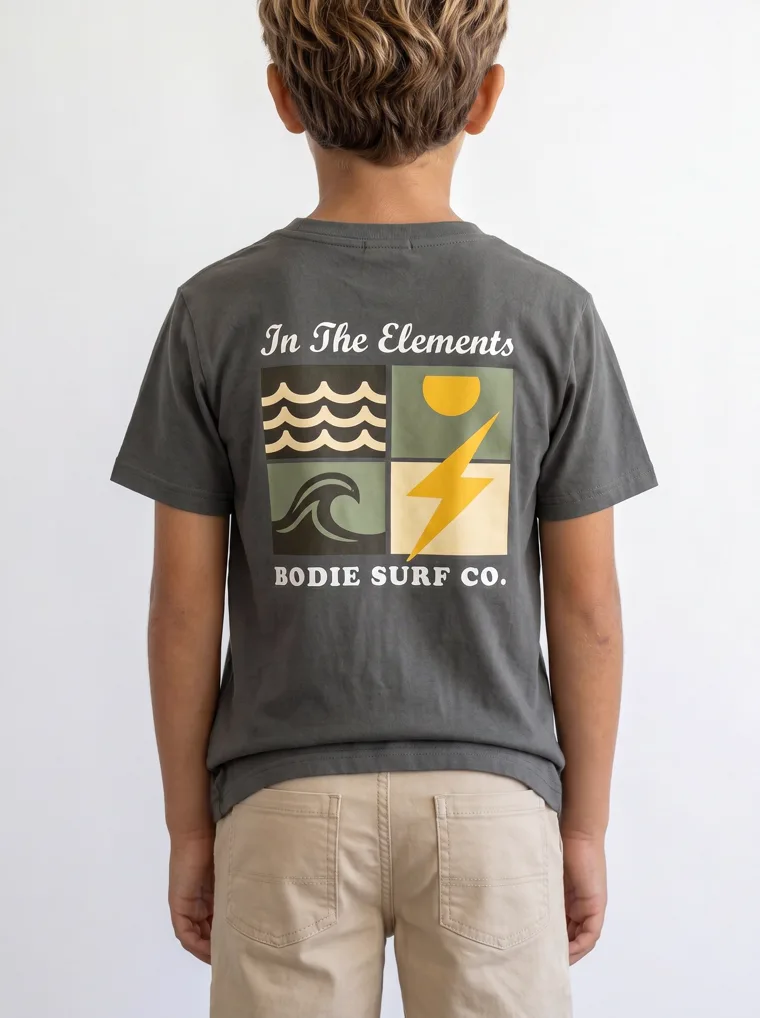
Look 18. The back view is the product.
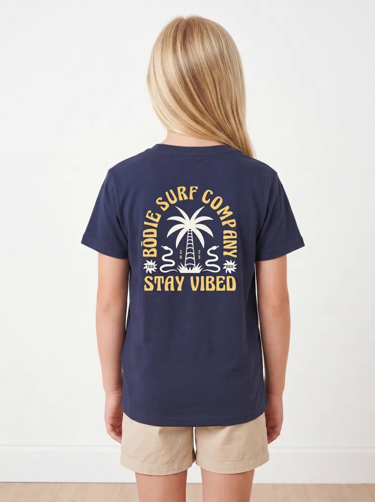
Look 19. Same logic, different range.
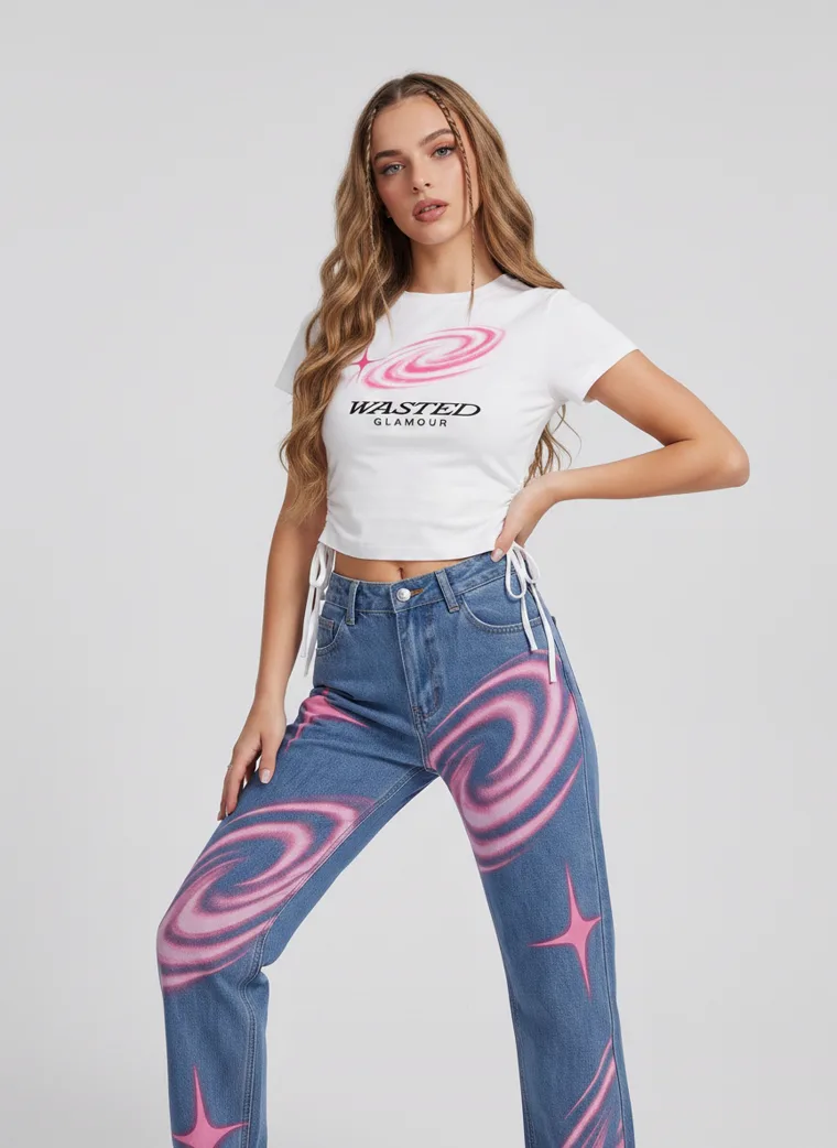
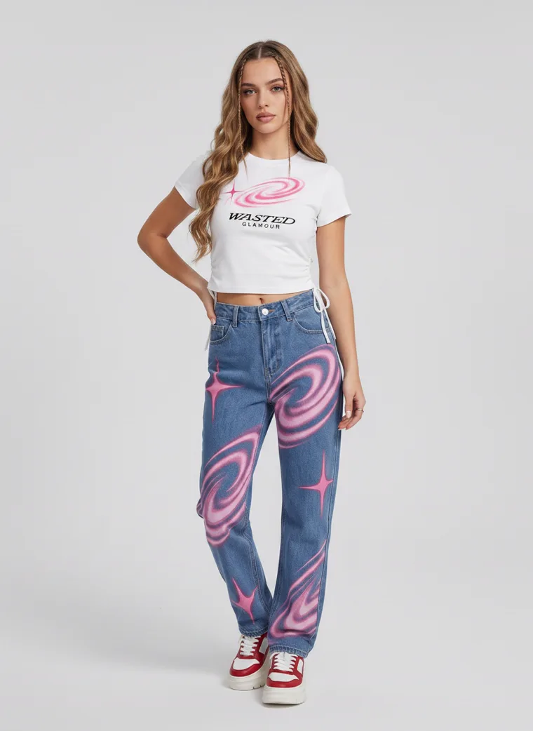
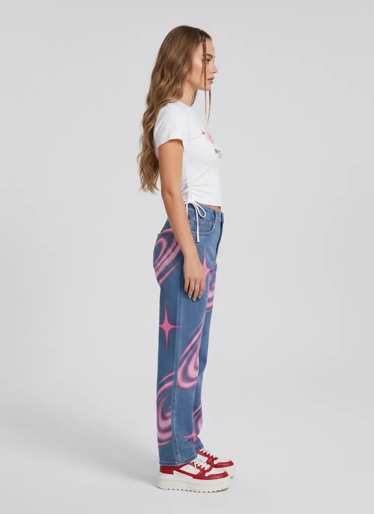
It gets louder when the surface moves across an entire trouser. At that point the print stops being a detail and becomes the reason the product exists.
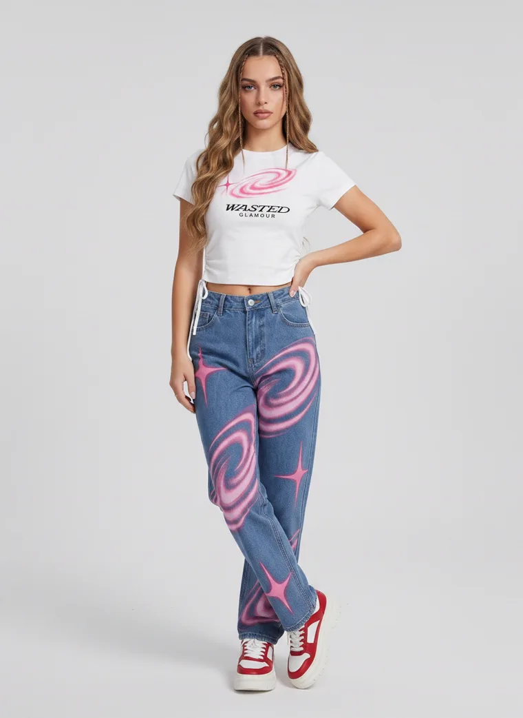
Look 13. A plain tee, deliberately, so the trouser can carry everything.
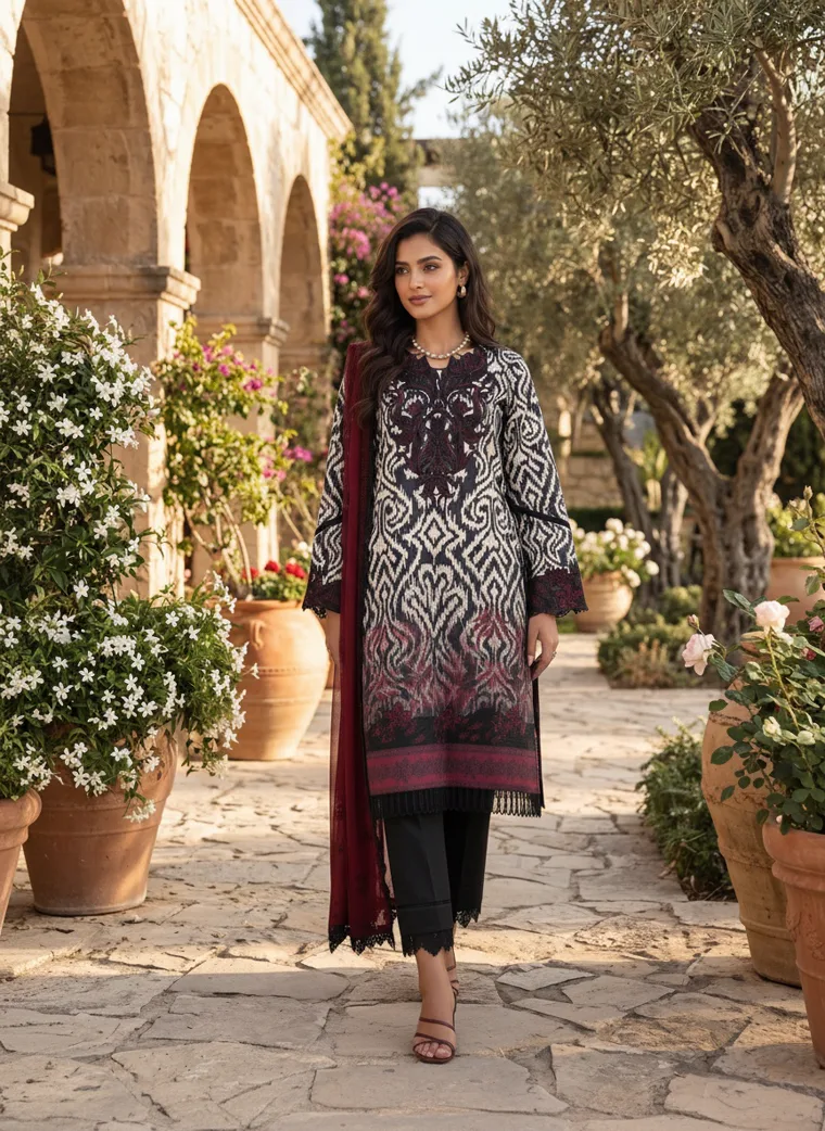
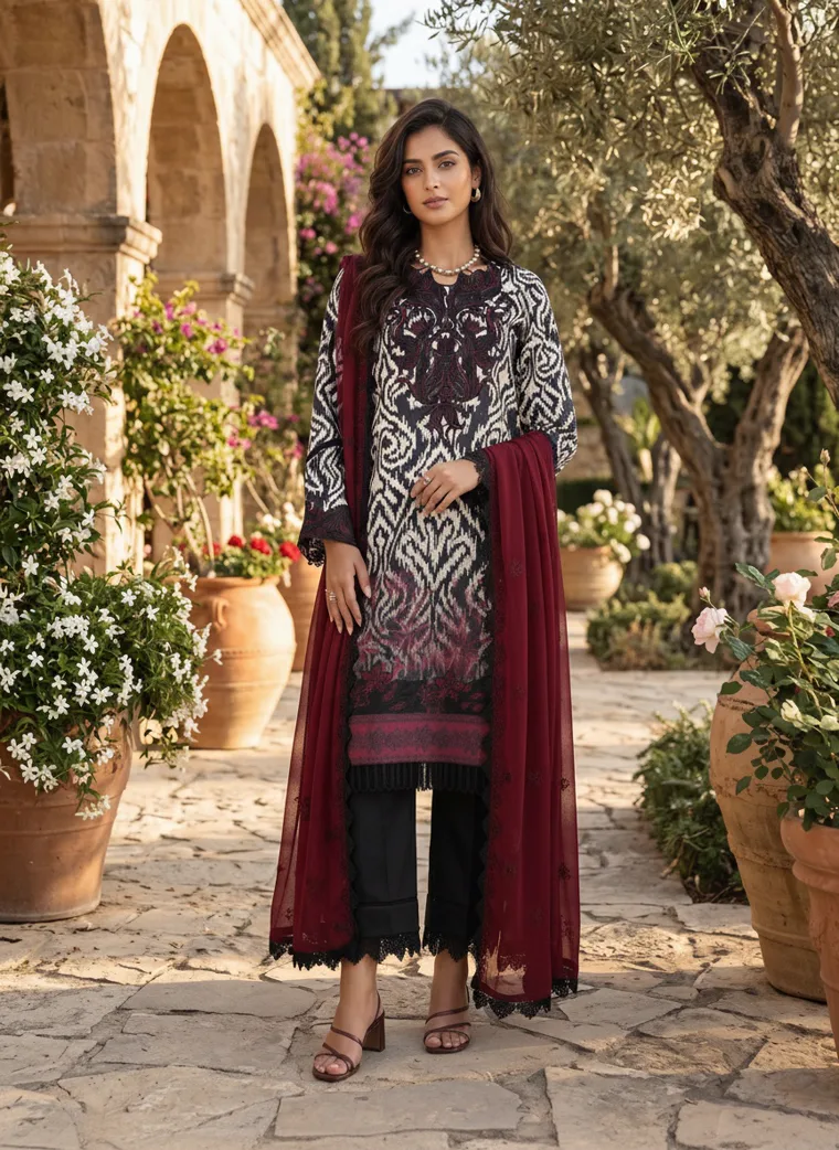
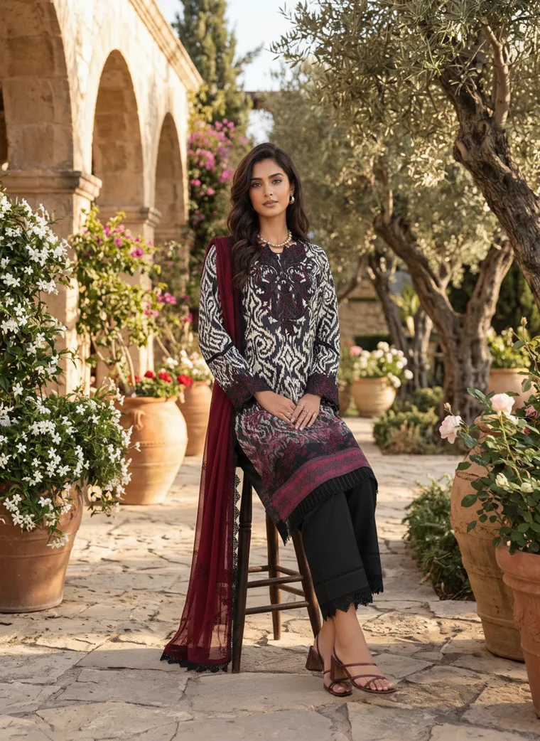
The printed ethnicwear look takes the idea furthest. Here pattern is not a detail applied to a garment. It is the entire visual identity of the piece, and it does not need to share a category with a graphic tee for the underlying idea to connect.
That is worth sitting with. A season is not twenty brands producing the same outfit. It is twenty different brands starting to speak with some of the same visual grammar.
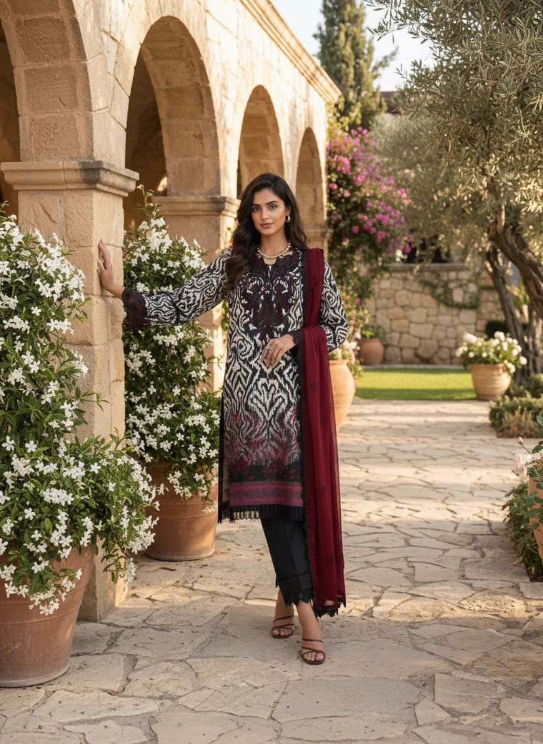
Look 14. Print as the entire proposition, and burgundy arriving again, this time as a dupatta.
What the runway sent that did not arrive
It would be dishonest to present these twenty looks as a complete picture of the season. The loudest FW26 runway stories are almost entirely absent from them. Coveteur reported texture as the season’s focal point, with fur, shearling and fringe at Bottega Veneta and layered sequins at Chanel. Fashion Magazine and Who What Wear both flagged tuxedo dressing, ladylike skirt suiting, dark romance, head to toe tomato red and thigh high boots.
None of that is in this edit, and that is the honest shape of a season. Spectacle is expensive to produce and narrow in appeal, so it stays on the runway or appears in small quantities. Colour and proportion cost nothing extra to adopt and sell across a much wider customer base, which is why they travel. If you are planning a range rather than a show, those are the two signals worth following.
FW26, once it becomes real clothing
Seen together, these twenty looks do not resemble one collection, and they should not. A kids tee, a kurta, a knit, a tracksuit and a burgundy blazer are made for different people, different stores and different reasons.
What connects them is quieter than a trend. The colours carry more warmth. The silhouettes have more ease. Tonal dressing simplifies the outfit. Sportswear moves freely into everyday clothing. Print and graphics bring character back without demanding a maximalist wardrobe.
The runway gives direction, not instruction. The job is not to make every product look like fashion week. It is to work out which parts of the season already belong to your collection, and let those shape how the collection is seen.
The Edit
Twenty looks in full
Five frames each. Grouped by category rather than by trend, because that is how a range is actually built.
Womenswear
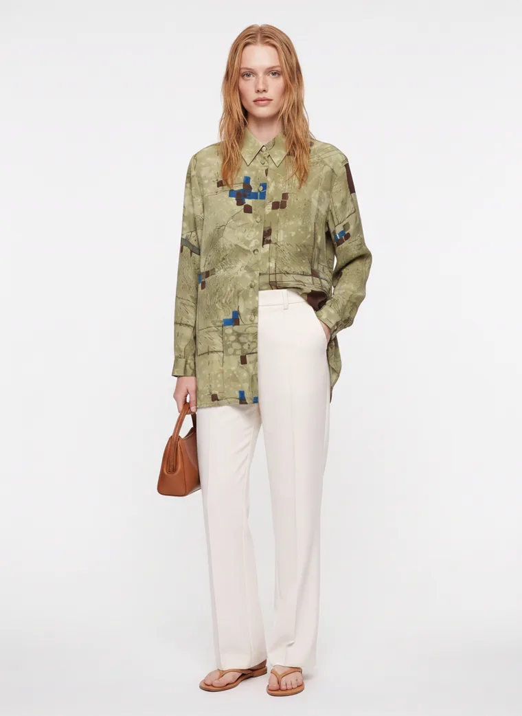
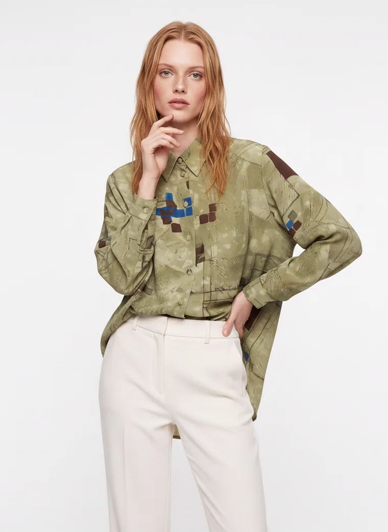
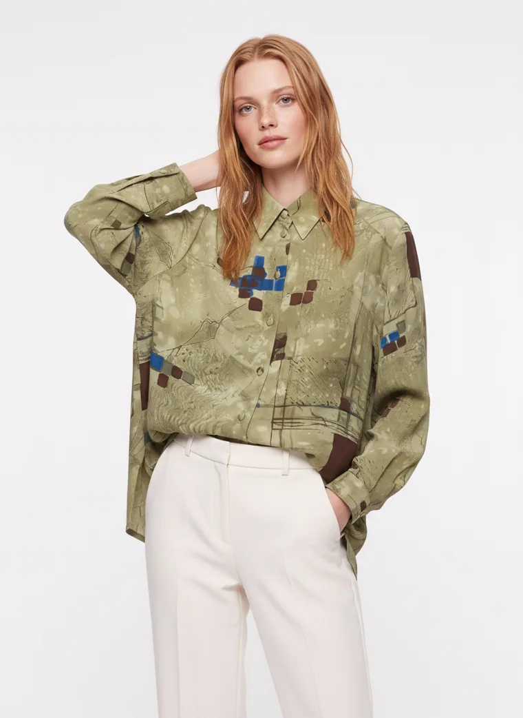
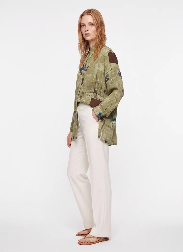
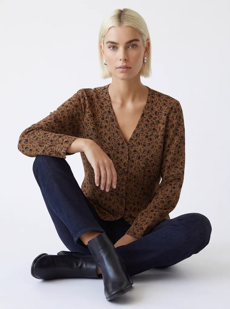
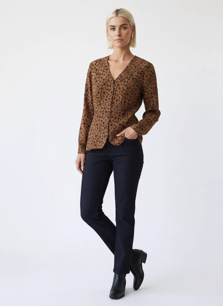
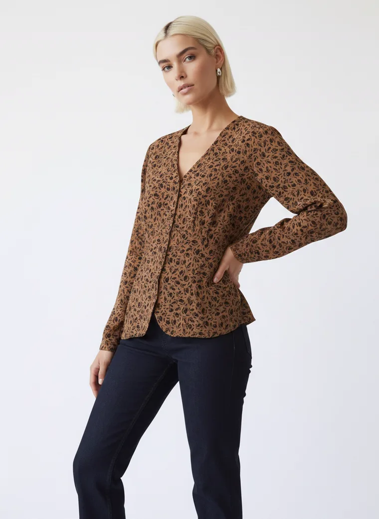
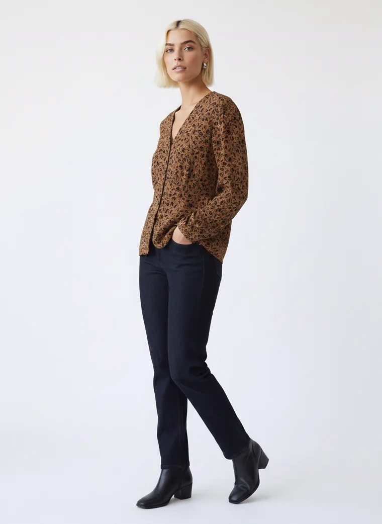
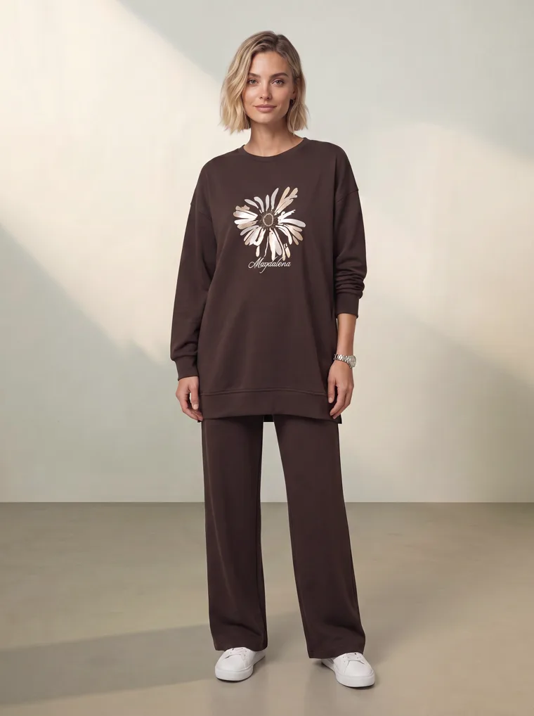
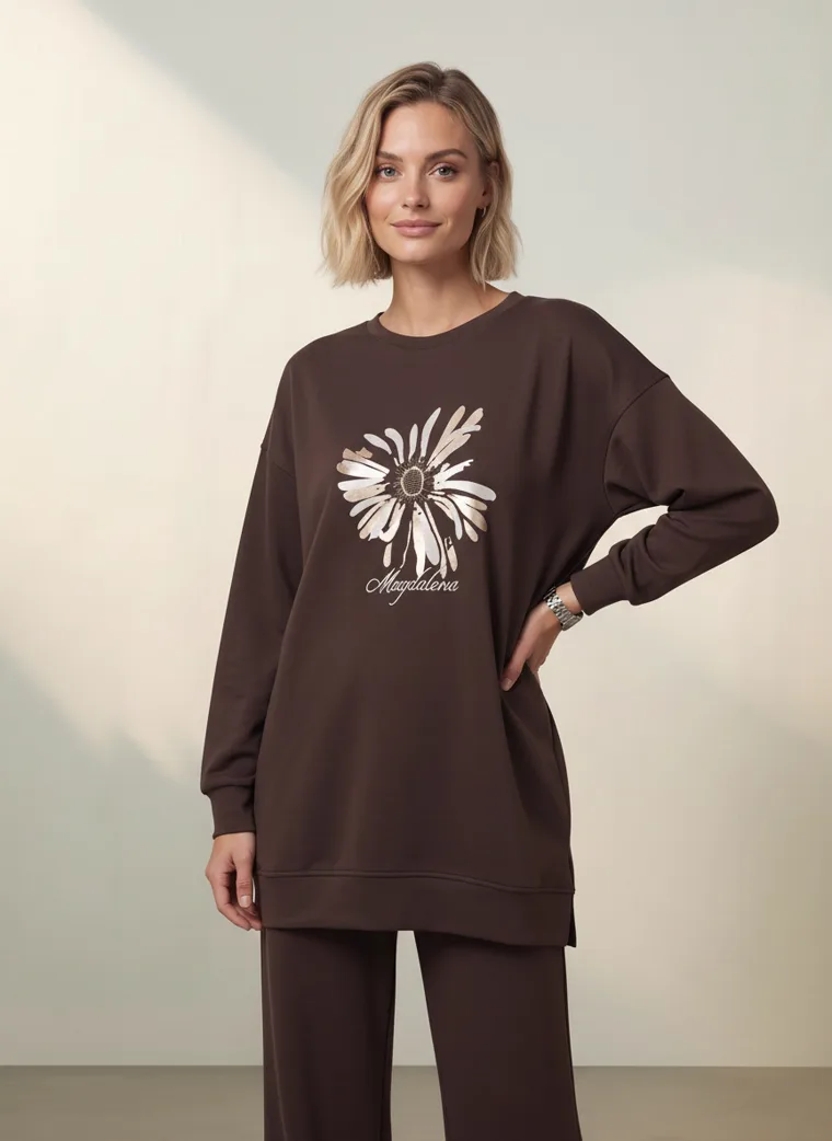
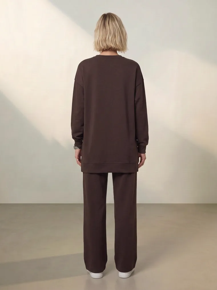
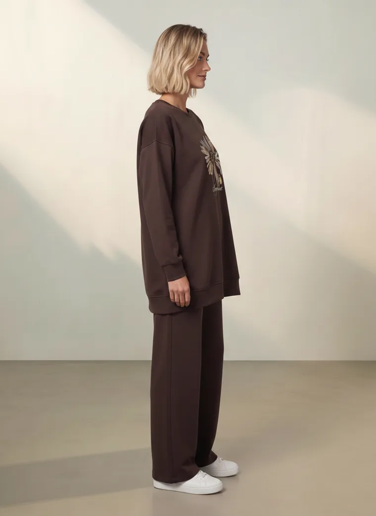
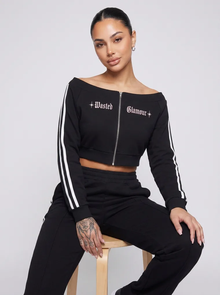
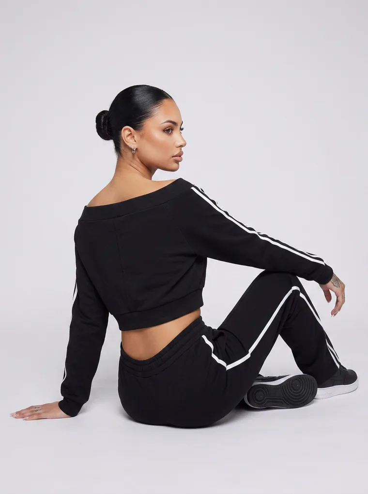
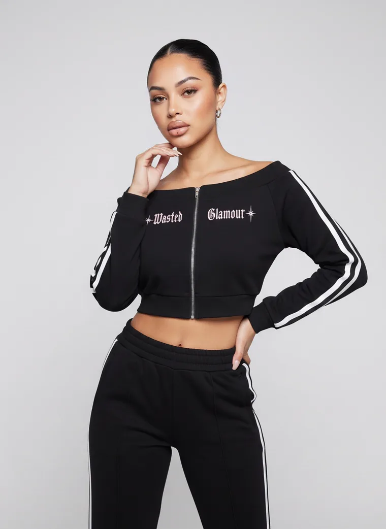
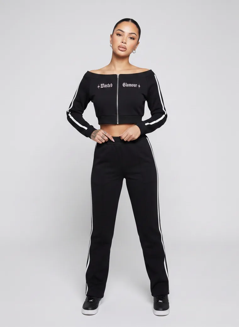
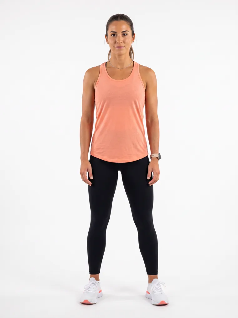
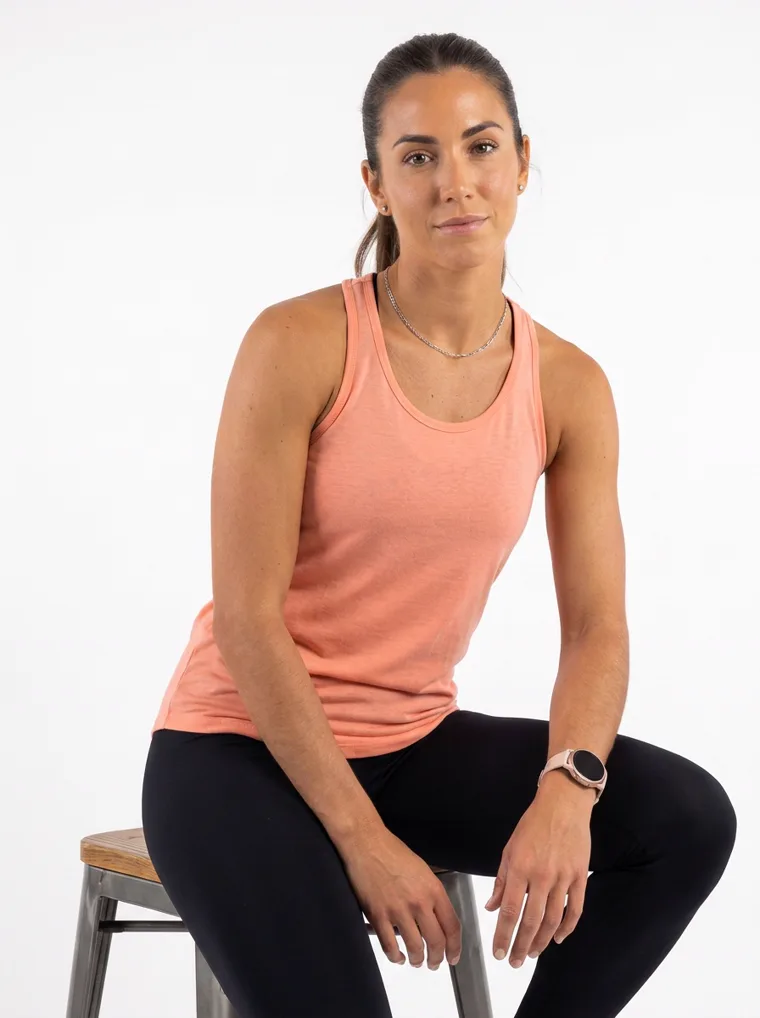
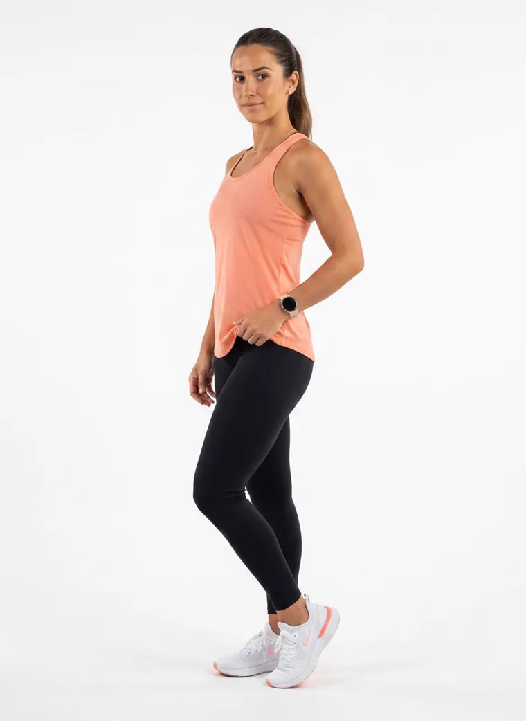
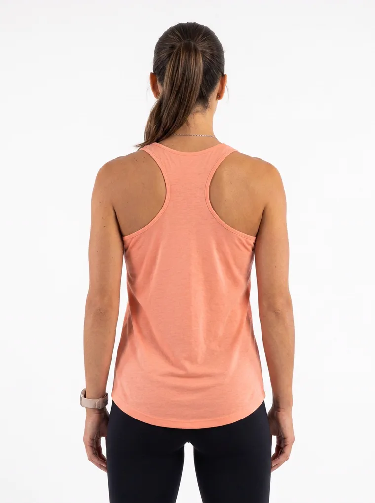
Menswear

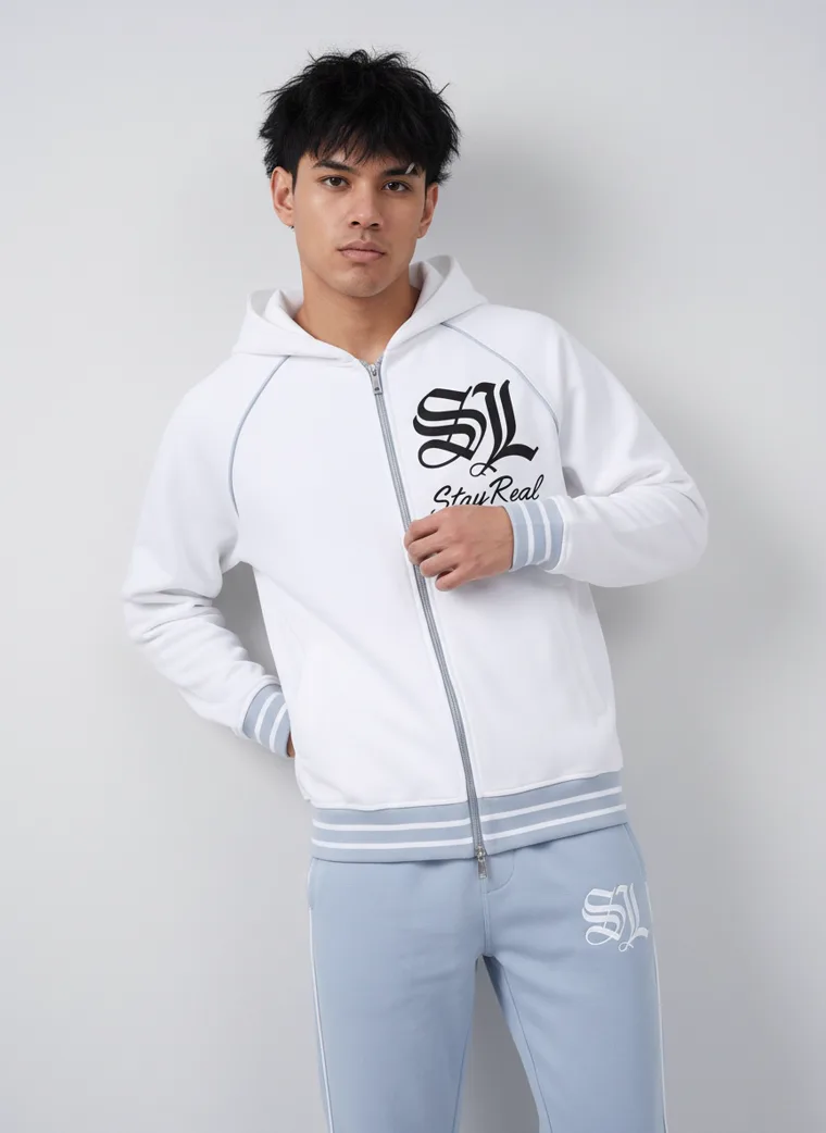
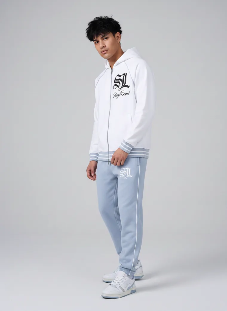
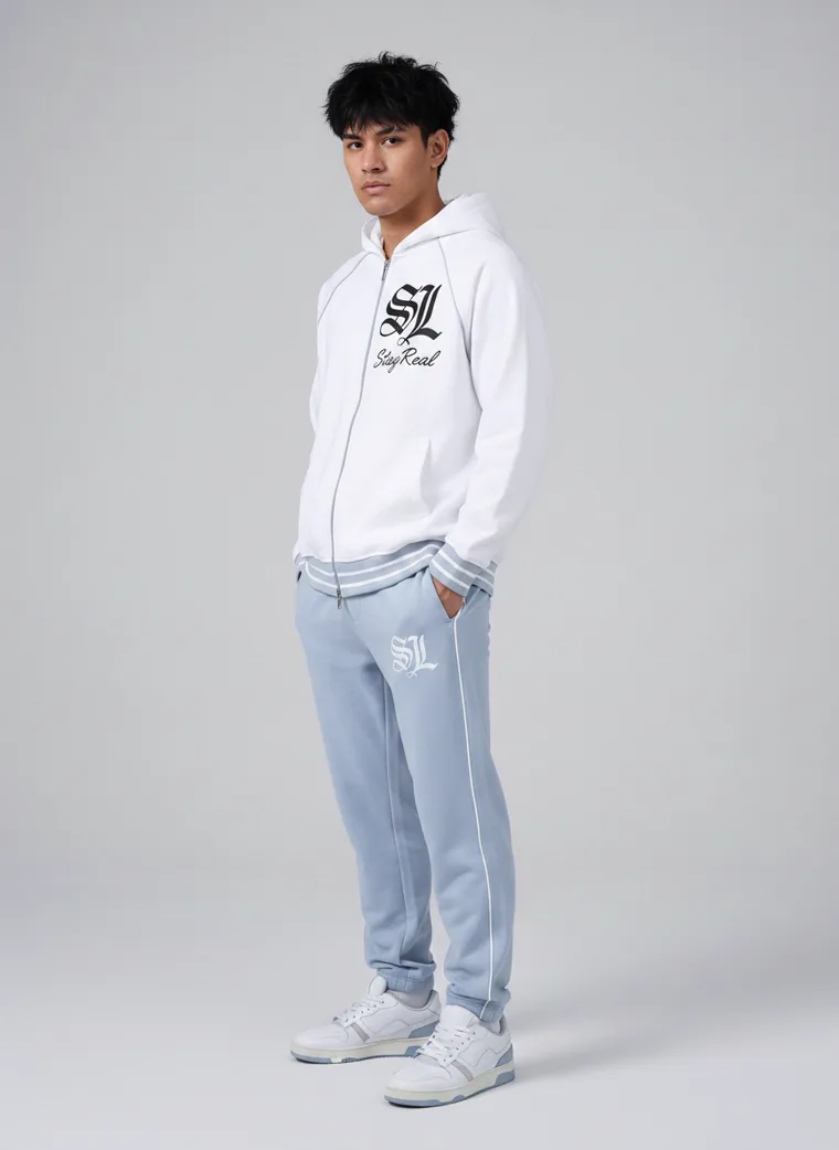
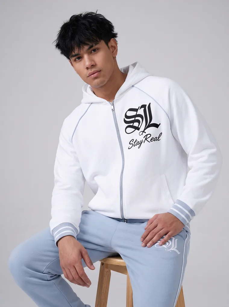
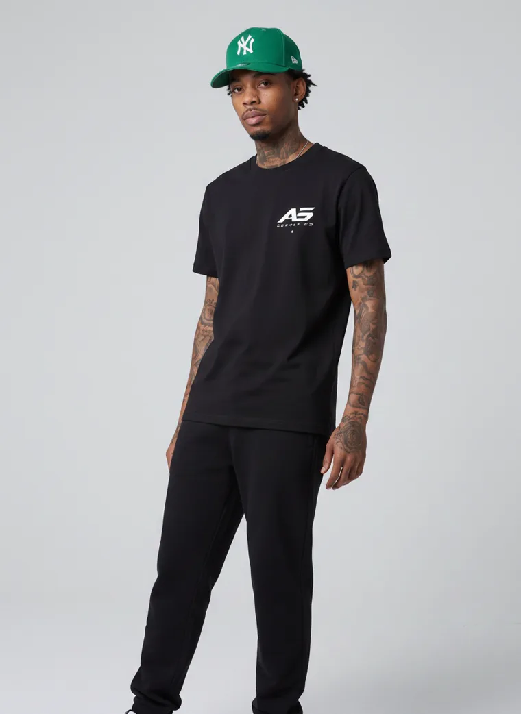
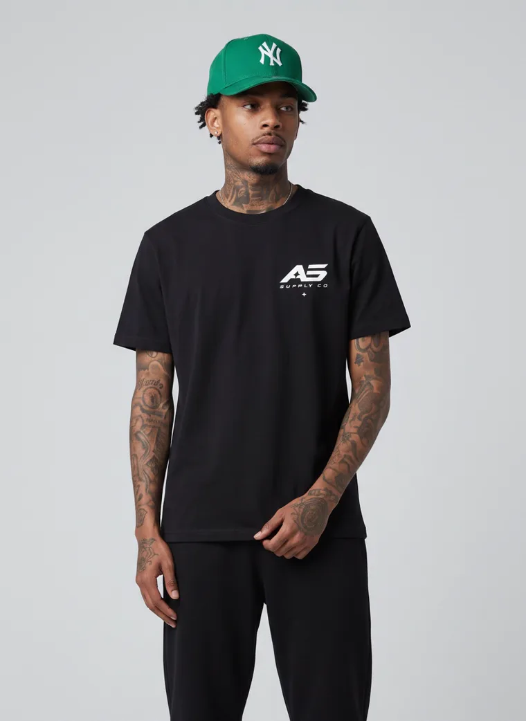
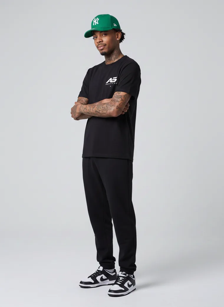
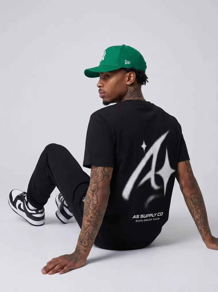
Kidswear

A note on how this edit was photographed
Every look here was produced with MODA AI. Five catalog frames per look, plus the video, generated from a single garment upload per product rather than shot over twenty separate sessions.
That is the reason twenty unrelated products can sit in one edit without looking like twenty different shoots. The model, the setting and the light are set once and reused, so the only variable left between looks is the clothing, which is exactly what you want when the point is to compare a season rather than compare photography.
If you are building an FW26 range, the practical version of this is that you can photograph the season before you have finished buying it. Our guides on cohesive catalog photography and shooting from tech pack sketches cover how that works in practice. And because so much of this season is cream, pale brown and tonal, the decisions that keep a pale garment from sinking into its background matter more than usual. Those are in How to Make the Product Stand Out in Catalog Photos.
Frequently asked questions
What are the main FW26 fashion trends?
On the runway the season was defined by texture, plaid and checkerboard, dark romance, skirt suiting, tuxedo dressing, tomato red and statement accessories. In commercial ranges it reads differently: a warmer palette, easier proportions, tonal sets, sportswear moving into everyday dress, and print carrying the personality when the shape stays simple.
What is the FW26 colour palette?
Brown is the foundation. WGSN with Coloro built the palette around warm earth tones such as Cocoa Powder against lights such as Wax Paper, and Pantone’s fall palette runs Arabian Spice, Toffee, Coffee Bean and Hot Chocolate. Burgundy, olive, peach and tobacco all behave as neutrals around it, and the whole palette is anchored by cream rather than black.
Which runway trends actually reach commercial ranges?
Colour and proportion travel. Spectacle usually does not. Sequins, shearling, tuxedos and thigh high boots are expensive to produce and narrow in appeal. A warmer palette and a softer trouser cost nothing extra to adopt and sell to far more people, which is why they move into mainstream ranges within a season.
What is tonal dressing?
Matching the top and bottom in one colour so the outfit reads as a single silhouette rather than separate pieces. For FW26 it appears across athleisure, kidswear, loungewear and gym ranges. It sells well because it removes a styling decision for the shopper and lets a brand sell two pieces as one look.
How should I photograph an FW26 range?
Let colour and proportion carry it rather than props. Tonal sets need full length frames so the single silhouette reads. Graphic pieces need a back view, because the graphic is often the reason someone buys. And keep the model and setting constant across the range, so shoppers compare the clothes rather than the photography.
Twenty looks. One season.
FW26 does not need one house style. It needs a point of view. Build your next catalog with MODA AI, free to try from the Shopify App Store.
Get Started FreeOr browse the full lookbook